
giggle
Giggle provides a platform for music enthusiasts to discover, share, and experience live local performances.
Team Members

Problem
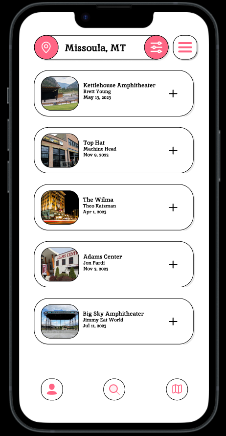
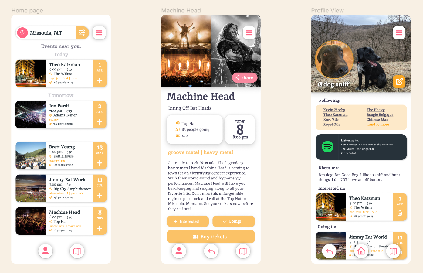
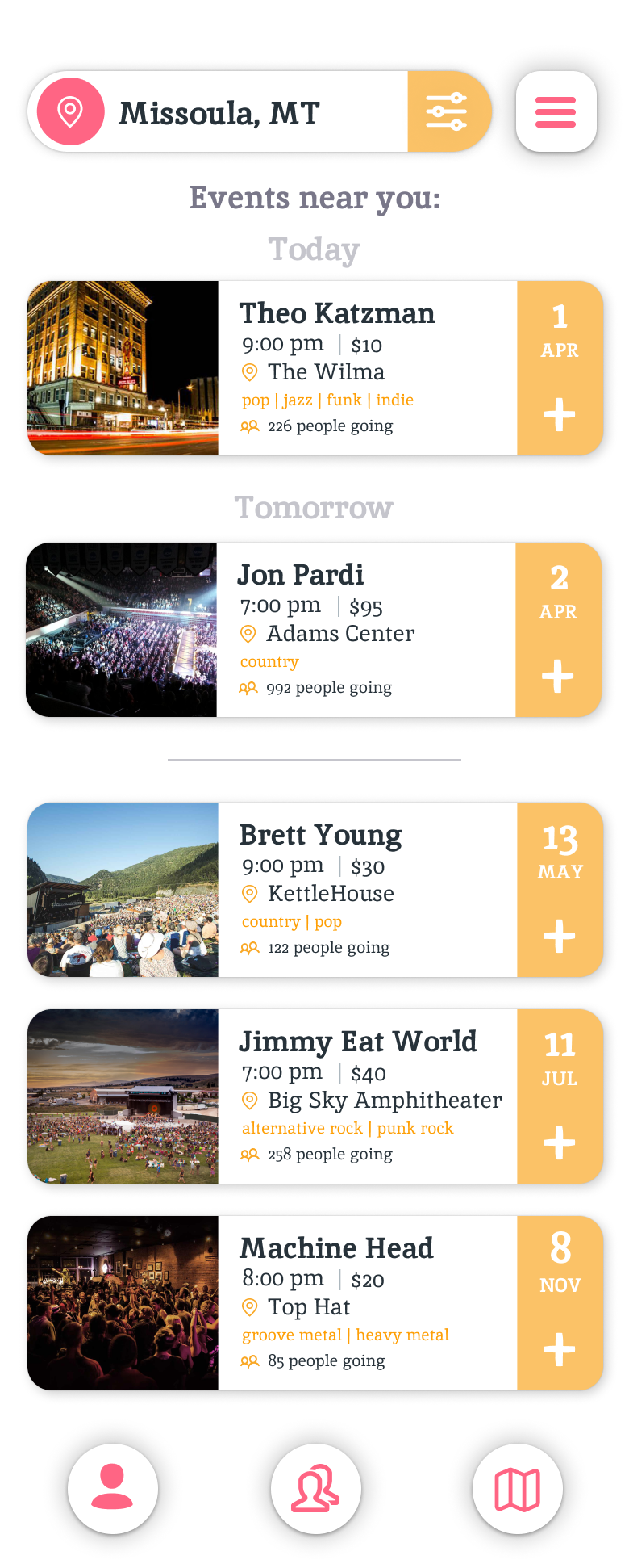
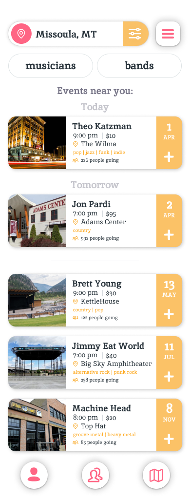
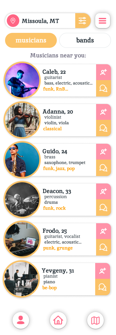
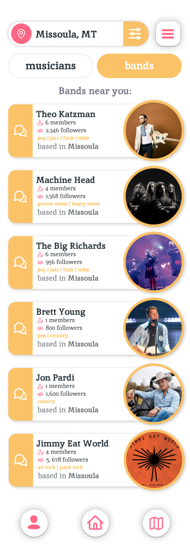
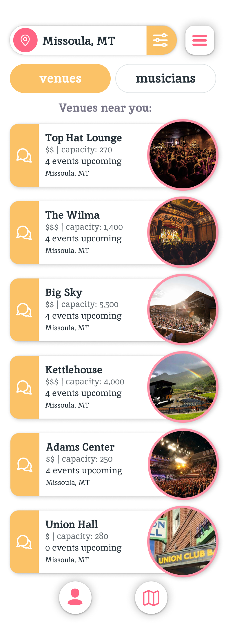
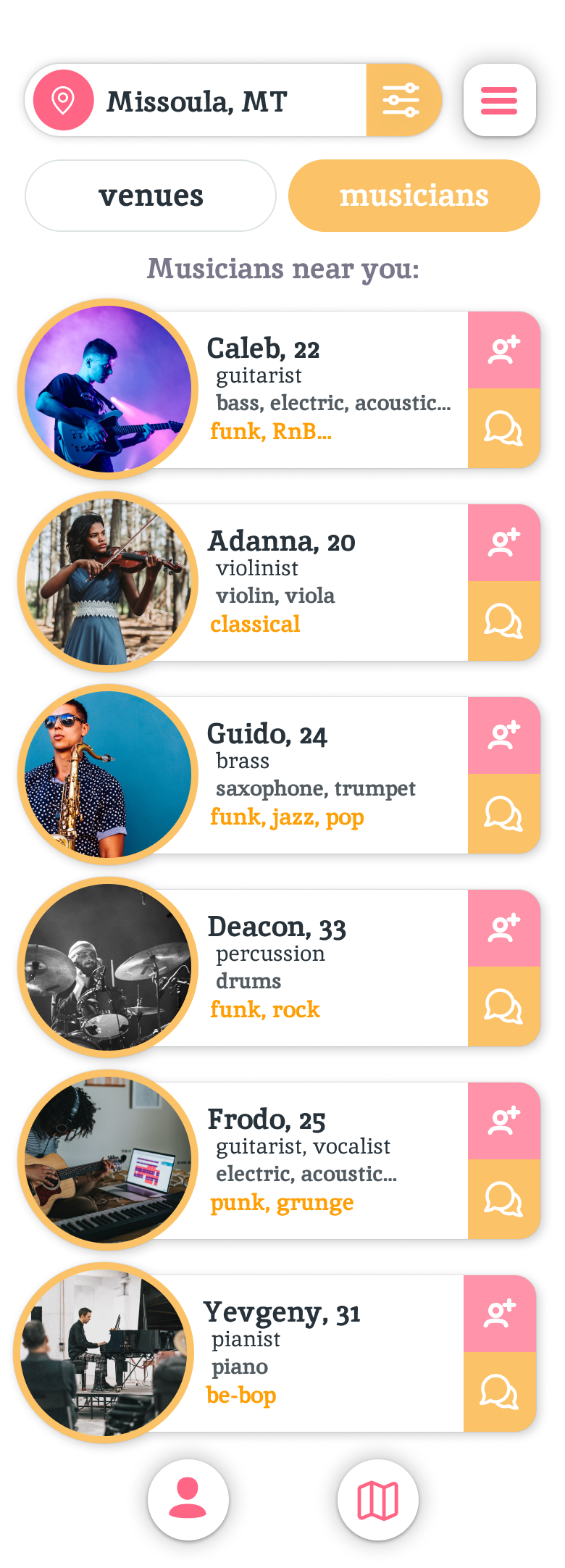
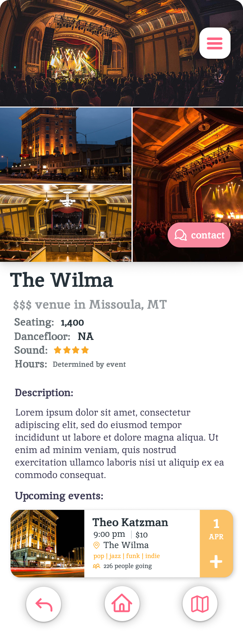
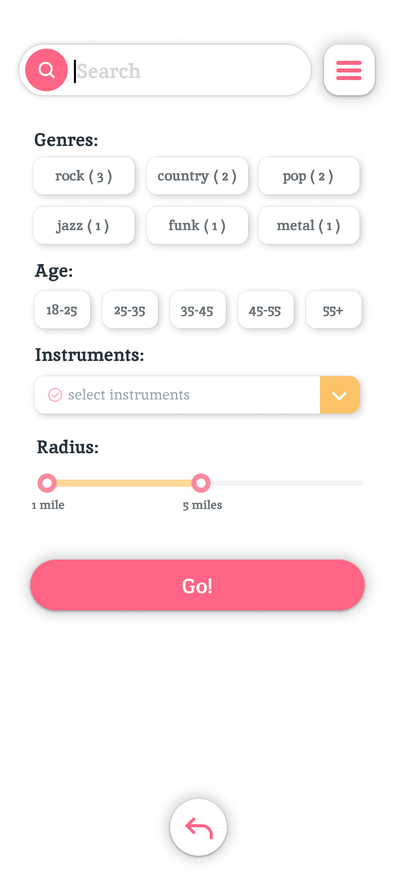
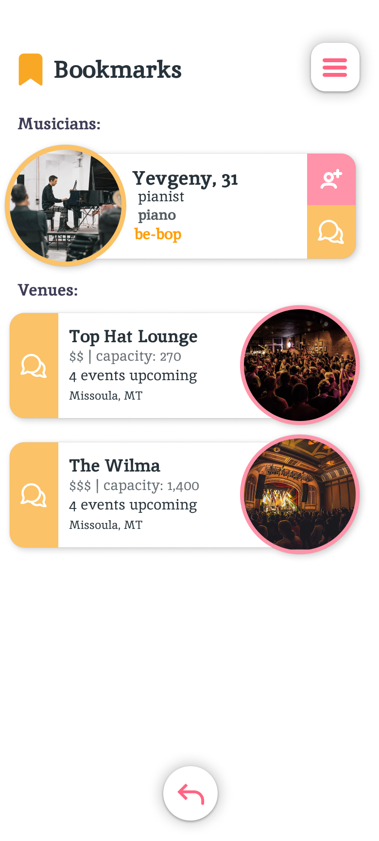
Giggle's aim is to allow its users to find local music, musicians, and bands in a simplistic manner. There are not many mobile apps that allow users to easily filter thorugh and find local concerts and events that are going on around them. Giggle also holds appeal for musicians in bands, and venue managers themselves. Bands and musicians are able to connect with venues to make booking gigs that much easier for both sides. We wanted Giggle to be simplistic, so our homepage will be a default list view of local events that have been booked near you. Users can bookmark an event to save it for later with the + button, or click on an event to find further info. Users also would be able to change their location, and apply filters to find specific results to fit their needs.
Early Design
The primary focus of our early design was to determine what a user would expect from our app based on the concept alone. We wanted to know what tools the user would want to be equipped with in order to achieve whichever goal they had in mind when they downloaded our hypothetical app. Overall we were looking at features which needed to be added, and how they could be placed within our application in an appealing manner.
Early User Feedback
Early on we wanted to know what users would want out of our application. We were looking for specific features that were desired among our potential user base, along with what they believed would be beneficial to the application. Overall we wanted to know who would be using our app, and why they would be using it.
Sample Feedback Questions
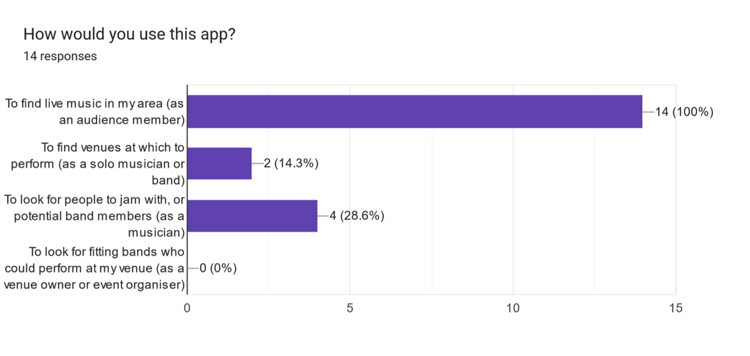
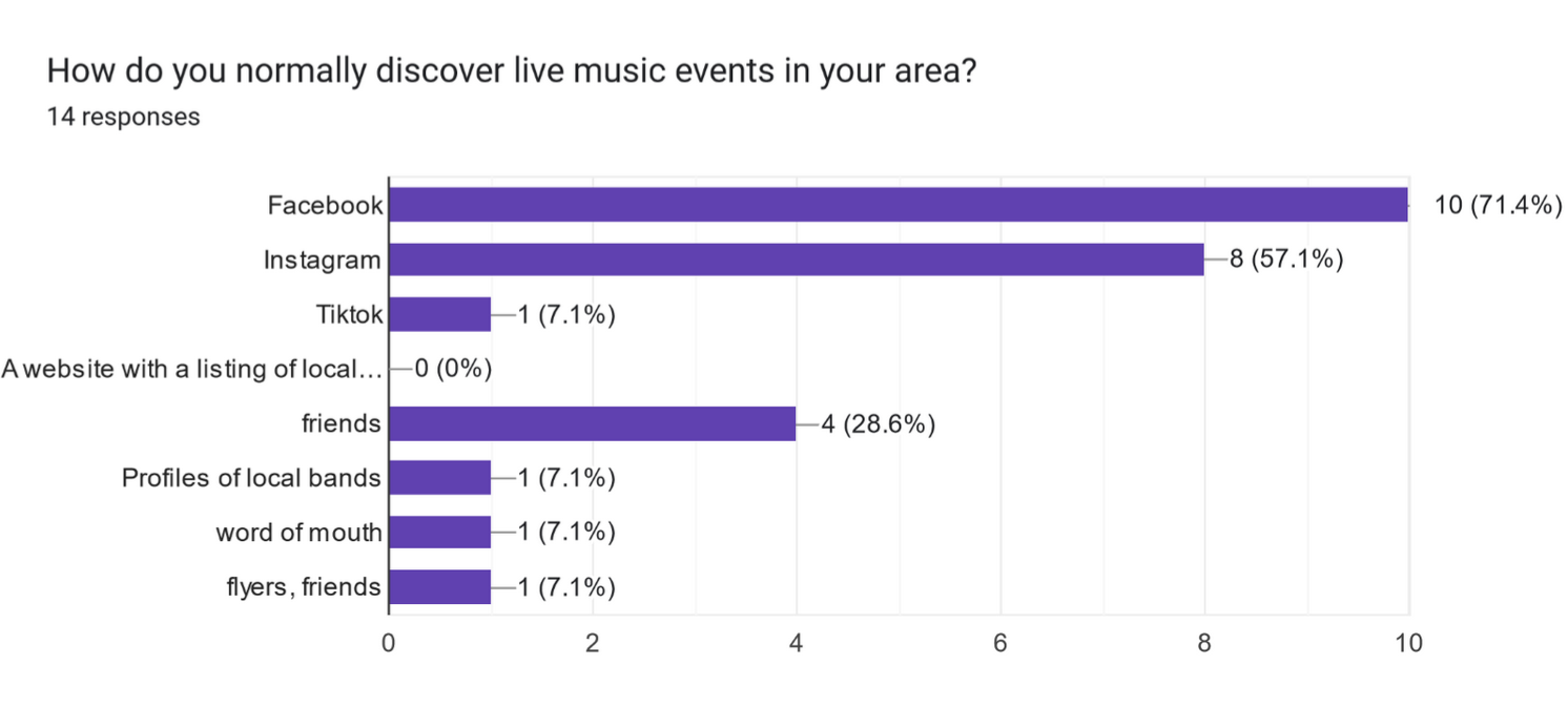
The questions we gave users were geared towards finding out how they would use our application and how they were currently dealing with the problem we were trying to solve. We aimed to figure out how they were currently discovering local music, if they were satisfied with their current methods, and how they would intend to use our application based on a short prompt describing what our proposed app would look like. We wanted to know how users planned to utilize our application, in order to be able to design giggle with our users' experience in mind. Some sample questions from our feedback sessions are included below:
- “How do you normally discover live music events in your area?”
- “Are you satisfied with the options for discovery that are currently available?”
- “Would you be interested in using an app to more easily find people to jam with?”
Early Feedback Methods
Our method of gathering early feedback was a combination of in class constructive feedback activities, and questionnaires to potential users. These questionnaires were given out via a Google Forms document as this makes it not only easy to get to potential users, but google forms provides also analysis tools which make gathering feedback and drawing conclusions more straightforward.
Key Insights
1. Users seemed to favor more of a social media aspect to our application
While giggle's aim is to provide a platform to find local music, bands, and musicians user
pointed out that this could be achieved in a social media type app. Not only did they want to find local music,
but they also wanted to be able to share that experience with their friends through giggle.
2. Not all of our initial ideas were going to make the final cut
During initial discussion of our application, some potential functionality was planned that was either out of the scope of this project,
or undesired among potential users.
3. There was no current option for finding music that was agreed upon by all users
Based off of user feedback, there was no clear one option currently available for finding local music events. Most current options
appeared to be posted by vague groups on already established social media platforms, and word of mouth.
Storyboard
To start our design process, we both drew out what we thought the app should look like on paper. We wanted to find aspects in our early designs that were common to one another to determine what would make the final prototype, and so we worked separately at first.
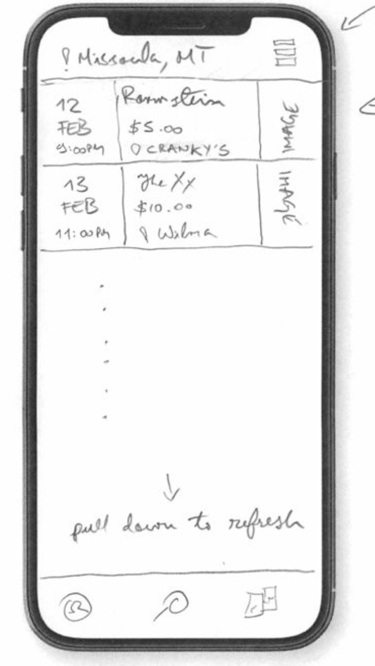
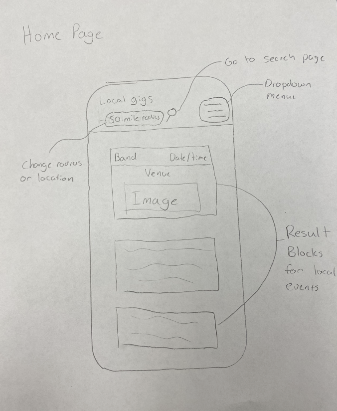
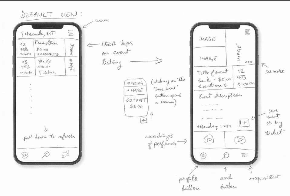
Both of the above home page sketches are each of our initial thoughs on how our main page should look. We saw a lot of early similarities that we decided to keep in our design
- A location indicator at the top of the screen
- Hamburger menu on the top right of the screen
- Block elements for each event listing
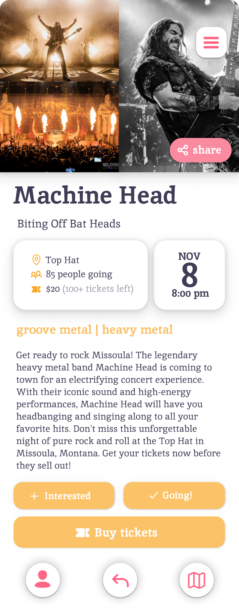
We decided that Bogdan's design (pictured on the upper left) had all of the aspects that we wanted to include in our prototype. We set out to follow that design, and determine later on whether or not we wanted to make changes to the initial sketches. Bogdan's designs had some more functionality that we wanted to see included, such as the navigation bar at the bottom and a better utilization of space from the event blocks. The bottom sketches are what the user would see when they clicked on eny given event. The event view would later house some of the most important information on the app. The main goal of giggle is to give users a place to find events, and we decided that we wanted to implement these early sketches into our app.
Design Crits
Our individually created low-fidelity prototype sketches were presented to the class in a slideshow, as we explained our thought processes and where our ideas overlapped and complemented each other's. Our presentation was then opened to questions from our peers.
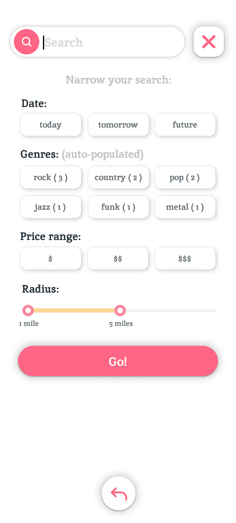
Some of the feedback we received that day was invaluable-- both our peers and Dr. Reimer had very useful remarks regarding our design of the events search page, which we hadn't given enough capability to. Moving forward we strove to broaden the possibilities within the various search pages, whilst keeping them as visually simple as possible.
The following week we had prepared a partial medium-fidelity prototype which demonstrated two simple test scenarios, and our design was heuristically evaluated by two fellow teams, and Dr. Reimer.
This phase of the project really threw into contrast for us what high-fidelity actually meant within the context of UI prototyping. Having worked on low-fidelity sketches and documentation thus far, it was only when our medium-fidelity prototype was roasted by our peers and professor that we realized how much hand-waving we had done assuming that the intentions behind our design decision would be intuitively picked up by others. A major critique was our complete lack of dummy data which turned out to be absolutely necessary in order to effectively communicate the capabilities of our app.
Some other useful criticisms during the heuristic evaluation at this point were:
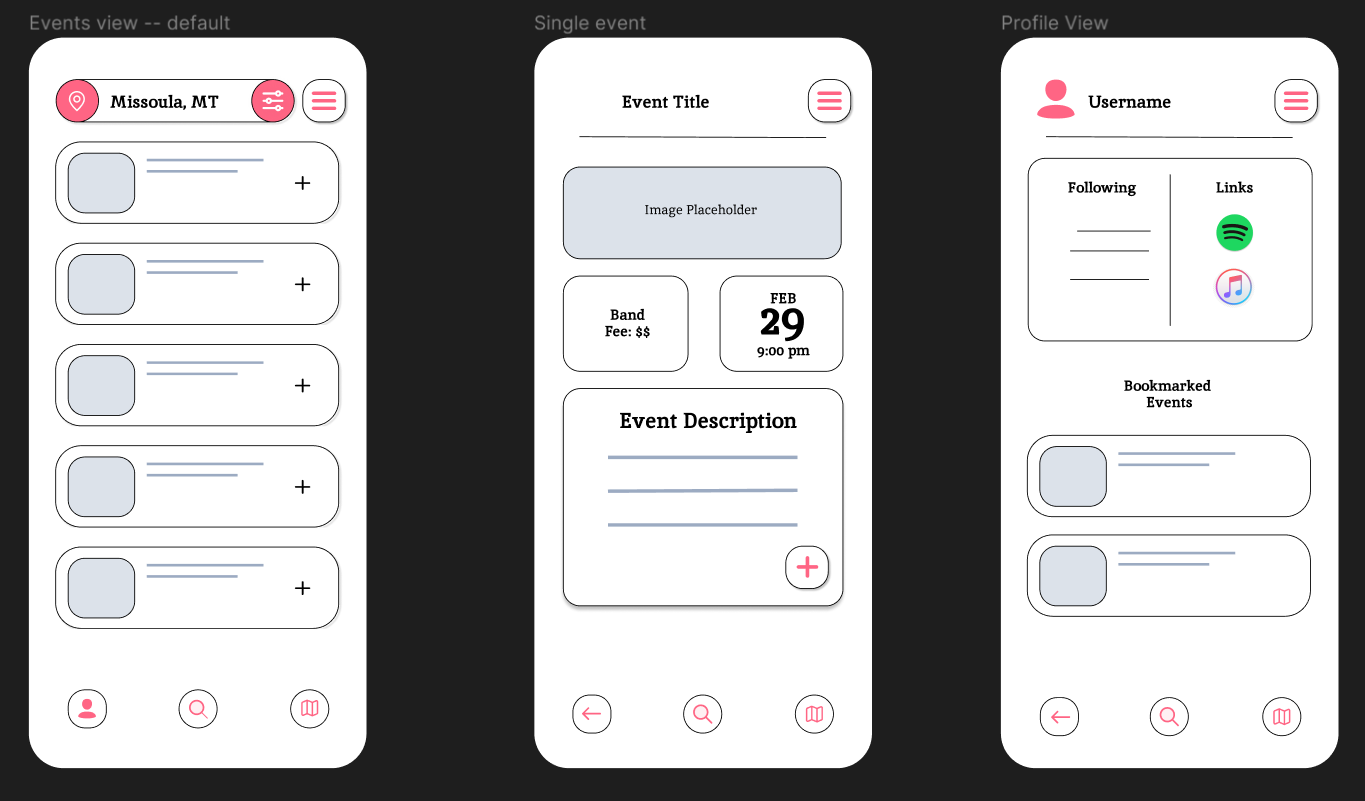
- Consistency. Navigation within our app takes place via 3 buttons at the bottom of each screen, and a menu button in the top right corner. In our medium fidelity design, the buttons were inconsistent between screens, and would in some cases display redundantly (i.e. profile page button being displayed on a profile page). As we moved to high-fidelity, we deleted and redesigned all of those button groups and took care to consistently apply them to each app view.
- Feedback. There was no sense of depth to the prototype while interacting with it. Buttons, links, clickable block elements had a very flat design which gave neither any indication as to being interactive, nor gave any feedback to the user during interaction. Our high-fidelity prototype now has 3 states for most interactive elements: a default state, a "while being clicked" state, and a selected state. This change went from very low priority to high priority the moment we realized how positively it impacted the user experience while we were testing our own prototype.
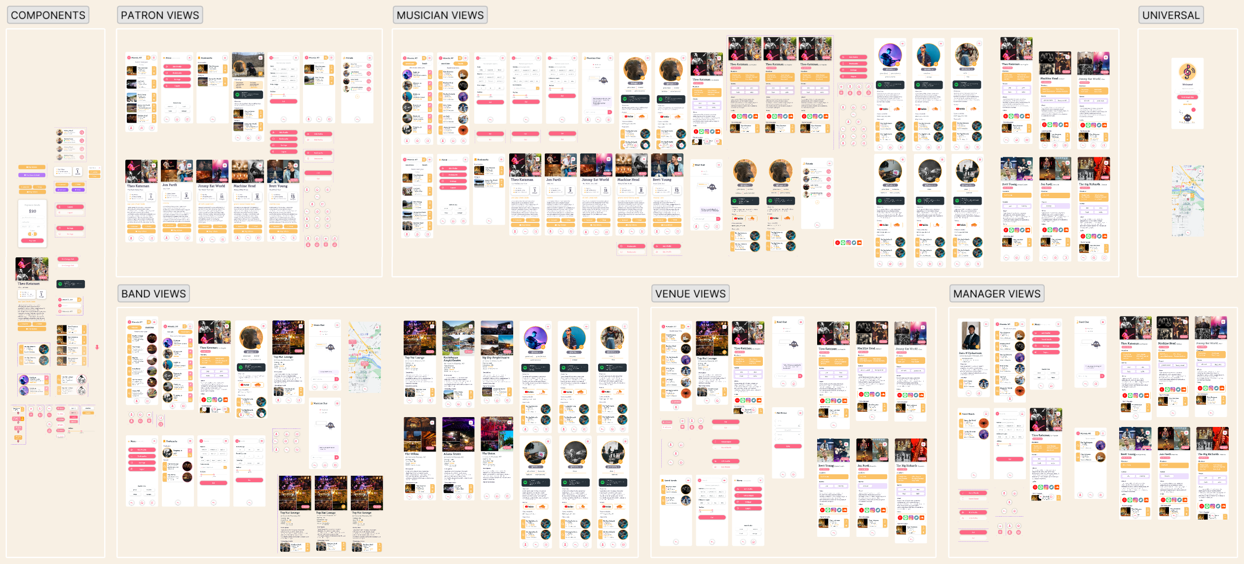
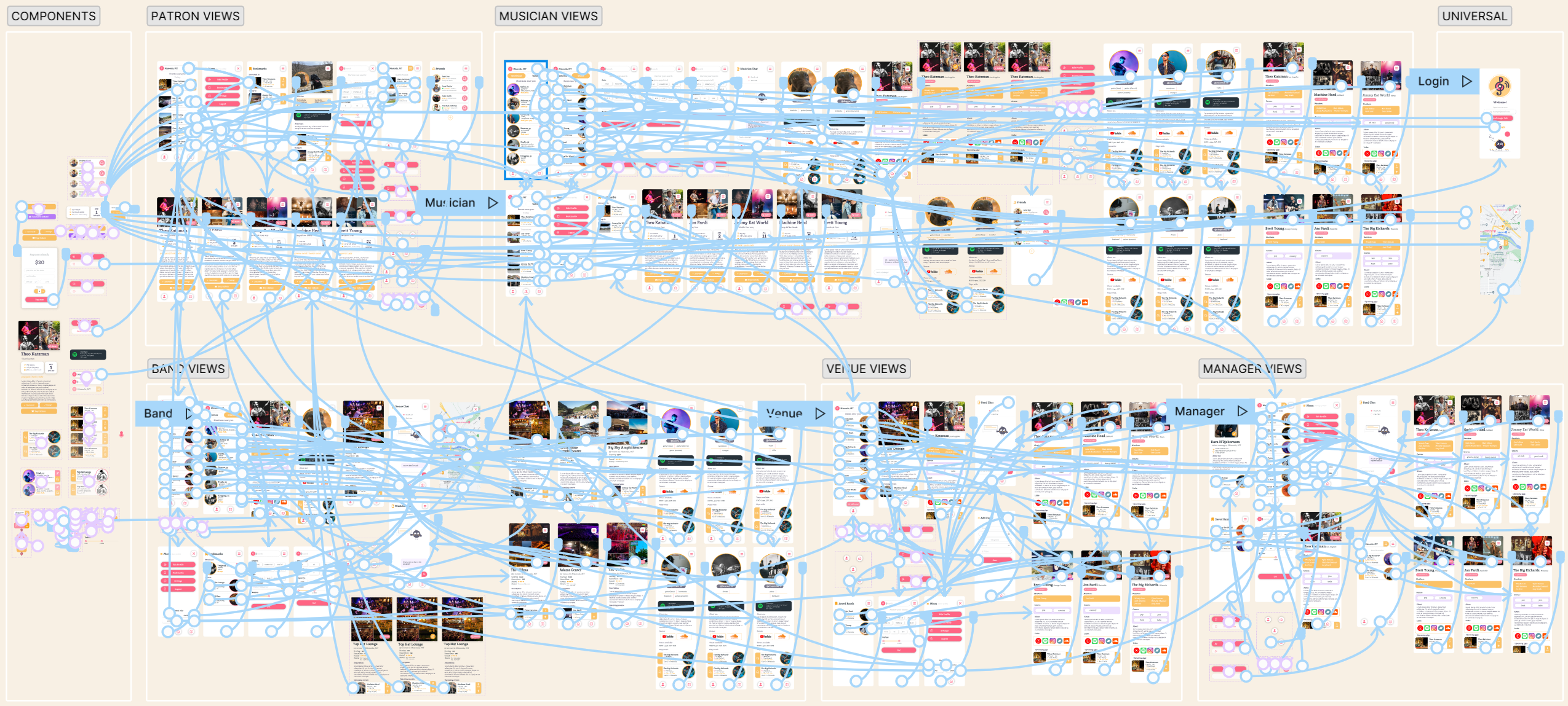
High-fidelity Prototype
Our prototype was built in Figma. Initially we intended to pivot to a tool like Protopie after the medium-fi design stage but we gave up on that idea once we realized how immature and bug-ridden Protopie was, despite its slightly more advanced prototyping capabilities. Figma turned out to offer much more functionality than we were aware of at the start of our prototyping process, and it does seem to be an industry standard tool so we decided to keep using it going forward.
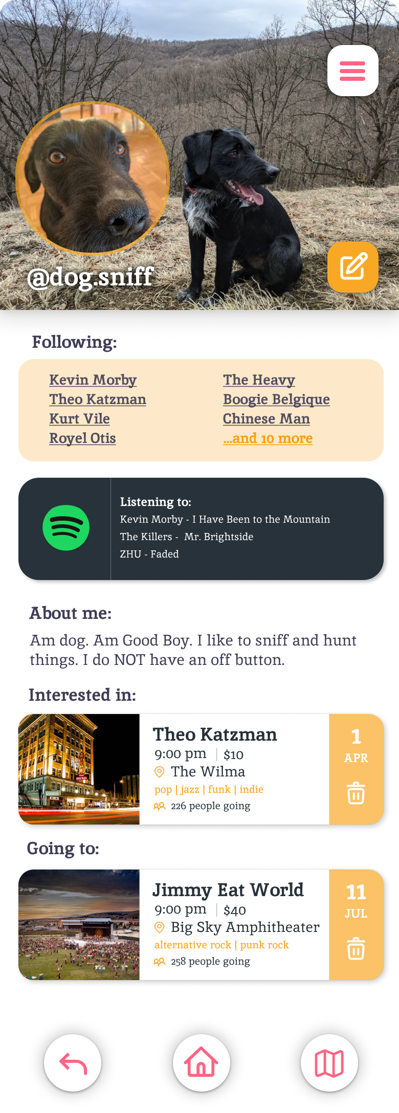
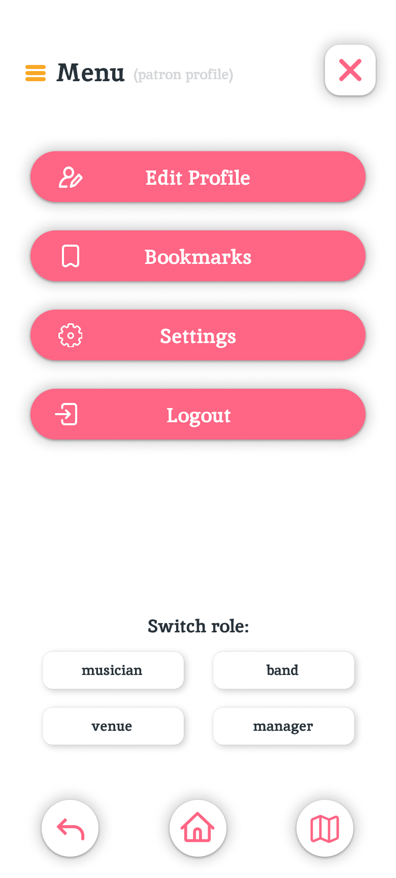
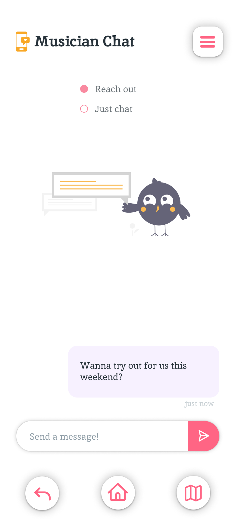
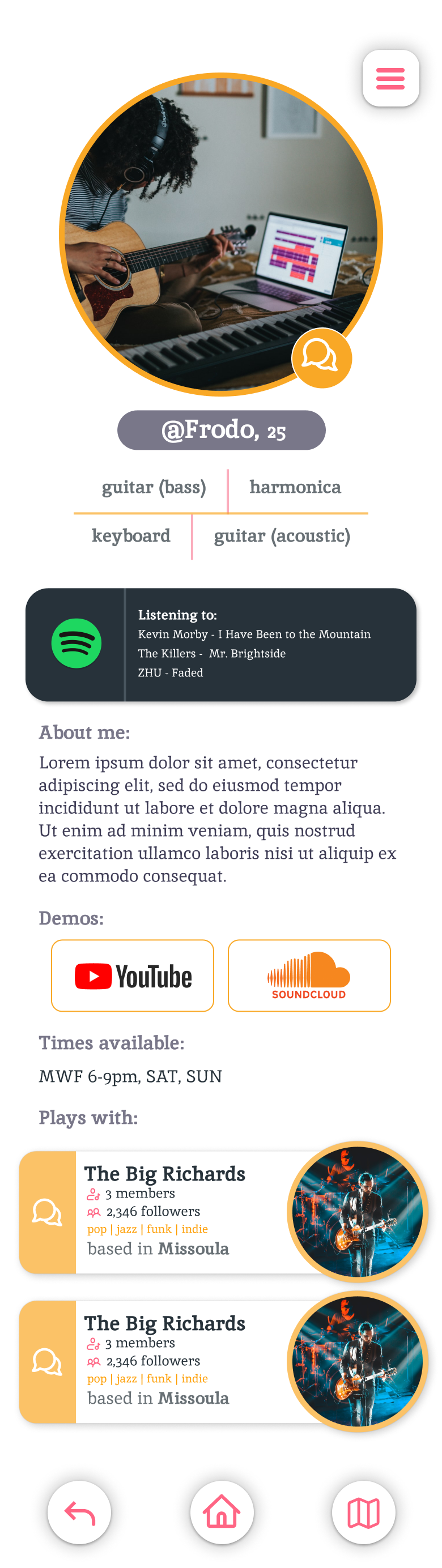
Our application is intended for 5 different types of users-- a default user or a patron looking to find a gig or connect with friends, a musician, a band, a venue, or a talent manager. Users are able to switch roles from within the app, and each role has slightly different functionality. Some of the usage flows are described below.
As a patron:
As a musician:
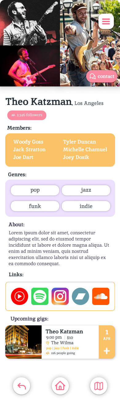
As a band:
User Testing
Test Environment
Usability testing was conducted with 7 participants over 5 sessions, two of which were conducted with two participants at the same time. Users were given the app prototype to work with on
one of our phones via the figma app. The idea here was to remove a layer of suspension of disbelief from participants when it came to engaging with our app. Since
we were designing it mobile-first, it made sense for our testers to be interacting with our prototype on a phone. They each were asked to complete five scenarios and the accompanied tasks lists. After
they were done with the scenarios, users were given a questionnaire to answer some basic questions on a Likert scale, and then we interviewed them in a conversational manner to get some of their more in depth thoughts about the app
and their thought processes during testing.
Our trial-run test took place at Dalton's house. Two subsequent tests were conducted in the University Center, by the ballroom entrance, followed by a test in the UC dining hall, and a final test in the Lewis & Clark Village commons.
Key Findings
There were a lot of similarities between our findings from each separate testing session. There were a few main things that most participants gave the same sort of feedback on:
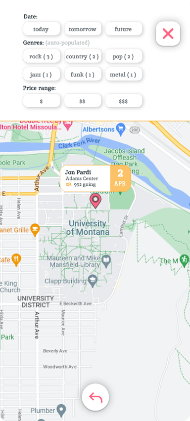
- Testers wanted additional searching features, particularly a more exact way to pick a date
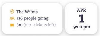
- Testers would have liked to see a ticket availability counter on an events page somewhere
- Testers wanted to be able to follow their favorite bands/musicians in order to recieve notifications about them
- Most importantly testers were pleased with our design and navigation. None of them had anything negative to say about the design.
- Our initial performance measures were far too high. Testers navigated through scenarios in half of the time expected, and with a fraction of the expected errors.
Effect On Design
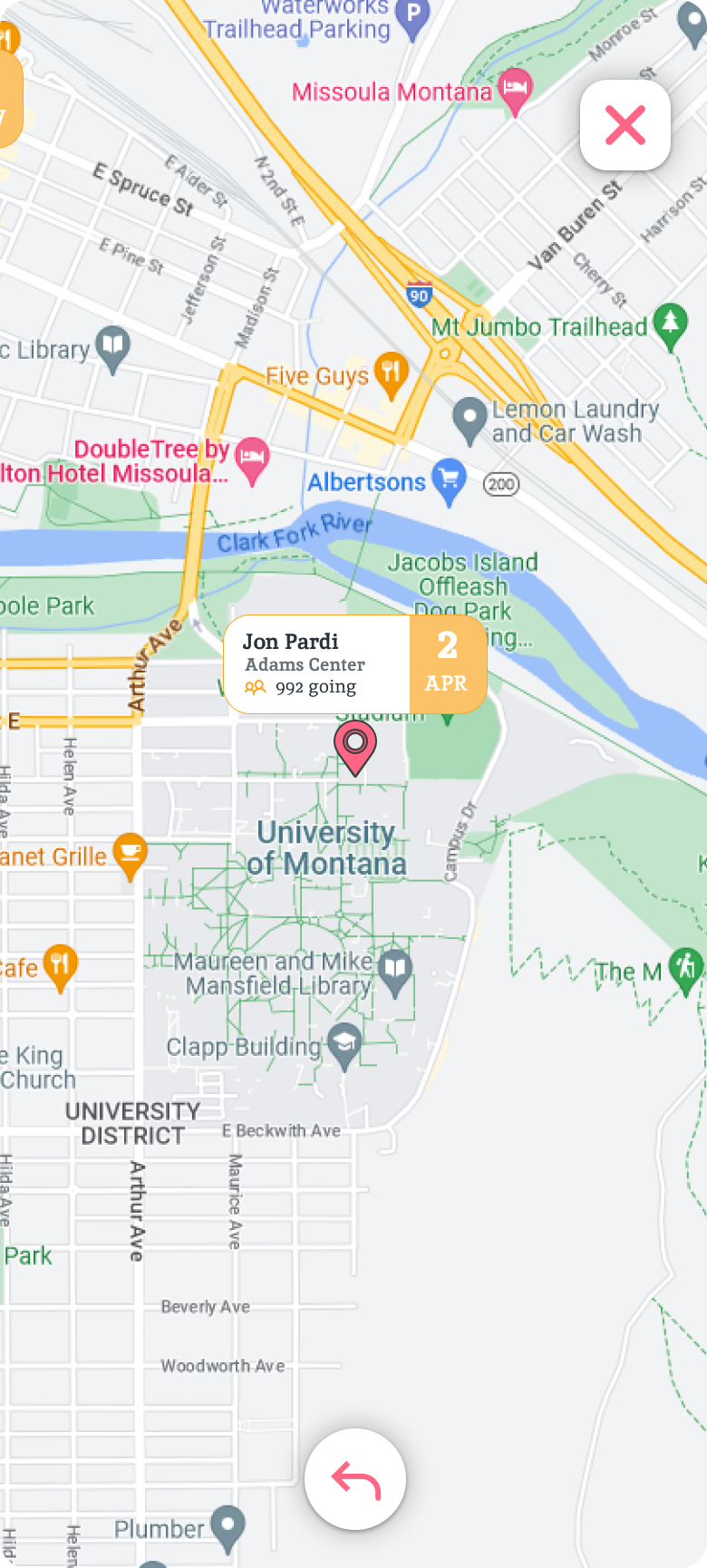
Because there were only a few things across the board that users wanted to see within the app, we decided to implement them on figma for our final prototype. The first feature that was added as a result of the testing sessions was a ticket availability feature on the events page.
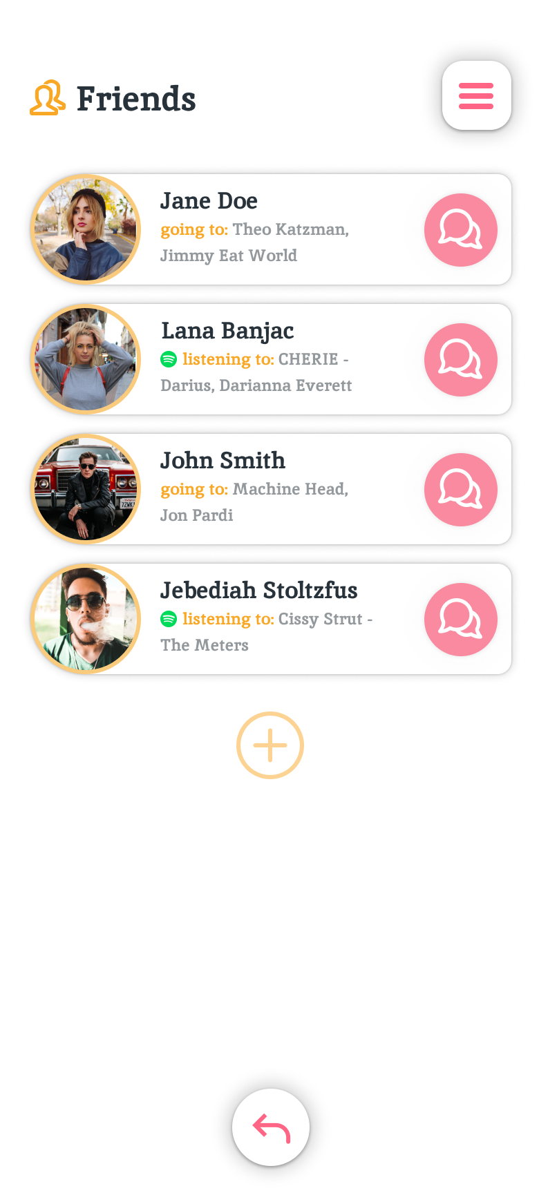
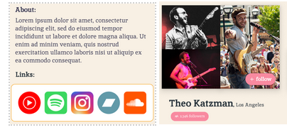
We also added the ability to follow an account, along with some social media links.
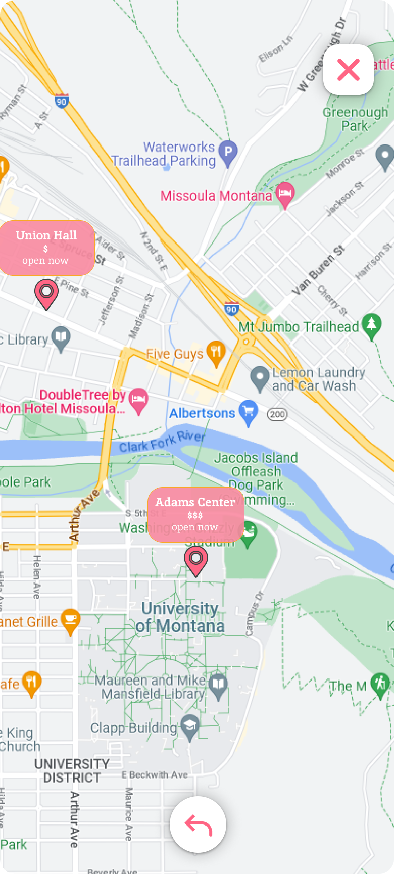
Lastly we added the ability to filter search results on the map itself, which a couple of users mentioned would make finding local events easier by being able to see search filter changes immediately reflected on the map view.
Reflections
Overall the design process was very beneficial to us both. We learned what was out of scope, what was not achievable in the prototype environment, and how building a prototype was a lot different than actual implementation itself. Once we were able to get past the planning stage and get into the actual prototyping itself things began to get a lot easier. Learning figma was the main roadblock in the process, and Bogdan gained a lot of skills in that area that made our final design look extremely professional, and work as close to a real app as possible. Figma is an industry standard for a reason, and once you learn how to harness it, you realize how capable it is. We learned how to think of the design process in terms of knowing when a compromised solution is needed in prototyping as opposed to in actual implementation. Being able to see our app go from sketches, to a medium fidelity prototype, to the high fidelity prototype whilst keeping most of our original design and ideas was very rewarding. We had a fairly solid idea of how we wanted it to look at the beginning of the semester, and we followed it through. If you go back and look at our initial sketches compared to our final design they look quite similar but enhanced, which we are proud of.
Key Learnings
- Trust the process: Our design did not come together right off the bat; we needed time to crystallize our vision for the app and how it would be used before we could commit to high-fidelity prototyping.
- Figma has a learning curve: Initially our design looked very basic because we were not experienced with Figma, but once we learned more our design started to look a lot better.
- Prototyping is time consuming: Due of the nature of prototyping and it being basically a glorified slideshow which gives testers an illusion of an implemented app, it took us a long time to accept the compromises we would have to make in order to simulate the idea that we had for giggle as closely as we could.
- Simplicity is good: We set out to make our app as simple as possible while remaining effective. After user testing, the majority of our participants commented of their own volitions that they liked the simplicity of the app, and the minimal amount of useful information that it conveyed without being overwhelming.
- Testing was smoother than expected: Testing went a lot easier than we planned for and we were both very pleased with that fact. We got some constructive criticism, perhaps not as much as we hoped for, but also got an unexpected amount of praise which validated our design process.