
Swift
Empowering communities through trusted service-sharing.
Team Members

Problem
Swift is a mobile application for service sharing that allows users to quickly find services in their area and make money offering services to other users. Transactions between users are processed through an escrow system, and users can rate services. The app's design prioritized user needs, technical requirements, and business goals, with emphasis on simplicity and trustworthiness. Registration requirements for becoming a Swifter are separate, with ID verification and background checks, and a Swifter Dashboard was created to manage and complete services
Early Design
In the early stages of our design research, our team focused on identifying potential users of a service-sharing application and determining the essential features they would require. Our objective was to investigate whether businesses would be interested in a platform to advertise and manage their services or if the application would be more suited for individuals offering services in their local community.
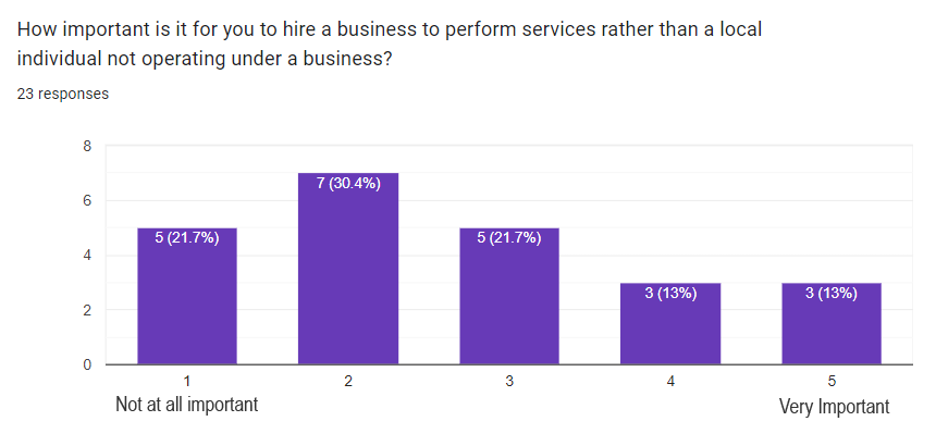
We started by asking ourselves if businesses would have a reason to use a third-party application to manage their work or if they were content with their current methods. To gain insight, we sought to understand what features businesses would need to manage their work more efficiently. Similarly, we explored how customers currently hire services, whether they prefer businesses or local individuals, and if they would trust strangers from the community if they had a reliable service-sharing application with background checks and verification.
To gather user feedback, we employed both interviews and questionnaires. Our interviews were open-ended and aimed at understanding how users currently search for or offer services. We conducted three interviews, mainly with friends and family members. The questionnaire was designed to reach a larger audience, and we analyzed statistics from multiple-choice and rating questions.
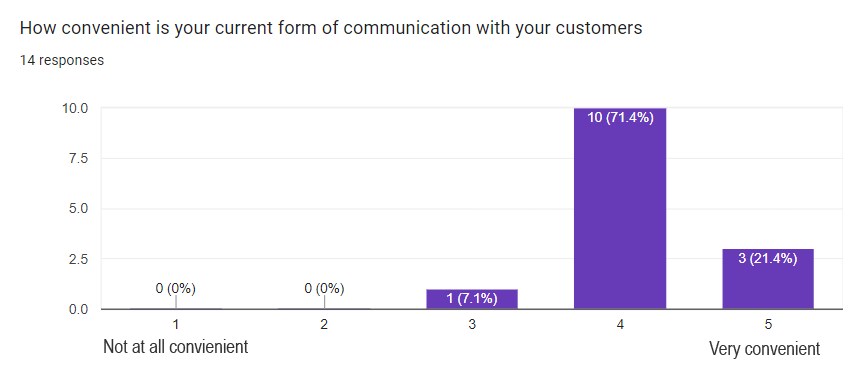
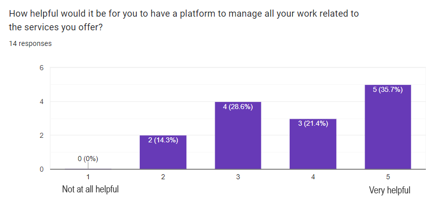
Our questions focused on the convenience of current service searching methods, satisfaction with current methods, preference for hiring businesses or individuals, and what would be needed to trust individuals. For business owners and individuals offering services, we also inquired about their satisfaction with current management methods and their willingness to use a third-party platform.
Key Insights
1. Trusting Strangers
We discovered that users were comfortable hiring people they did not know, provided they had undergone background checks and had positive reviews. In fact, many preferred hiring local individuals over businesses. Since customers need to trust the identity of individuals they hire, we decided to require that users offering services on the app will need to submit their ID so that their name and date of birth can be verified. They also need to submit their social security number so that a background check can be performed.
2. Businesses Content with Current Methods
Businesses did not trust third party platforms to help them manage their services and were satisfied with their current methods of advertising and communicating with customers. Based on this discovery, we decided that the users offering services will likely be individuals not operating under a business. Based on the interviews and questionnaires, there doesn’t seem to be enough incentive for businesses to host their services on third party platforms.
3. Service Management Functionality
Individuals offering services were interested in a platform to help manage their work-related tasks. To accommodate this we decided to create a section of the app called the Swifter Dashboard. The dashboard should allow them to accept or decline services, edit the details of a service, send a custom invoice to the customer, add attachments.
Storyboard
We started off with a rough paper prototype of our idea. Our paper prototype served as a foundational blueprint for our subsequent design work, enabling us to test and refine our ideas before investing in more complex digital prototypes. The accompanying illustrations show our early design sketches, along with brief annotations explaining the purpose and functionality of each screen. By creating a paper prototype at the outset of our design process, we were able to validate our ideas and ensure that our subsequent design work was grounded in user-centered principles.
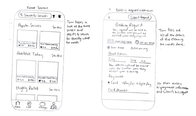
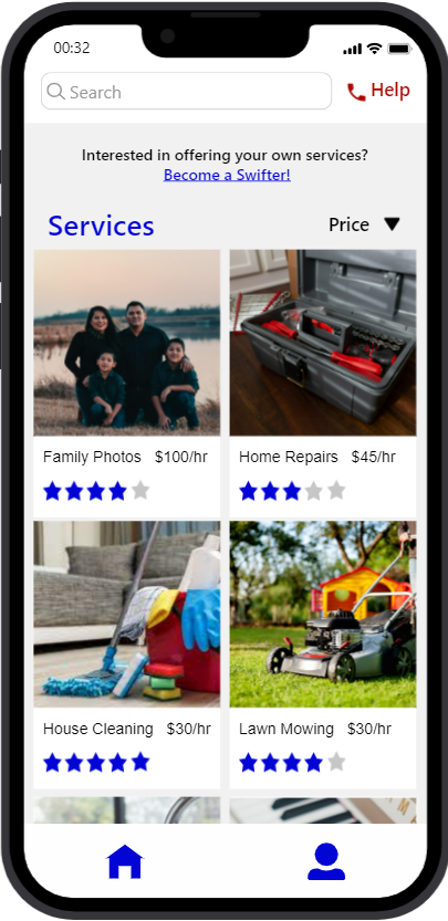
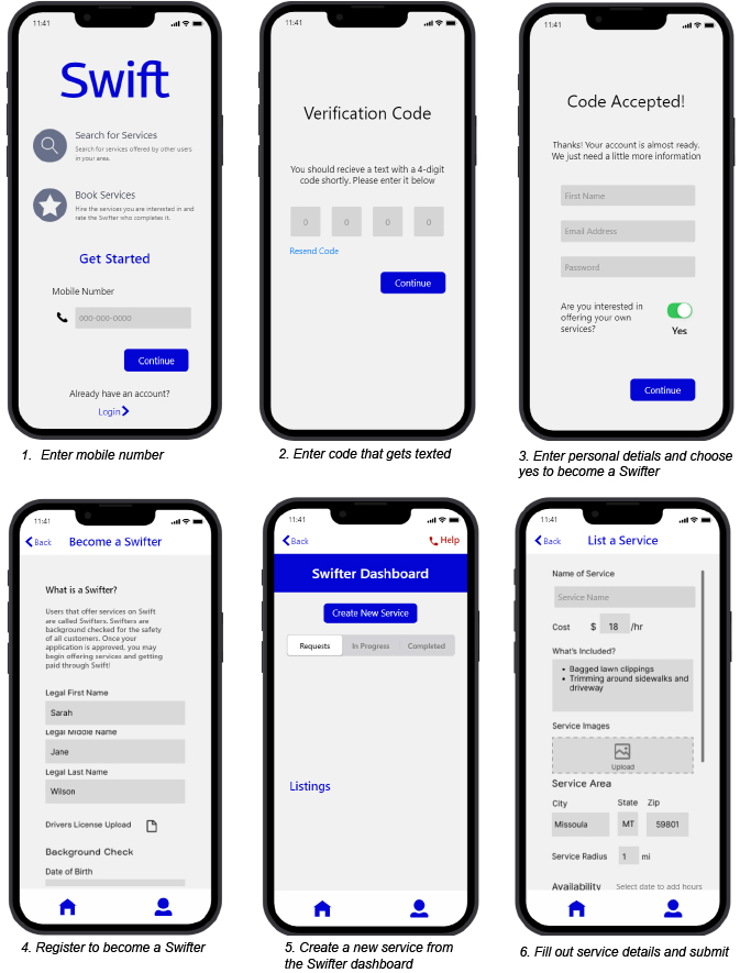
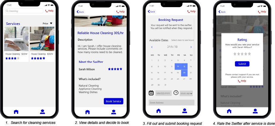
The home screen shows the services that have been posted by other users. On this screen, users can select a services to view more details on it, search for services using the search bar, or filter the services using the filter dropdown. We also designed a navigation bar on the bottom of the screen to provide quick navigation to the main sections of the app.
The booking request form allows users to submit a request when they want to book a service. They fill in the their personal information and details on the service they need then submit it for the Swifter to review.
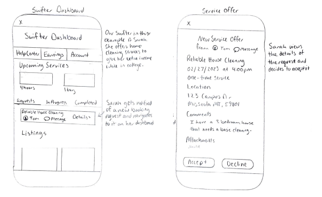
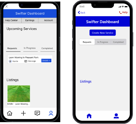
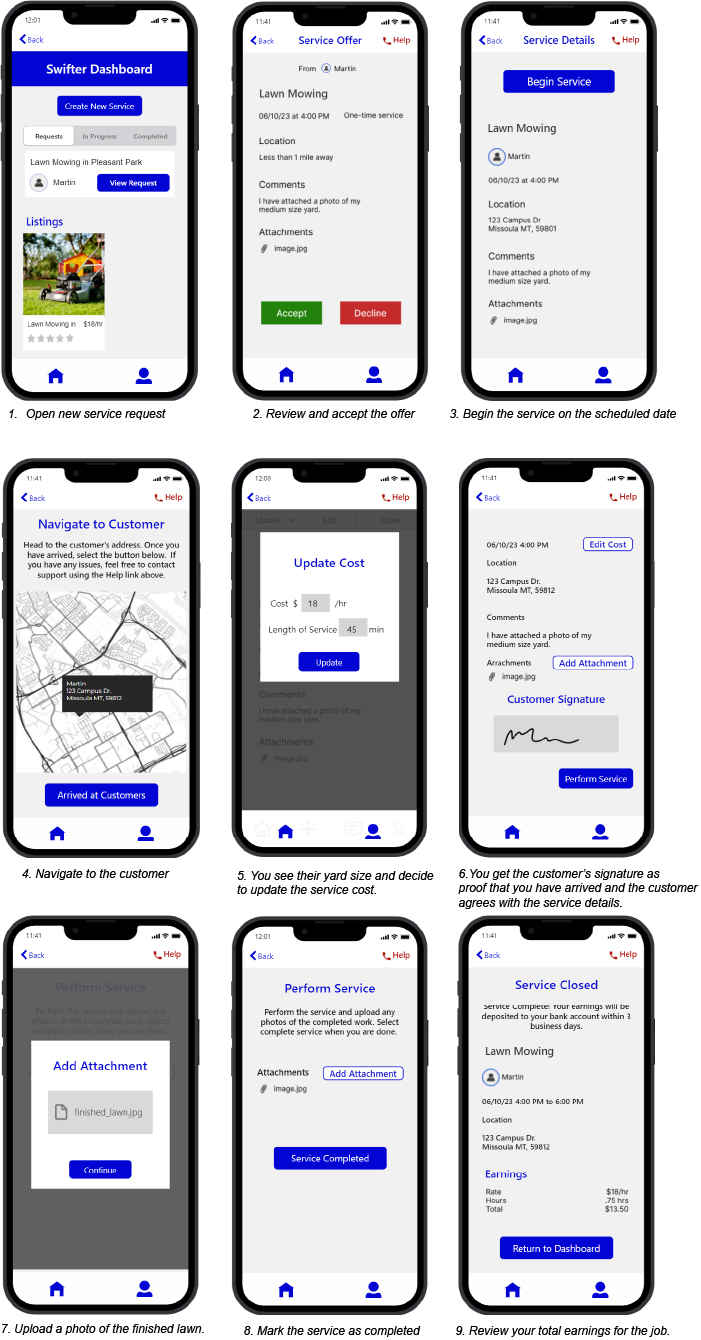
The Swifter Dashboard contains the service management tools that many service providers need. Here they can accept or decline new service booking requests, view in-process or completed services, and view their own listings.
Once a customer submits a booking request, the Swifter recieves the service offering. On this screen they can view the service details and either accept or decline it. We decided to hide some details such as the customer's address for their privacy.
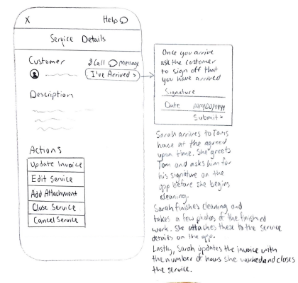
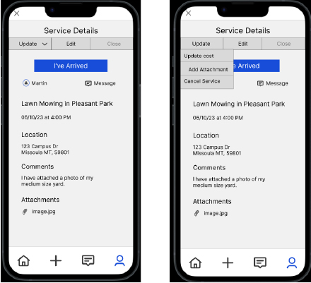
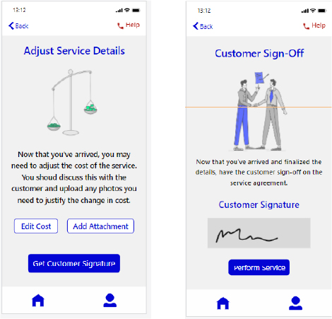
Once the Swifter accepts a service offering, they can manage the service on this screen. They can get the customer's signature once they arrive, edit the cost of the service, message the customer, and close the service once they complete it.
Design Crits
Our iterative design process mandated that we gather user feedback early and often throughout the design cycle. To accomplish this, we utilized low-fidelity prototypes and engaged in a variety of design critiques (crits) with our classmates and instructor. During these design critiques, our peers attempted to complete tasks on our prototype and we took notes on their feedback. Additionally, we conducted a heuristic evaluation with our peers to gain valuable insights into potential usability flaws and areas for improvement.
Through our design crits and heuristic evaluations, we gained valuable insights into user behavior. We found that upon logging in, many users were uncertain about the subsequent steps they needed to take. In addition, there was confusion surrounding how to become a Swifter and start offering services once users had logged in. Even after successfully listing a service, users reported feeling uncertain about the app's expectations for the service. These affected changes to our designs in the following ways:
1. Created a welcome page after creating an account that introduces you to the app.
2. After registering to be a Swifter, you are immediately brought to the Swifter Dashboard where there is a clear button to create a new service.
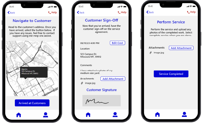
3. Created a new flow for the process of performing the service. The app now walks the Swifter through the steps needed.
High-fidelity Prototype
After gathering feedback and conducting a heuristic evaluation on our initial prototype attempts, we incorporated most of the feedback as we refined our design into a high-fidelity prototype. During the early prototyping stages, we faced challenges with using Figma, and we subsequently switched to Proto.io to overcome these issues. Presented below is a walkthrough of some of the main scenarios and tasks that users can perform on our app.
Scenario 1:
You just graduated highschool and need to earn some extra money before college starts in the fall. Your dad bought a fancy riding lawn mower two years ago and he agrees to let you use it if you buy the gas and pay for any maintenance it needs. You decide to offer lawn mowing services to your neighborhood for the summer.
Scenario 2:
You listed your lawn mowing service 4 hours ago and just got notified that another user has requested to book your service.
Scenario 3:
It is two weeks before Christmas and your parents tell you they are coming to town. Between work and your child's extracurricular activities, you don't know how you will find time to get your house clean before your parent's arrival. You decide to search for some help on Swift.
User Testing
To conduct user testing on the Swift prototype, six participants with diverse backgrounds were recruited and four individual testing sessions and one session with a pair of users was conducted. Each user was given a test script and a list of tasks to complete to ensure consistency in testing. The Swift prototype was tested on a mobile device equipped with screen recording software and a laptop was used to record audio. Throughout the test, the test monitor recorded notes on each tasks the user worked through in a data capture table. After completing the tasks, participants were asked to fill out a post-study questionnaire to assess their comfortability using the app and to evaluate the app's overall usability. Additionally, open-ended post-study interviews were conducted with each participant to gain deeper insights into their experience with the app. The questions included topics such as what confused them while using the app, what they would like to see added, and which features of the app they found most helpful.By collecting data from this user testing process, we were able to identify any usability issues and improve the overall design, functionality, and user experience of the app.
Key Problems Identified
1. Availability calendar and date picker was confusing.
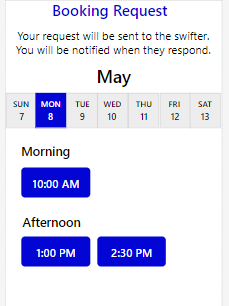
One main issue that was identified was the availability calendar and date picker on the booking request being confusing for users. A possible solution is to combine the interface that shows the Swifter's availability and the fields that allow a date and time to be selected. It should also be designed in a way that limits users to only booking the times available by the Swifter. The potential re- design shown instead allows users to scroll through dates and select the date they want to view. Once they do so they are shown time slots that are available. They can select the time slots they would like to book.
2. Unclear how to leave a rating and call support.
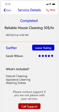
It was apparent that many of the users were struggling with the task of leaving a rating for the Swifter. The test notification that was meant to guide them to the rating page was not noticeable enough, causing a great deal of confusion and frustration among the users. To address this issue, I decided to create a service summary page that would appear for a customer once a service had been completed. The purpose of this page is to provide customers with a summary of the completed service, and to give them the option to rate the Swifter and call support if needed. The rating and call support buttons are placed prominently on this page, making them more noticeable and easier to access.
3. Confusion on what a Swifter is.
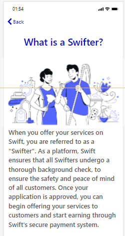
Many users appeared to be unsure of the role of a Swifter and how they fit into Swift. To address this, I decided to create a more engaging and visually appealing introduction to what a Swifter is and how they contribute to the app's purpose. While a brief explanation was provided on the Swifter registration form, it did not seem to capture the users' attention or fully convey the value of being a Swifter. A more eye-catching and interactive introduction would help users better understand the significance of their role and enhance their experience of becoming a Swifter.
4. Issues with the flow of completing service tasks
Users encountered issues with updating the cost and attaching photos. A potential solution is to walk the user through these steps more clearly. To do this I would create a page before the customer sign off page that is dedicated to giving the Swifter a chance to update the cost and attach photos. Then they can move onto the step of getting the customer's signature. I also decided to add illustrations to add visual appeal and help draw attention to the task that the Swifter needs to complete.
Final Reflection
During my experience doing user testing, I encountered various challenges and gained valuable insights into the design and usability of the app. One of the challenges was the limitations of the prototype, which resulted in delays and confusion for users. I also learned that users were more likely to rely on prompts within the app rather than thoroughly reading the use cases, which was both helpful in identifying potential issues and led to missed tasks. I also discovered that users desired more instructions within the app but did not want to spend significant time reading lengthy explanations. To address this, I incorporated illustrations into the app to provide visual cues and streamline the user experience. The testing session with a pair users was particularly insightful, as they were comfortable sharing their thoughts and helping each other through the tasks, leading to more feedback and ideas. Despite the challenges posed by the prototype limitations, users expressed enthusiasm for the app's purpose, and I believe that a fully functioning app may have helped resolve some of the issues. Overall, my experience doing user testing was informative and allowed me to improve the design and functionality of the app.