Rendezvous
Craft Legendary Journeys. Forge Unparalleled Memories. Uncover Rendezvous Now!
Team Members


Problem
When planning for a vacation/trip a hotel has to be booked, flights, rental cars, activities and usually they’re booked on different websites. This then creates the issue of the information for all of these separate but very important things being disorganized and all over the place. Rendezvous aims to fix that problem by creating a streamlined application that allows a user to either import all of their travel itinerary details or add in details manually. Rendezvous then gives the user a “one stop shop” of sorts to access all of their travel itinerary details.
Early Design
We wanted to first and foremost confirm that there was a problem to be solved before we put in the effort of designing a solution. So because of that the primary focus of our early design research was to figure out exactly what problems people had with traditional itinerary building/travel management apps. We then wanted to know what sorts of solutions people were looking for, whether it was an easier to use interface, more transparent travel information displays, etc.
Early Questions
After conducting our initial research into the software we wanted to create and the users we were looking for we settled on a few questions that we would seek answers to.
1. What are the main problems users have with current/traditional travel/itinerary management apps?
2. What information are users finding most important when traveling?
3. How comfortable are users at planning their own itineraries and keeping all of the information organized?
Methods for Gathering Feedback
To gather feedback for the early development of our product we conducted a series of in-person interviews as well as an anonymous questionnaire sent out mostly to employees of varying ages at TrailWest Bank.
For the Interviews, we asked specific questions that would help us gather detailed information about our users. Such as how our users plan their travel itineraries, what they dislike about other travel planning apps, what challenges they've faced, and if they were traveling in groups.
For the Questionnaire, we asked more general questions that allowed us to learn more basic information about our users. Such as how often our users travel, how difficult they find it to keep travel information together, and how comfortable they are with traveling and planning. We also asked about whether they faced challenges while traveling, and if a one-stop shop of sorts would be helpful for group travel.
Key Insights
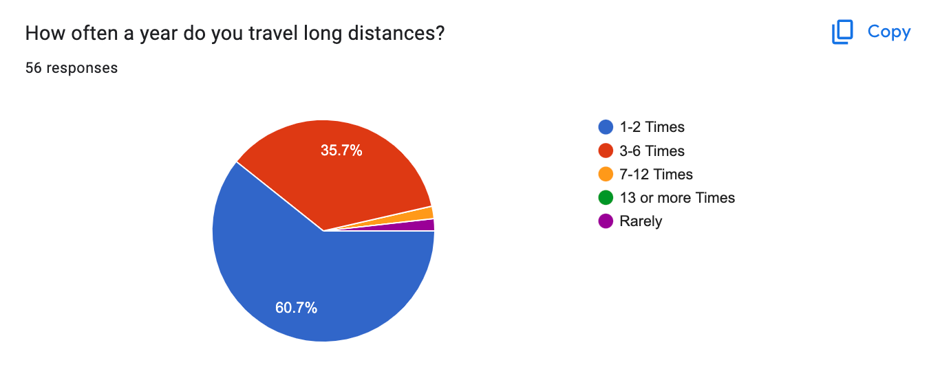
1. Majority of people travel less than half a dozen times per year.
Most people that we interviewed/took the questionnaire travel 1-6 times a year (96.4% of all questionnaire responses) we believe this would translate well to a wide-scale questionnaire being asked all over the country.
The fact the majority of potential users of our product don't travel very often means they wouldn't be interacting with our interface on a consistent basis. Because of this, our users wouldn't be able to develop a deep familiarity and understanding of our interface. Essentially users would come back to our app and not remember each and every detail of the interface. This made us realize we needed to make creating a simple and easy-to-use interface a main priority.
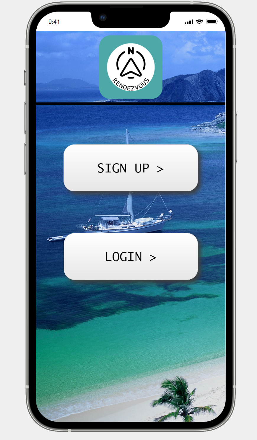
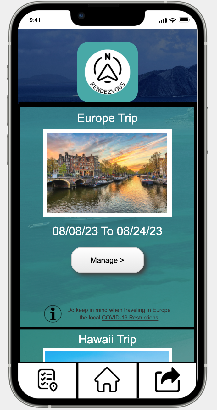
So we created an interface that was simple to understand (Shown in the image above and below) so even if users only used our product a maximum of 6 times a year they would be able to return and use the interface.
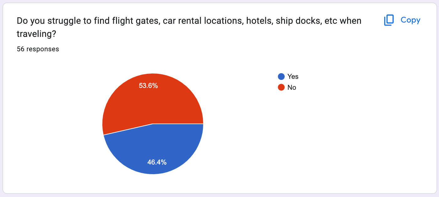
2. Majority of users experienced some sort of issue when traveling (i.e. delayed flights, getting lost, finding accommodations, etc.).
Surprisingly enough a slight majority of users in our questionnaire stated that they did NOT struggle to find gates, car rental locations, hotels, etc. This was interesting to us, in the early design phase we had considered adding an airport map feature, that would allow the user to view a map of whatever airport they were in. But after the interviews and the questionnaire, this decision became harder because it was so split on whether users had issues locating their flight gates while they are traveling. After some back and forth and more research, we came to the conclusion that we did not need an airport map feature. Airports nowadays are designed to be easy to navigate, as well as other apps such as Google Maps or Apple Maps making it incredibly easy to look at your phone and find gates.
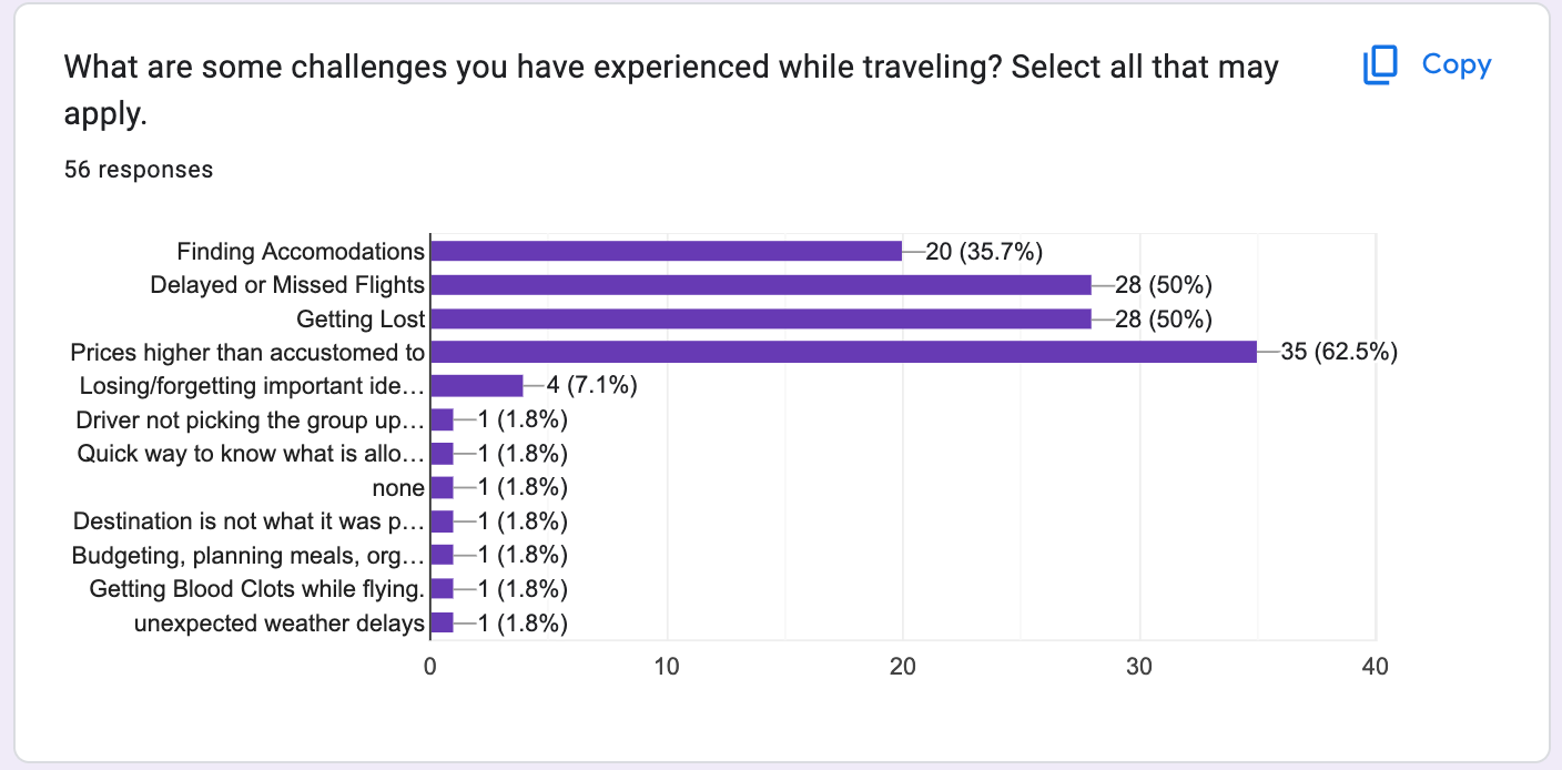
We then asked the user if they had experienced other issues when traveling including getting lost and this is when the results changed. The majority of users experienced an issue while traveling these included; not finding accommodations, delayed or missed flights, prices being too high, as well as getting lost. It was clear to us that the majority of users were having some sort of major problem every time they traveled. There was a problem to be solved when it came to travel and how the information was organized.
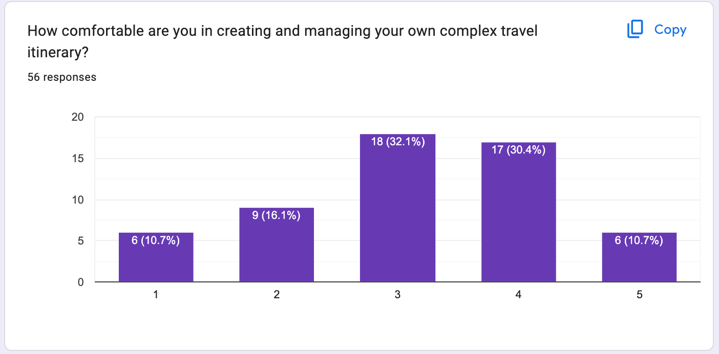
3. Whether or not users found it difficult to keep travel information organized.
When it came to how users felt when it came to their ability to keep travel information organized it was a bit of a mixed bag. On one hand, we asked a simple "yes" or "no" do you find it challenging to keep travel information organized? And in this case, a small majority of users said yes (55.4%).
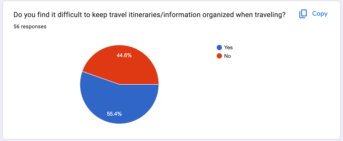
But then again when we asked how comfortable (on a scale from 1-5) are you managing a complex itinerary a majority said 3 or higher (41 out of 56 responses). This gave us the insight that a lot of users were able to book their own trips fairly easily but actually managing all the information and making sense of it was a different story
Storyboard
These sketches below ended up being the building blocks to our final product. We had several ideas within these skethches that ended up being scrapped or modified. Overall though the heart and soul of our application is displayed in these sketches.
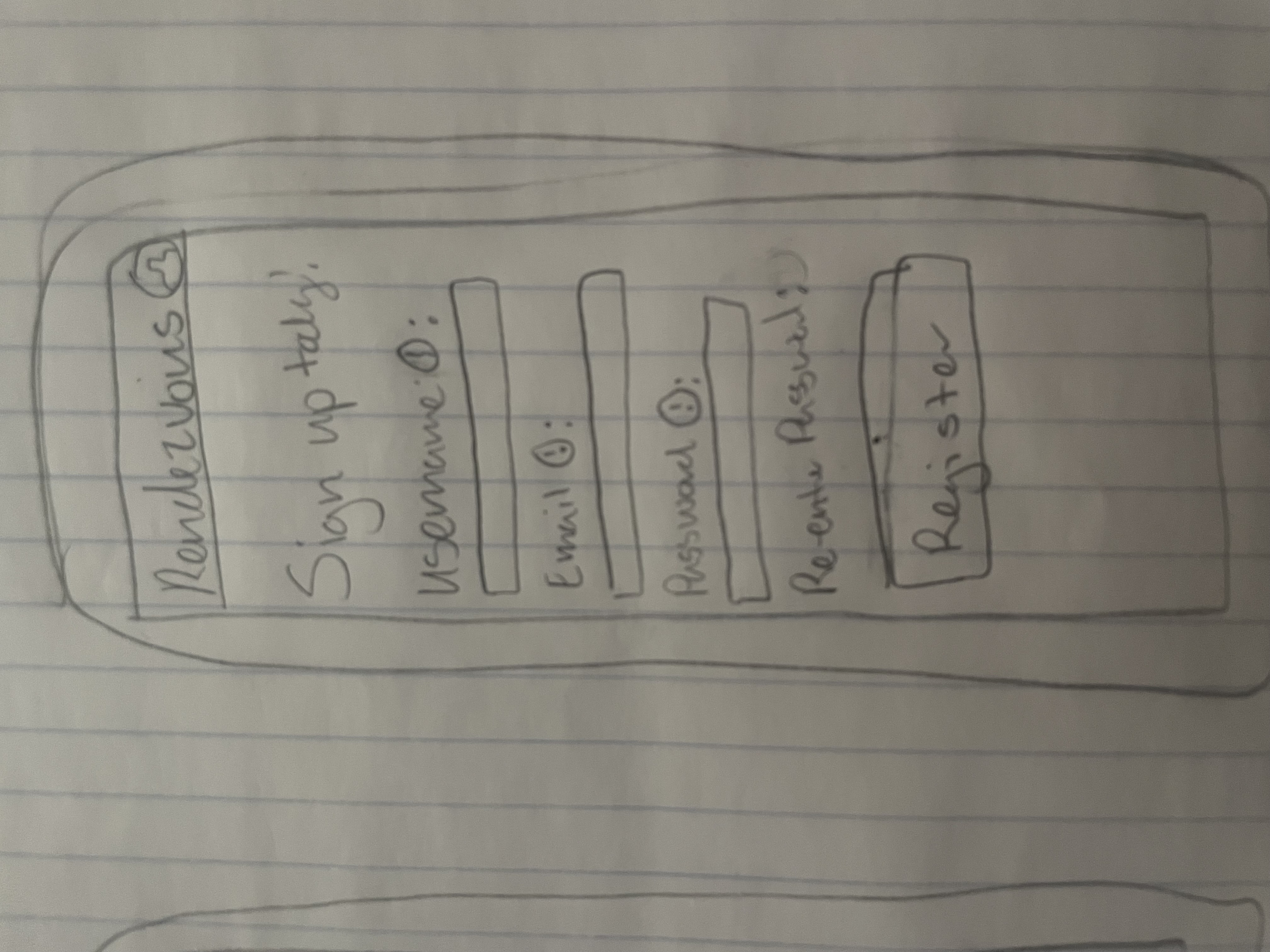
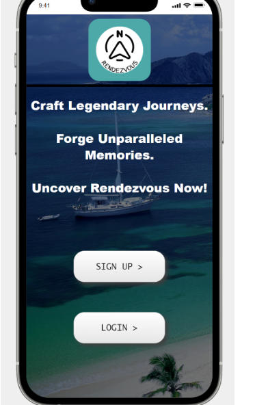
Our initial design for the signup page was incredibly simple. This is what we were aiming for in the overall design yet we needed to have some sort of flare to make us memorable. So we decided on a background image and other effects on the text and buttons. This made our user interface much more enjoable to look at and navigate.
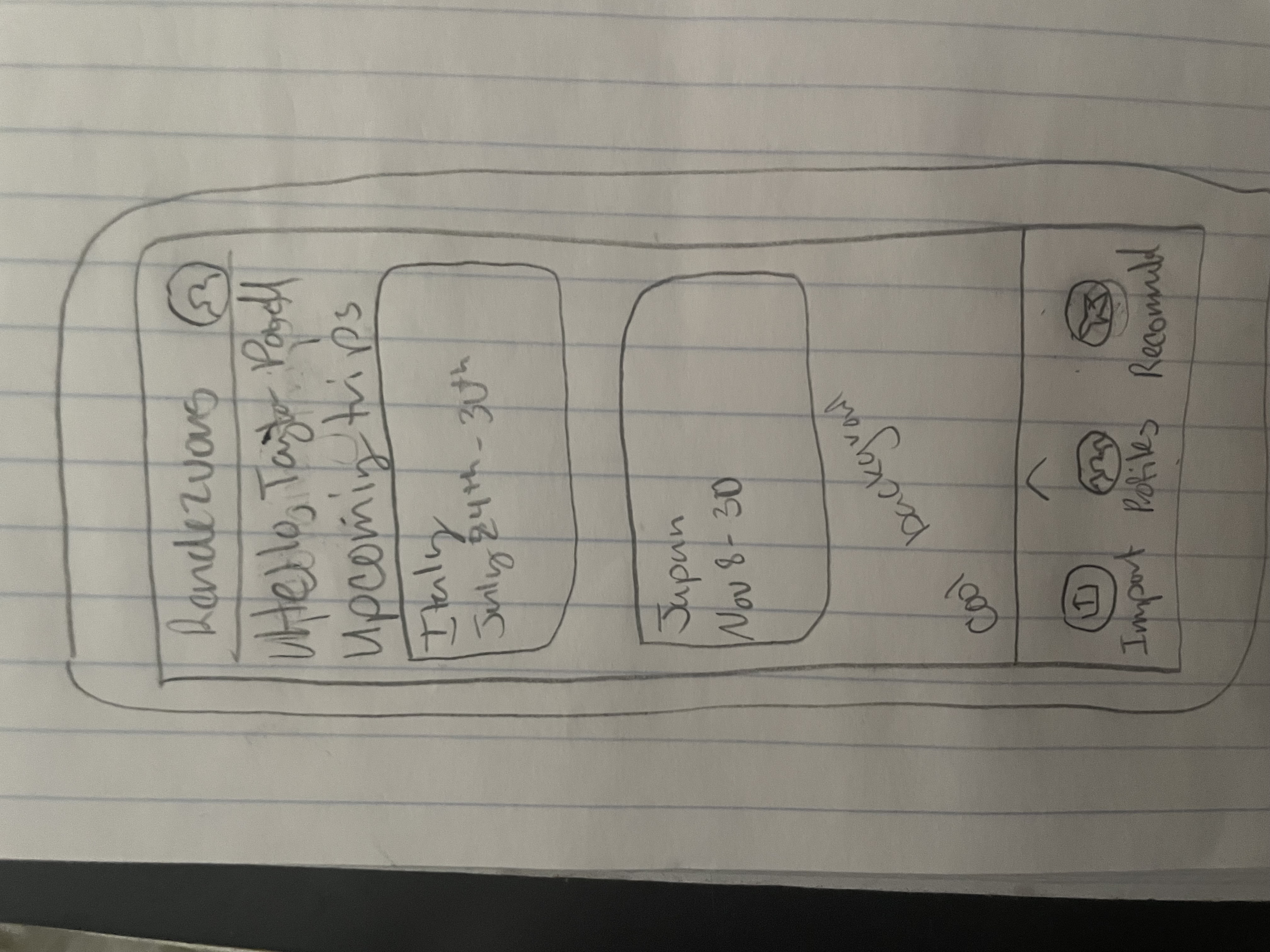
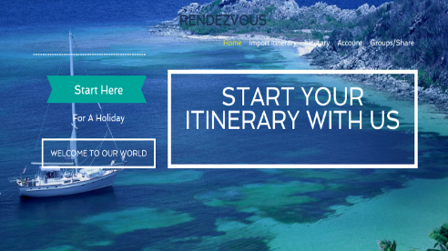
Our initial design for the home page was again very simple, this was the style we wanted. Except unlike our inital design for the signup page, our implemented design ended up being very similar to the storyboard above. We liked the idea of tiles for each individual itinerary, as well as the "cool pic" for a background. Which we later carried that idea onto every page.
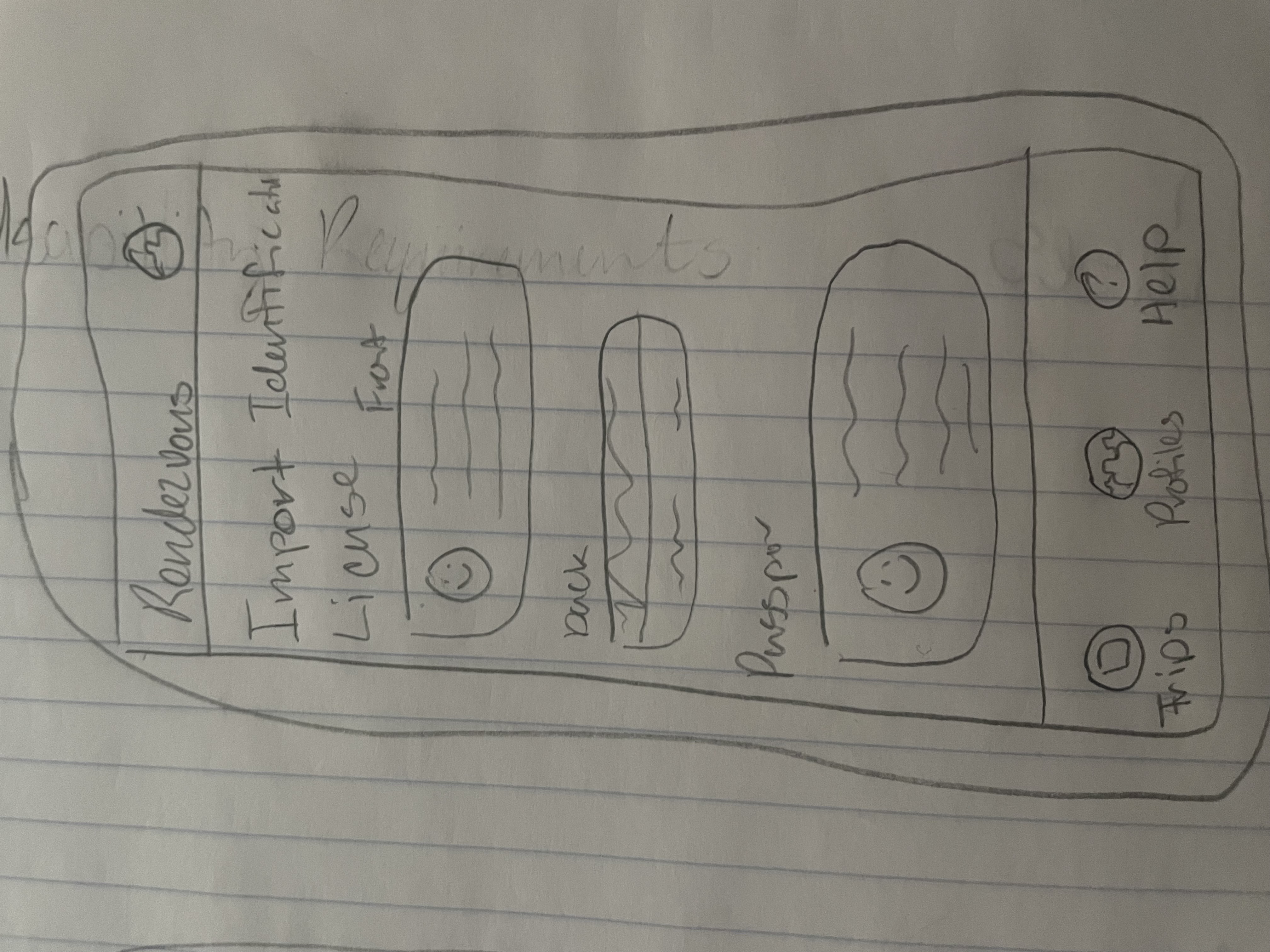
This storyboard idea ended up being scrapped due to limitations on time for development, and limited applications. The idea was to have a screen with the function for the user to upload images of different types of IDs to be used (i.e. Drivers License, Passport, Certifications, etc). The above screen would also then display the IDs the user had uploaded, they would then be able to present them to whomever needed them. Another problem we saw with this idea was a lot of times where a user needs to present identification they need the physical ID.
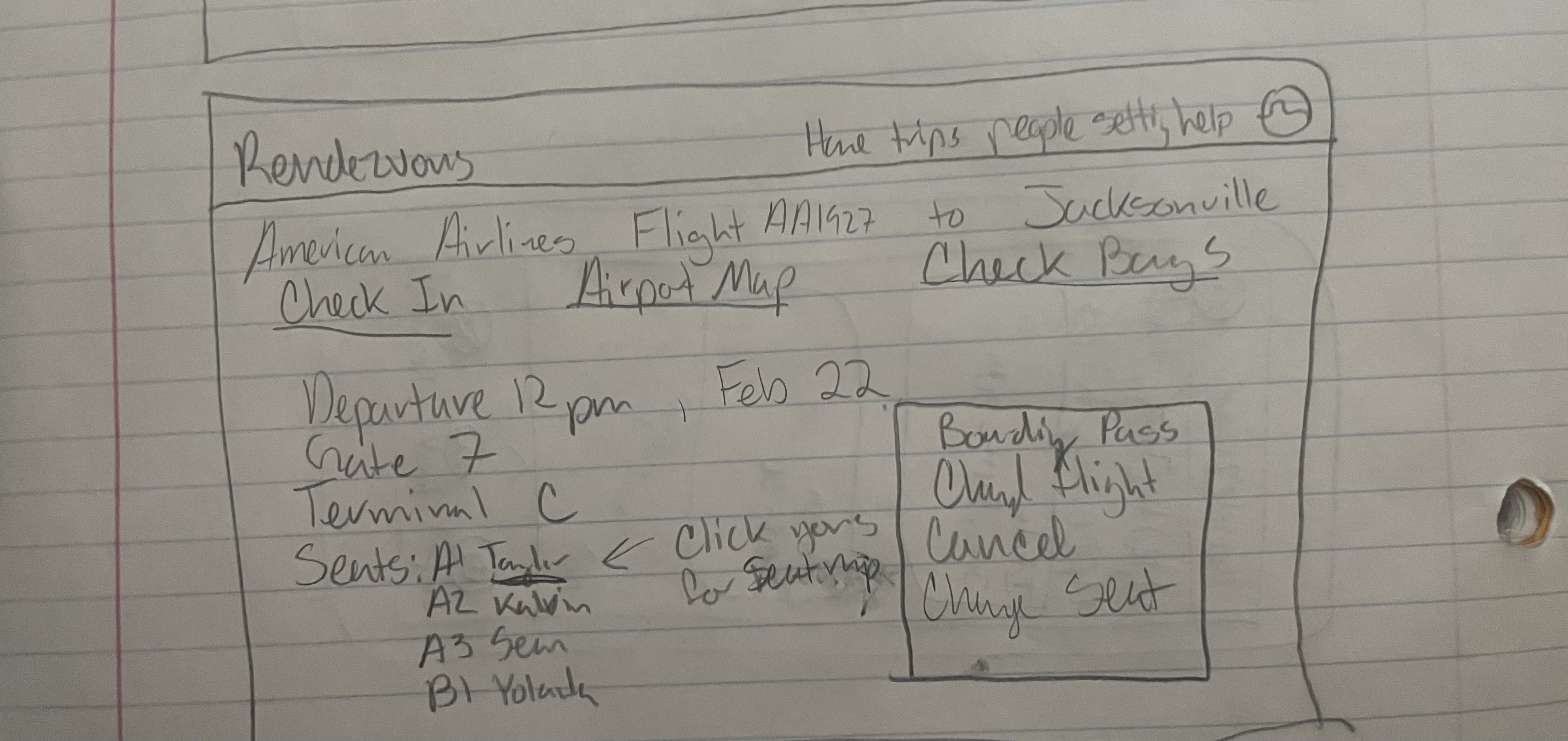
This storyboard idea has changed since its conception. Due to limitations on time for development and limited applications, we have now made the individual details a lot more simplified. The idea was to have the ability to check in, check bags, view maps, etc. but now we have changed the details pages to the key information. We have still mantained the ability to click a Manage link to go to the third party website to access and edit the reservation.
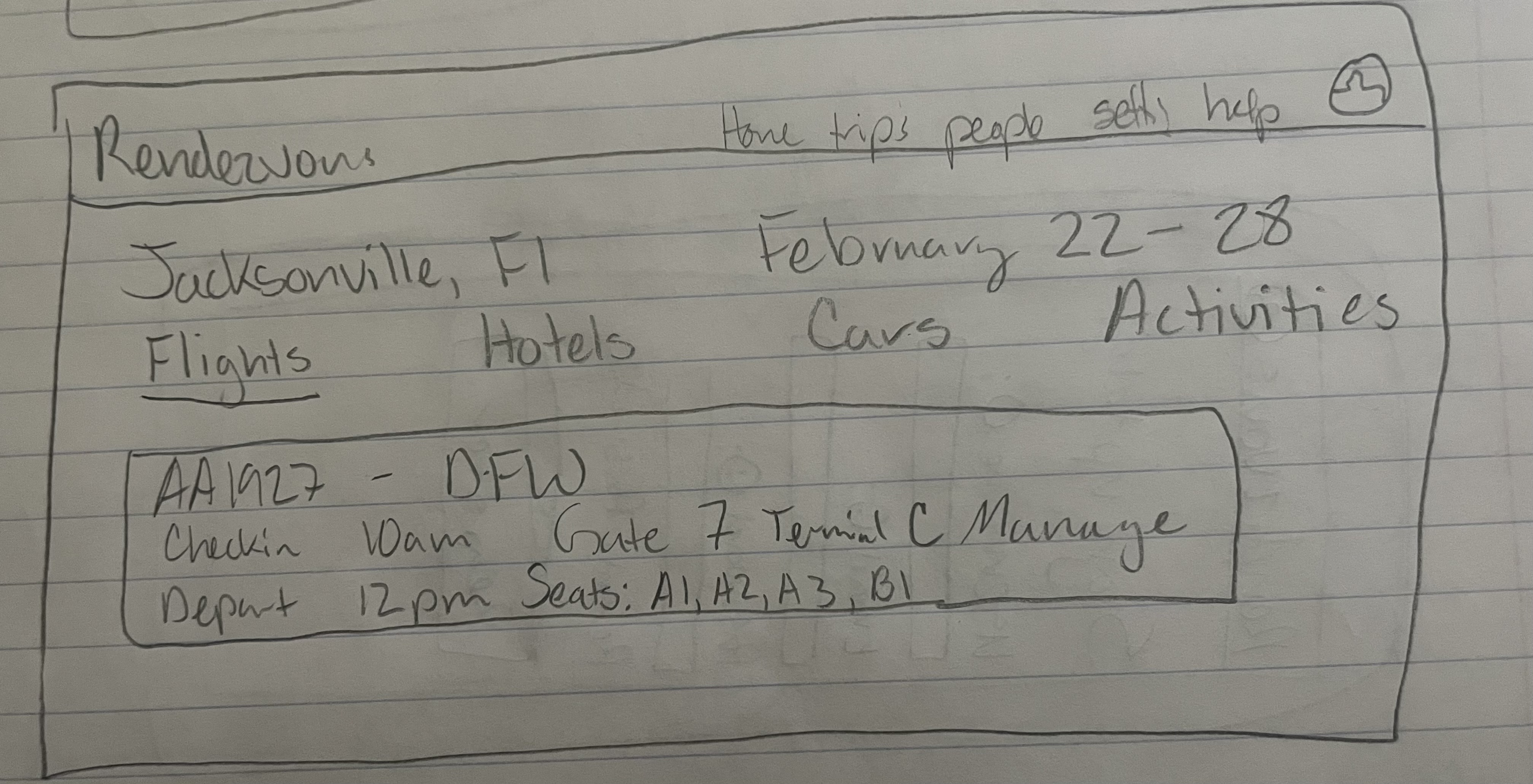
This storyboard idea ended up being changed and is no longer clickable tabs but a listed page. Clicking on the tabs would show each details for the flights, hotels, cars, etc. and be able to click to go to the details page for it. It would show all key information, and going to the more specific detail page would show other information, but we had scrapped that to limit the amount of page changing and to keep things on a singular page without traveling to another one.
This storyboard idea was the web-based style for our homepage. We ended up deciding to only pursue mobile-based styles and scrapped this in its entirety, but kept some aspects, like the tiles for each itinerary. We have removed the Drafts, Past, etc. for development time to flush out the bigger key details of Rendezvous. We also removed the search bar/acting as a business managing itineraries since this was just out of the scope of Rendezvous. However, the cool image and the tiled itineraries are still present in our mobile design today.
Design Crits
Throughout our iterative design process we gathered much needed and valuable feeback from fellow students, instructors, as well as potential users. We ended up making drastic changes to our overall design as we transitioned from low-fidelity prototype to high-fidelity. Below we've listed out some of the most important changes we made.
- We realized that not overwhelming the user with options was important so our interface was simplified with more concise options
- We needed to give the user more feedback when they interacted with something in the interface (i.e. success messages)
- We created a more contrasting interface to make it easier to read. Contrast between text and background images for easier readability
We received feedback from all parties that tested our low fidelity prototype, stating that a lot of our text was difficult to read due to the lack of contrast. This was visibility and error prevention issue that had a high severity rating to us. You can see in the two images above, the before (Left Image) and the after (Right Image). Before the contrast changes were made the text is hard to distinguish from the background with the white text nearly blending into the sailboat in the background image. After some changes were made such as darkening the background image, bolding the text, and making more clear buttons with drop shadows the overall readability of the UI increased dramatically.
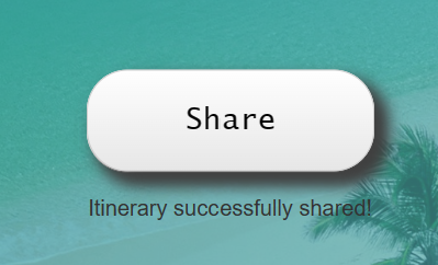
We received a lot of feedback from test users stating that it was difficult to tell if they had interacted with something in the interface. the only form of feedback they got was if the page redirected, if it didn't they weren't sure if they had properly tapped something. This was a flexibility and ease of use problem that needed to be solved, so we added success messages (Image on the right) to show the user if they interacted with something correctly. In the case of the image above the user has just hit the share button and it pops up a confirmation message stating "Itinerary Successfully Shared!".
Recieving a lot of feedback about a confusing interface was very common place when it came to our low-fideltiy and early designed product. We took this feedback and essentially rebuilt the entire interface and how the user interacts with it. Originally in our early design phase and low fidelity prototype we had both a mobile interface and a web browser interface (Left Image). With so much feedback geared towards a confusing interface we decided that we needed to focus on one or the other so that the user experience would benefit. We chose to focus on the mobile interface (Right Image), due to that fact when people are travelling they will most likely be on the move and would much rather glance at their phone than get out their laptop.


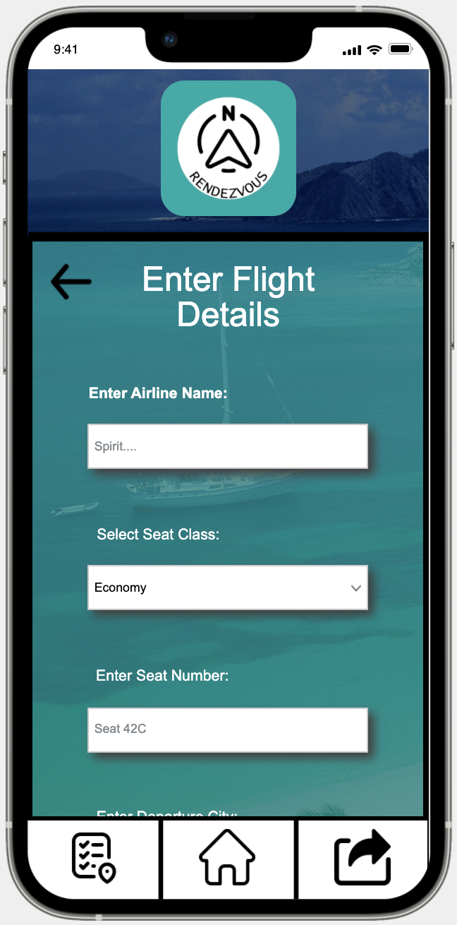
Continuing with the simplifying the user interface topic the two images above show the most recent iteration of Rendezvous on two specific screens. The right image is our simplified input fields, in this ones case it is entering flight details manually. The left image is our simplified home screen, with two itineraries on it. We decided to scrap that slideshow idea due to limitations in implementation, we instead went for the single image of the respective destination of the itinerary. We also created a clear button labeled "manage" that would indicate to users that this is where you make changes to this specific itinerary.
High-fidelity Prototype
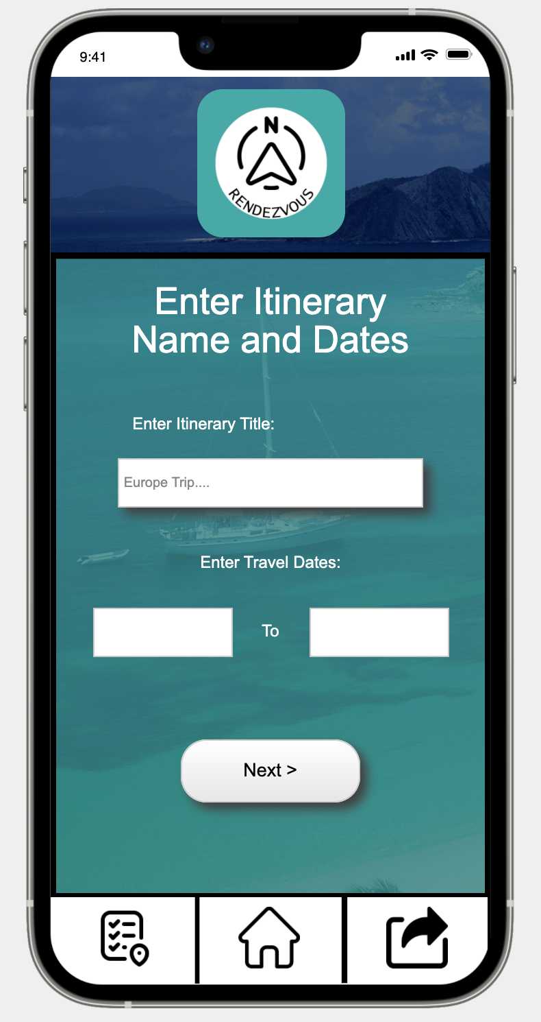

If you were to start up Rendezvous and were already signed in it would take you to the (Left Image) where you could then choose whether you wanted to import itinerary info or manually create an itinerary. In this scenario we will say that you choose "Manual Itinerary Creation". After we've pressed this button, you are redirected to the page shown in the (Right Image) on this page you will be presented with the options to "Enter Itinerary Title" and "Enter Travel Dates". You would put appropriate information into these input fields and continue.

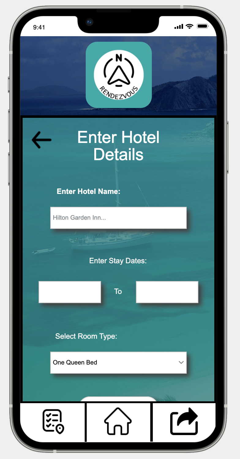
After selecting "Next" on the previous page you would be redirected to the "Enter Flight Details Page" (Left Image). You would then enter the appropriate information into the input fields Airline name, seat class, seat number, etc. (Not all input fields pictured). After entering all appropriate information, you would hit "Next" (Not Pictured) this would then redirect you to the page pictured in the (Right Image) . You do also have the option of skipping any of these input pages and not entering anything at all, in the scenario that you do not have a flight, hotel, etc. For the scenario we are describing and showcasing we will be entering information in the input fields. After hitting "Next" on the flight details screen you then are redirected to the screen shown in the (Right Image). You would then continue to enter or skip depending on your itinerary on the future input screens car rental, and activities (Not Pictured).
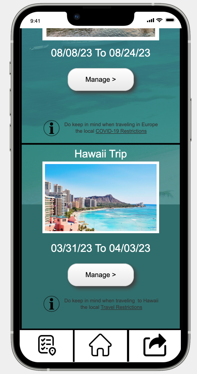
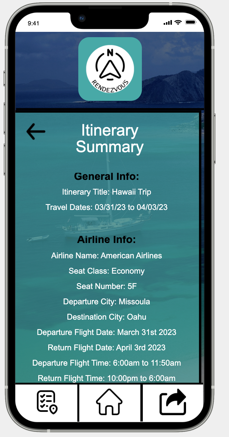
After completing your manual itinerary creation, you will be redirected to the screen shown in the (Left Image) which if you scroll down, it will show all the information you just entered in previous screens. You then are able to review all the information you entered to make sure it is correct, if you discover an error, you are able to go back to the previous screens and correct it. After confirming that all information you entered was correct you select "Done" (Not Pictured) and it will redirect you to the Homepage (Right Image). From there you can see your upcoming trips and what dates they are on; you are also able to see the details of these itineraries by either tapping on the image associated with the itinerary or tapping "Manage". In this case we will tap "Manage".
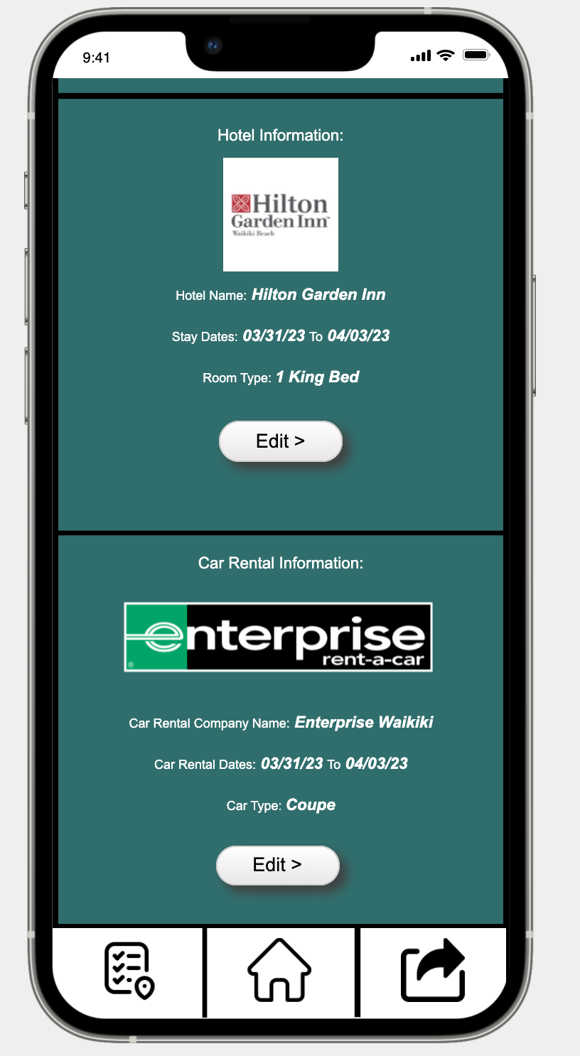
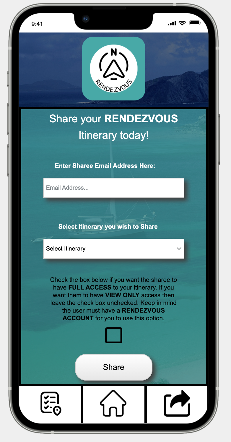
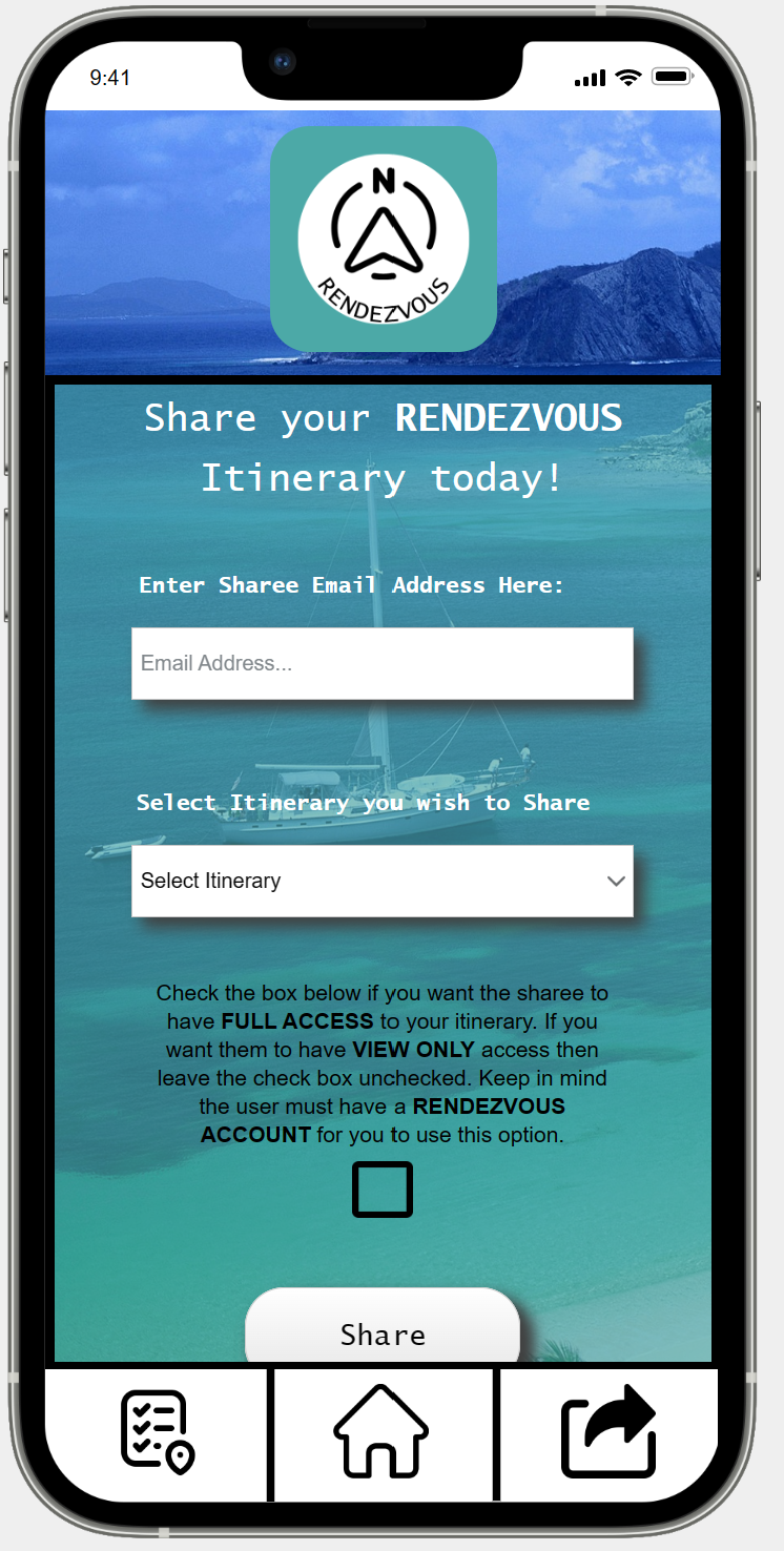
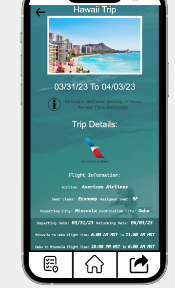
After tapping "Manage" on the previous page you are redirected to the screen pictured in the (Left Image), all your itinerary details are showcased on this page for easy viewing. You are also able to tap "Edit" in any of the sections separated by black bars and change the details of that particular section. In doing this you would be redirected to a page very similar to one of the details screens (Pictured Above) where you can enter your new information and update your itinerary with the new information. You are at this point able to easily and successfully manage or view your travel plans. But you are also given another option in Rendezvous, you are able to share your itineraries with other Rendezvous users as well as users without a Rendezvous account. You are able to do this by selecting the "Share" button in the bottom right of any screen in Rendezvous. This will then redirect you to the screen shown in the (Right Image). From there you can enter the email address of another Rendezvous user, select which of your itineraries you would like to share, as well as choose if they have full access to change and collaborate on your itinerary or just view it. If the person you wish to share your itinerary with does not have a Rendezvous account, you can either get them to sign up for an account first (Best Option) or simply enter their phone number on this same screen (Not Pictured) and it will text the itinerary details to them.
User Testing
Our main goal with user testing was to uncover issues with Rendezvous's UI navigation intuitiveness. In short we wanted to see if users who had never seen this UI could navigate through it easily and with little (hopefully) no guidance. We performanded the tests in a controlled environment with little to no distractions from the outside world. We used a rented conference space in the University library. We had a total of 6 particiapants, 5 tests 4 individual and one duo. In the conference space we had a laptop that the users would interact with Rendezvous's interface on. We recorded their screen so we could see what they were clicking on and relatively what task they were on in our scenarios. We also timed how long it took them to finish each scenario as well as the overall time it took for them to finish all 3 scenarios.
Key Insights
1. Users not understanding how to operate the JustInMind emulator
We had multiple instances of the emulator the users were interacting with not functioning. But every user at the beginning of the test would struggle to understand how to use the emulator. They wouldn’t know how to scroll, and when they had to input data they were confused by the keyboard popping up since the emulator is emulating the app on a phone. Even for the users who caught onto the controls quickly the emulator itself would bug out and not allow them to click on certain buttons. This would require us to step in and reload the page and affirm the user they are doing nothing wrong. A potential re-design to fix this issue is one get the ability to move the testing onto the phone emulator which would most likely fix any control issues. We would also go back through each page and make sure that none of the layers are incorrect. This would cause buttons to be behind certain screen elements, therefore, making them unlickable. We would also include a tutorial when first opening the app explaining that for most pages you will need to scroll down to see all relevant information. Or something that would be more difficult to implement would be after the user enters information in an input field it would auto move them down to the next input field.
2. Users misunderstanding what certain buttons do and when to click them
We had many instances where users were working through the tasks lists and were confused about what buttons to hit. An example of this would be when they were told “You have no planned activities” during the scenario where they are setting up an itinerary. Users would be confused about whether or not to hit “Next” or “Skip” since they had no information to enter. Another example was when they were told to go to the itinerary page. To navigate to this page they had to hit the button in the bottom left on the menu bar. It is simply an icon and not labeled with the word “Itinerary” This caused confusion since most users did not think the icon we chose clearly showed it was an itinerary. A potential re-design for the issue of users not knowing which buttons to click would simply be to re-label them differently so that they understand it more. For example, when users are wanting to not add information to an itinerary in the case of skipping the activities section in scenarios 1&2 it would make more sense if the “Next” button was changed to “Add”. This would insinuate to the user that they are adding this information to their Itinerary. Therefore the “skip” button would make more sense in the grand scheme of things.
3. Users confused on what format certain data needed to be inputted
We had multiple instances of users being confused about certain input fields during the manual itinerary creation scenario. Specifically, the flight times sections where they were tasked with inputting the outgoing flight times and the return flight times. Users would not understand the wording and would end up putting the departure time in the first input field and the arrival time in the second field. Instead of putting the departure and arrival time for the first flight in the first input field. A potential and suggested re-design of users being confused on what format to enter data would be to add captions below each input field that stated what format to enter the data in. We also had the issue of the flight times being confusing, a way to fix this would be to change the input fields to look more like the itinerary dates field. There would be two sections one section that said “Departure to Destination Flight Times” and then below that would be two boxes one labeled departure Time and another next to it labeled arrival time. This is where the user would enter the time their flight leaves and arrives when they are going to their destination. Then below those would be a section nearly identical except labeled “Return Home Flight: Times”.
Final Reflection
This entire design process has been a wild ride for both of us. We've learned a lot about the whole design process from start to finish, from storyboarding to user testing. We both realize how much of a logistical nightmare user testing can be and how revealing it really is when it comes to the validity of a project. Test users will tear apart an application that a lot of time was invested in. We learned this quickly with Rendezvous and found its shortcomings as an overall usable product. Overall, though we enjoyed the whole process and learned a lot about software design development, it is a very enjoyable process and we both believe that the skills we learned throughout this semester will be useful in our future careers. We are also very glad this semester is over and feel accomplished in what we were able to build and present.