
Pocket Pantry
Pocket Pantry is the concept of maintaining an inventory of ingredients that you keep in your house and seeing what delicious dishes you could potentially make from what you have.
Team Members


Problem
Maintaining an active inventory of your pantry that you can create and update every day with the assistance of grocery list creation is the aim of the Pocket Pantry. This will provide the users with the ability to browse and find amazing recipes, with the assistance of the Pocket Pantry's recommendations, from what is currently on the ingredient lists of their pantries. However, the ability to maintain, update, and observe the current stock of food in your own house with minimal effort, is the ongoing and long-lasting goal of the Pocket Pantry.
Early Design
The primary focus of our early design research revolved around gathering user feedback on what appeals to different users in a cookbook application, and what could be implemented into our application based on our scope. We gathered a lot of useful feedback from users and had to trim a lot down to fit the scope of our project which can be summarized in a few short words: simple, but productive. Some initial questions we asked ourselves were: what functionalities did our user’s want to see? Which design patterns fit our user best? How can we simplify our application to make it user friendly? Will our prototype accomplish more than a regular cookbook and other applications currently on the market? We handed out questionnaires and conducted formal & informal interviews to gather a lot of helpful feedback on what to implement in our prototype. All methods we used in the end greatly enhanced and influenced our final product.
Key Insights
1. Simplicity is Key to Good Design
Our users wanted simple functions, but a lot of them. After gathering feedback, we found our users were frugal but complex in what they wanted out of a cookbook application. We as a group had to consult with ourselves to see which functionalities were the most important and which we could leave out to keep our scope in the bounds of possibility.
2. Balancing Functionality & Visual Appeal
Users wanted a visually appealing user interface. Users like visually appealing design and that especially rings true with digital applications. Our initial feedback on our hand-drawn designs were mostly how visually unappealing they were. We from then on made it a priority to create a more visually appealing application.
3. Familiarity & Intuitive Mapping is Important
Most of our users liked things that are familiar. We found that our initial feedback included a lot of suggestions to include familiar design patterns we see in other applications. From scrollable views to hamburger icons, our early users wanted things that were familiar to them already.
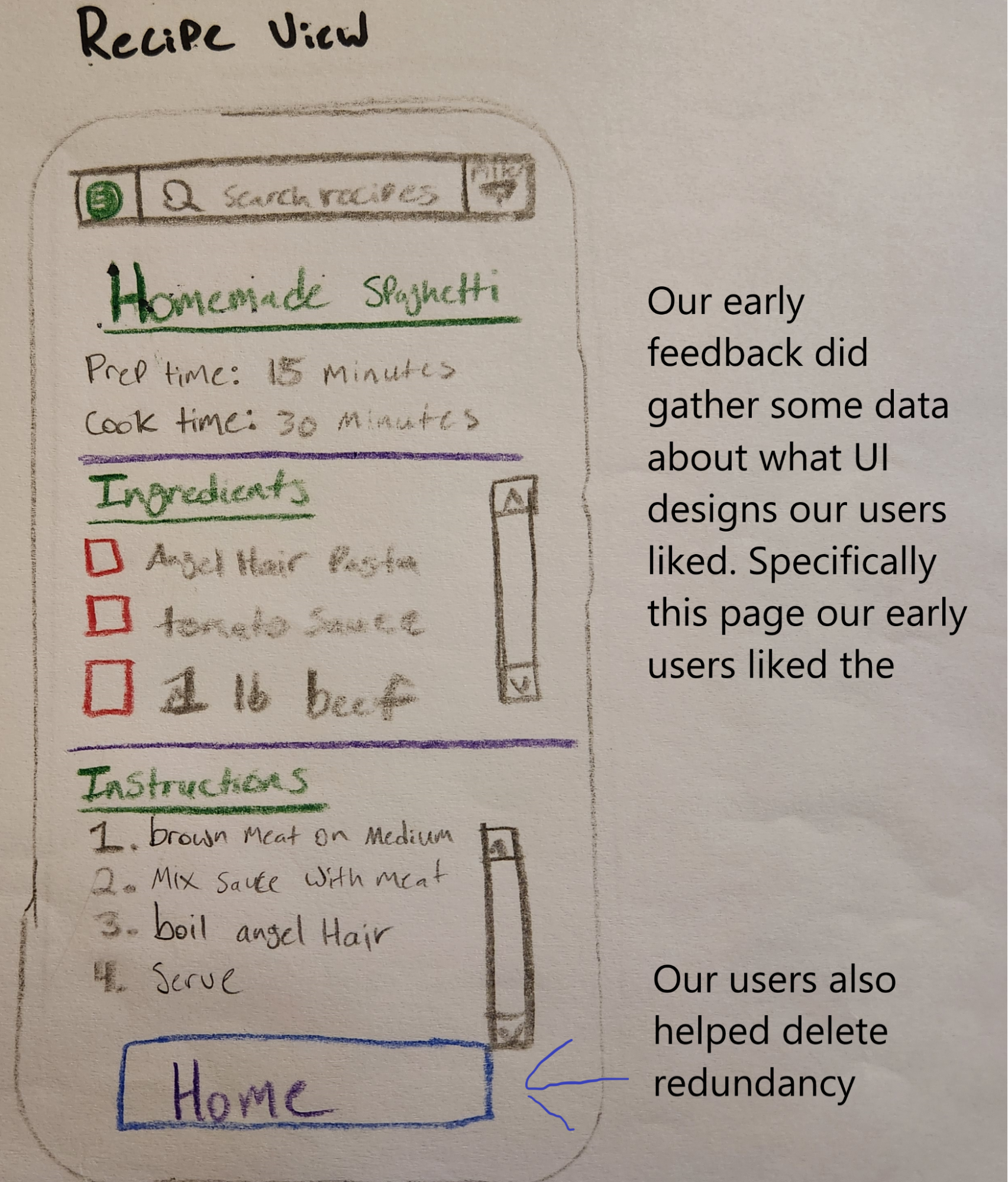
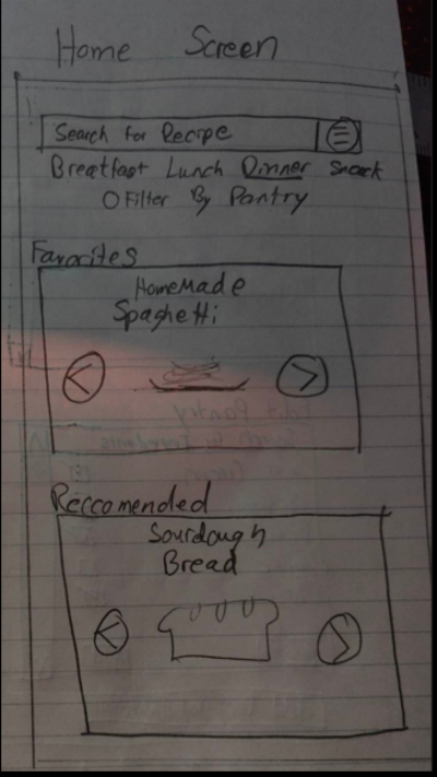
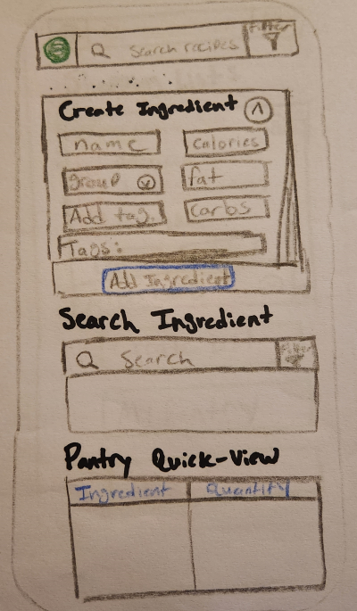
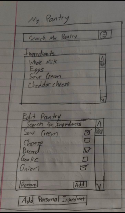
This can be demonstrated by our view recipe screen of our initial app sketches below:
Storyboard
We started off with a rough paper prototype of our idea. Below is an illustration of some of the initial ideas we sketched out along with brief annotations of what is represented in each screen
Shopping List / Home / Ingredient View
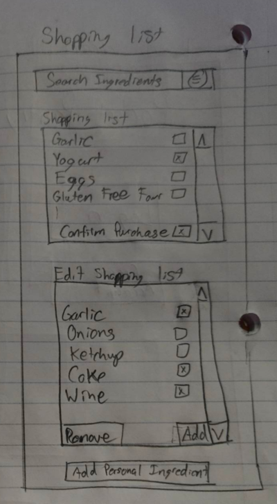
- We designed a shopping list page to represent a shopping list our users can add and delete common grocery list items.
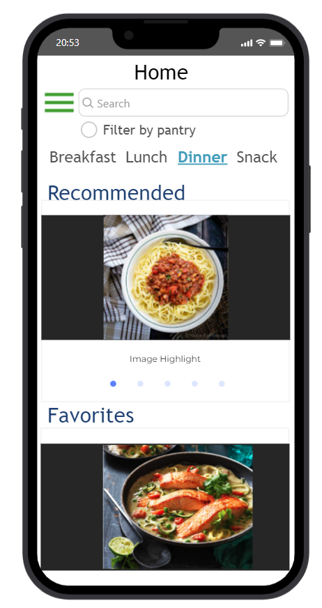
- Using familiar design patterns found in other phone applications, we also prototyped a simple and easy to user home page for our users
- We prototyped and got feedback on an ingredient page so our users could view certain ingredients.
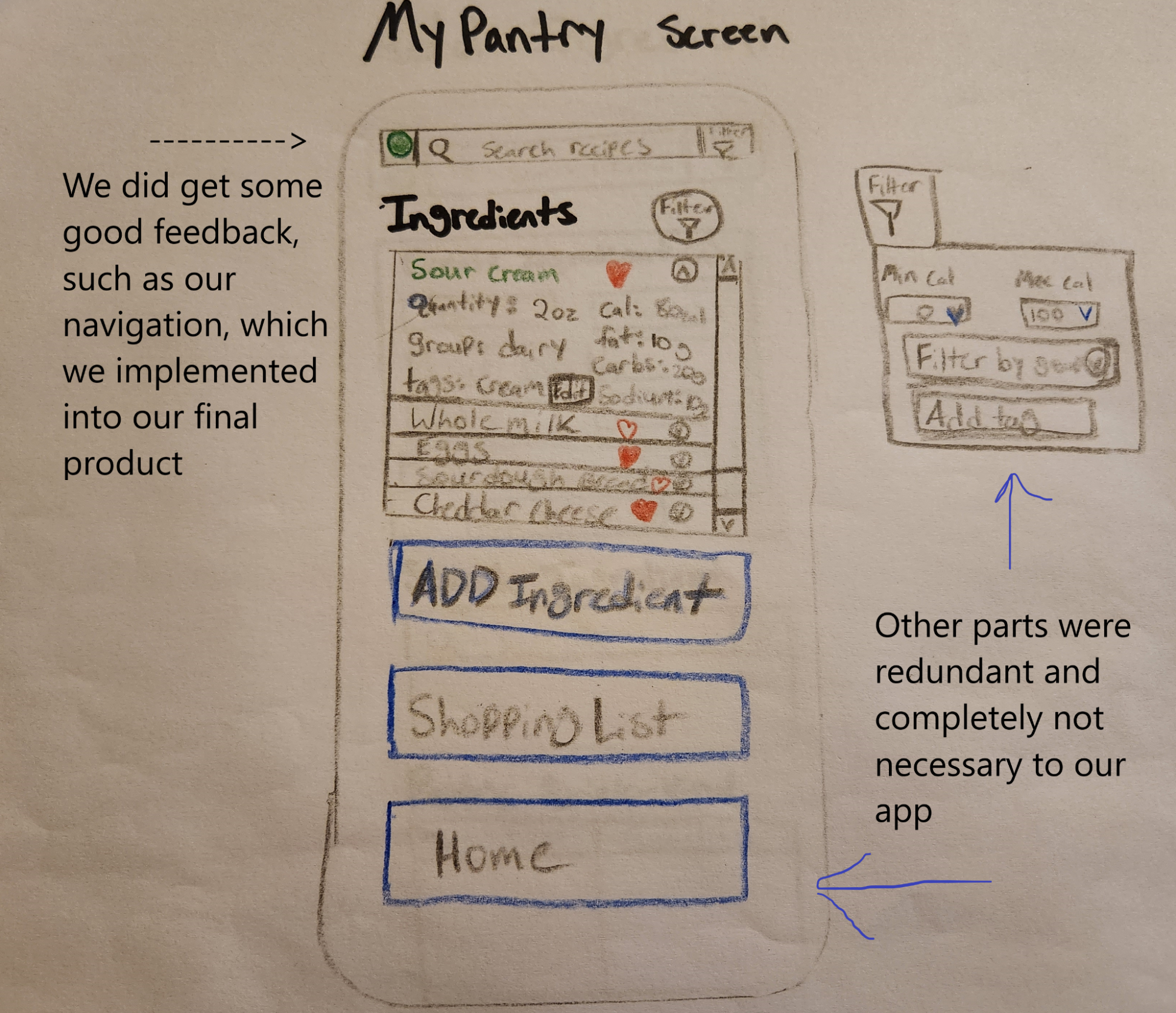
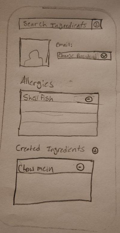
Recipe / Pantry / Login / Profile
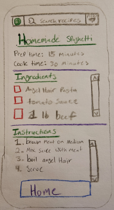
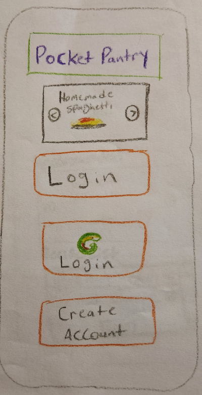
- We designed a simple recipe page our users can easily view a certain recipe
- We designed a shopping list page to represent our users home pantry, with the ability to add ingredients or add custom ingredients our users can create
- We initially designed a login page we thought would be simple and easy for our users with minimal buttons
- We prototyped a profile page so our users could add some personalization such as custom ingredients and allergies
Design Crits
Our iterative design process required that we gather user feedback early and often throughout the design cycle. Using our low-fidelity prototypes, we engaged in a number of design critiques (crits) with other students, outside stakeholders relevant to the application, as well as with the instructor. We also performed a heuristic evaluation by taking key points of user feedback and transforming it into an easy to read table as listed below
| Description | Severity | Revision | Heuristic Violation |
|---|---|---|---|
| Possibly sync app with phone number - email is too long | 1 | Login screen was changed to include email & phone login | Shortcut |
| Add a prior login page | 1 | Login was changed to include email & phone login | Speaks User Language |
| Ingredient Quantity | 1 | We decided this revision does not fit the scope of our app | Feedback |
| Instead of checkmark, use an indication that the item is in the pantry | 3 | Due to mixed feedback, we decided to keep the checkmark in place | Feedback |
| Remove item from pantry | 4 | We added a delete button to the pantry | Simple & Natural Dialogue |
| Import share shopping | 0 | We added a share button to the shopping list | Minimize user memory load |
The main insights we gathered from our design crits and prototype evaluations included a range of feedback pertaining to different important aspects to an appealing and easy to use application. Some crucial feedback was gathered around allowing shortcuts for our users and simple functionality flaws as simple as allowing an item to be deleted from the users pantry. Our early feedback also allowed us to realize the importance of consistent colors and themes throughout our application for a sleek and visually appealing look and feel. The feedback gathered affected changes to our designs in the following ways.
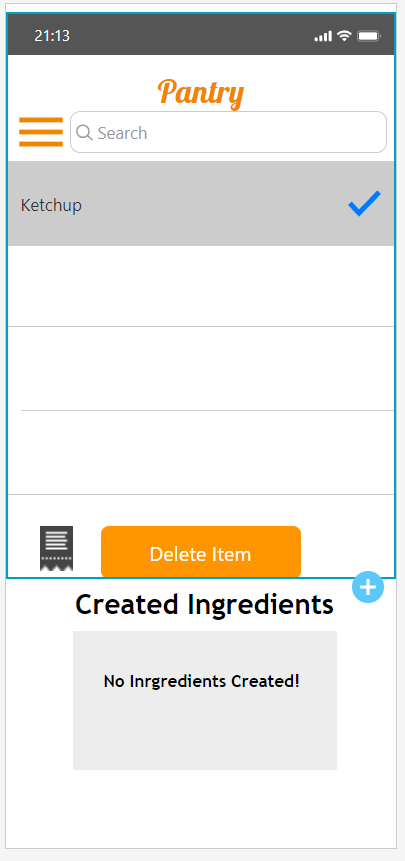
- Added functionality to our design by implementing a delete button to the pantry.
- Implemented a share button to the shopping list to allow users to share their shopping list with others
- Implemented a phone number login to allow easier use for our users.
- Added a consistent orange color theme throughout our application for a visually appealing look and feel
High-fidelity Prototype
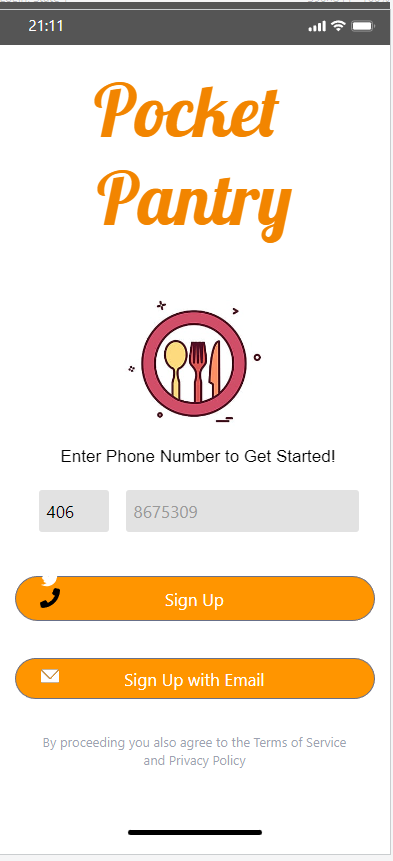
After gathering feedback and conducting a heuristic evaluation on our early prototype attempts, we kept our user feedback in mind as we created a high-fidelity prototype. We created our high-fidelity prototype using the online software proto.io which allowed us to model a user friendly design and add simple functionality to our evolving application. Using our new prototyping software, we were able to make crucial changes to our application from the feedback we had gathered thus far. The main changes we included were 1) Consistent color them throughout the application 2) Adding additional functionality such as a scan receipt, share recipe feature, and phone number login 3) Added additional search bar functionality
The screen shots provided below help detail a walkthrough of some of the main scenarios and tasks we will give different users for our user testing portion to gather more detailed feedback on our design.
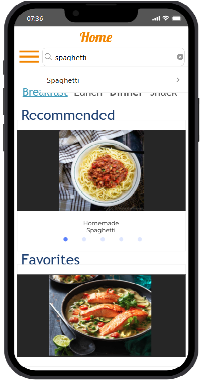
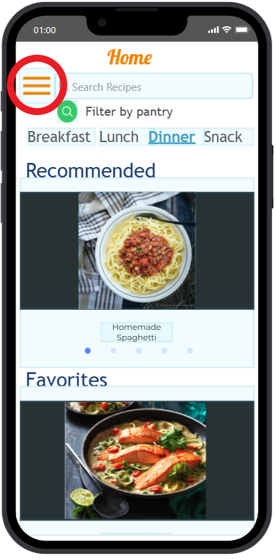
Scenario 1: Find something to eat for dinner
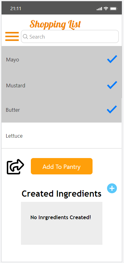
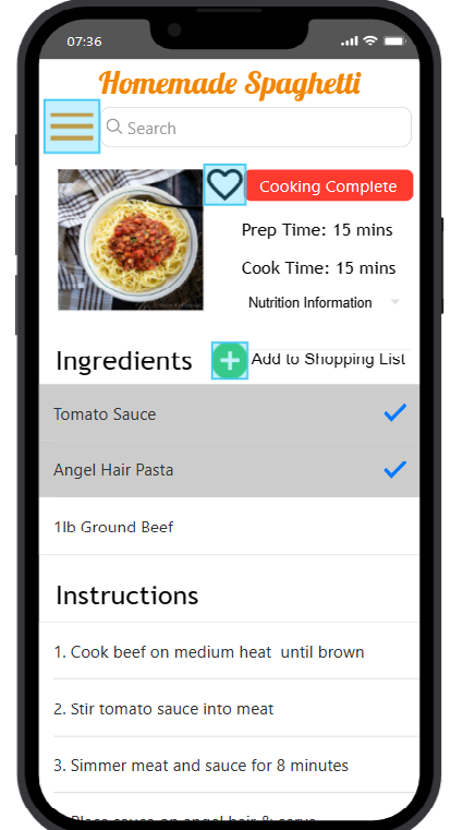
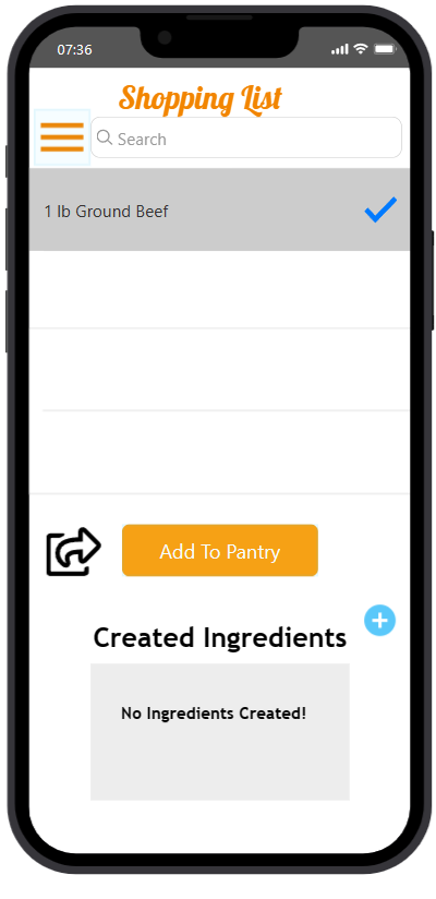
You have only used the application once before, and now you’re looking to find a new spaghetti recipe to eat for dinner. To accomplish this, you must first search for a spaghetti recipe, add the spaghetti ingredients you currently don’t own to your shopping list, then add those ingredients to your pantry (assuming you went shopping). Don’t forget to favorite the spaghetti recipe so you can quickly and easily navigate to the recipe when needed.
Task 1: Open application, Navigate to dinner tab
From the home screen, users would navigate to the dinner tab provided and search for a spaghetti recipe
Task 2: Find recipe, favorite and add ingredients to their shopping list
After successfully finding a spaghetti recipe, the user is asked to favorite the recipe and add the ingredients of the recipe to a shopping list
Task 3: Add shopping list items to pantry
From the shopping list, the user can choose to add which ingredients they would like to add to their pantry
Task 4: Navigate back to favorited spaghetti recipe
Finally, the user is asked to navigate back to their favorited spaghetti recipe from the home page
Scenario 2: Updating pantry with new groceries and finding a recipe
You just returned from the grocery store with a few items you picked up on your way home. You want to update your pantry in the app with the new items. After that, you decide that you would like to see what you can cook that uses these updated ingredients. After finding that you desire tacos, cook the recipe and confirm that after cooking tacos that those ingredients that were used in the recipe are removed for the pantry application.
Task 1: Open application, Navigate to Pantry
From the home screen, users would navigate to the pantry page to begin searching for ingredients
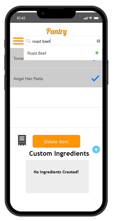
Task 2: Add roast beef, mayo, and bread ingredients to the pantry
The user is tasked with finding the different ingredients using the search bar in the pantry page
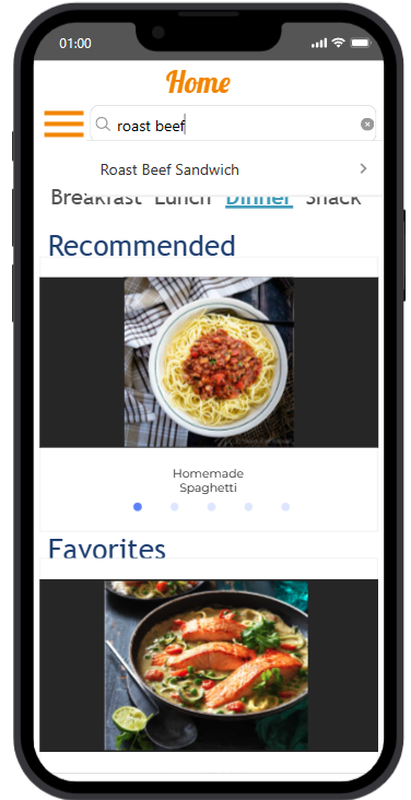
Task 3: Find recipe with pantry ingredient
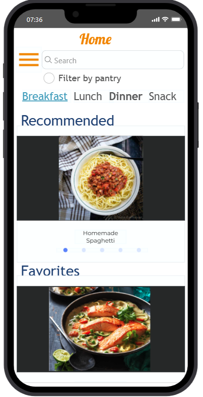
The user is next tasked with finding a new recipe with the ingredients entered. The user must first navigate to the home page, and search for a roast beef recipe we have with the filter pantry checkbox on
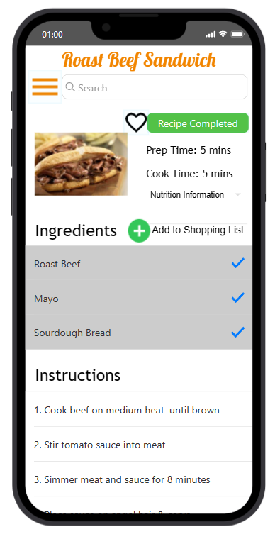
Task 4: View and "cook" the recipe
Finally, the user is asked to view the recipe and "cook" the recipe using the cooking completed button
User Testing
Testing is a crucial component for us to identify areas of our application that are difficult for users. Conducting user testing on our Pocket Pantry application was a necessity that allowed us to gauge the progress of our prototype. Our goal was to improve the tasks accomplished with our prototype compared to what users would do through other means, and user testing helped us achieve this goal.
To measure the effectiveness of our user testing, we identified three key areas of measurement. The first is scenario times, which will give us an idea of the application's learning curve. The second is problem task times, which helped us identify areas where we needed to add more design elements to guide the user. The third is user perception, which will allow us to understand how users feel about interacting with our application and whether they found it efficient to accomplish tasks. To ensure that our user testing results were comprehensive, we gathered data from a diverse group of individuals across various careers, including:
- Information Technology Manager
- Sales Representative
- Seamstress and Small Business Partner
- Housekeeper
- Student
Our plan included that we conduct in-person usability testing sessions with appropriate users, including at least one pair of users. Throughout the testing, both team members were present to gather as much data as possible to improve the Pocket Pantry application. By using a combination of quantitative and qualitative measurements, we gained insights into areas that require improvement, enabling us to make the necessary design changes.
Key Insights
1. Each user had there own perspective
Every single one of our users each had a different perspective on how our application should have worked. Some users believed the Hamburger navigation icon was simple to understand and easy to use, while others thought it added confusion and wanted to use a different method to navigate through our application while others weren't completely familiar with how to use it. Overall, we concluded every user has their own perspective on how an application should be used, and it's up to us as developers to accomodate that as best as we can.
2. Ambiguous Design
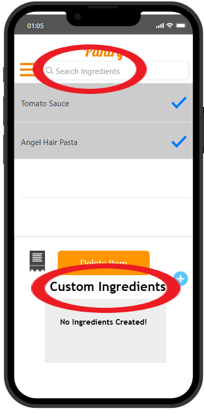
One of the useful insights that we gathered was that sometimes small inconspicuous elements of our prototype that are meant to help the user can sometimes lead them in the wrong direction if they are not intently clear with their design implementation. For example, one of our user testers wanted to add ingredients by creating custom ingredients, when they only needed to simple search the ingredient as detailed below. Ensuring that the user had clear and defined implementations of even simple tasks such as adding ingredients into your shopping list is important in the user experience. If the user came to a halt during our user testing because they were confused on how to accomplish tasks, this let us know as the developers that we needed to focus on those specific areas so that they were not ambiguous to the user.
3. User Testing Scheduling
Another of the more significant obstacles that we encountered had to do with scheduling the user testing itself. Due to the work schedules of our team, there were limited windows in which we could accomplish this user testing. Coupling that with ensuring that the user also had to be available made scheduling something of a challenge. This ended in a result of scheduling user testing for 5 participants over the course of a month rather than in a short time period. In the end, this did work out in our favor because it allowed us as the developers to go through cycles of testing and developmental improvements to the prototype. That allowed us to test new designs and ideas that we hoped would improve the user testing experience in the end, as well as receive feedback on different areas of our prototype rather than receive the same feedback from each user.
Final Reflection
Overall, our project was tedious and challenging. From initial user research to prototype implementation, we encountered many different issues. We learned as a team how crucial initial user feedback is and how much detail is required when asking our users for initial feedback on our design. We learned questionnaires are a vital tool in learning what our users want and how important it is to gather and implement that feedback. From prototyping on a piece of paper to a fleshed-out interactable application, the scope of our project grew from iteration to iteration as we developed that application for the users. The development of this application allowed us as a team to see the development lifecycle of a complex application and how involved the process can be.