OdysseyMate
Solve organization issues and time when traveling by using OdysseyMate!
Team Members
Problem
OdysseyMate aims to solve issues with organization and finding travel companions when traveling by simplifying and having all your travel, packing, and companion information all in a singular app.
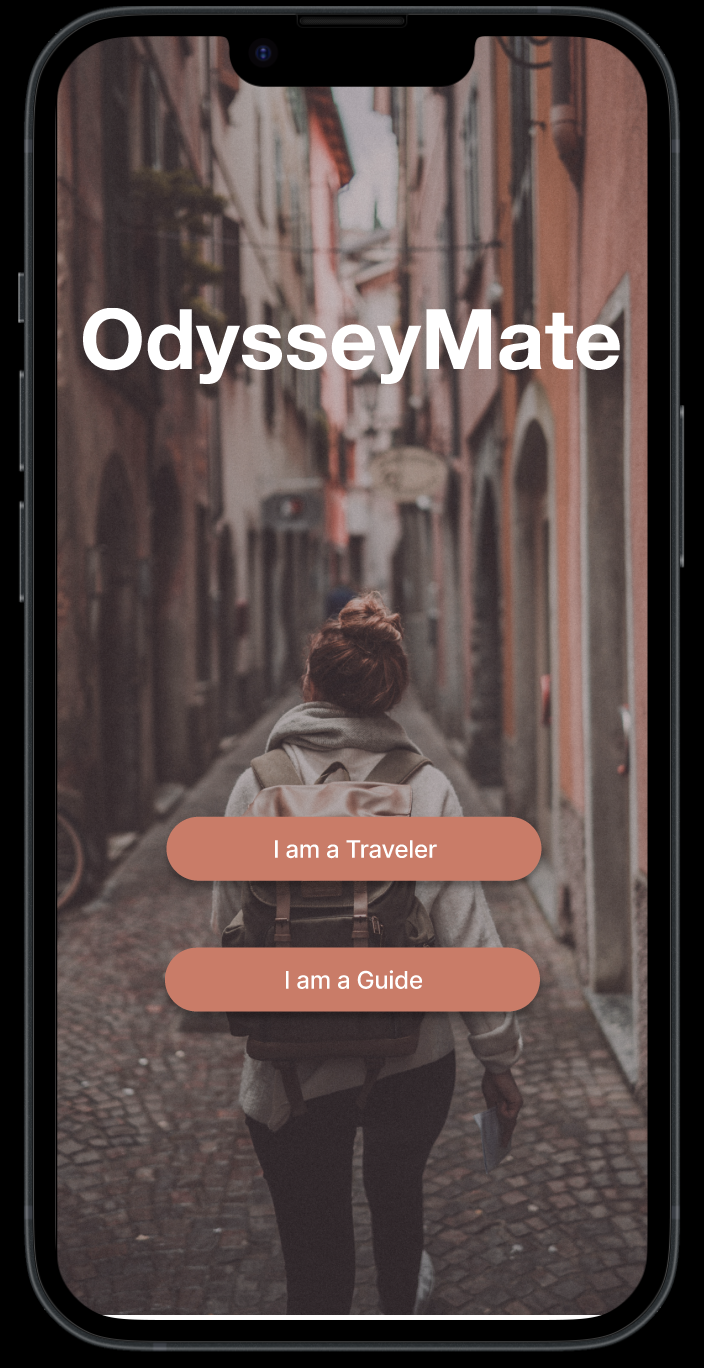
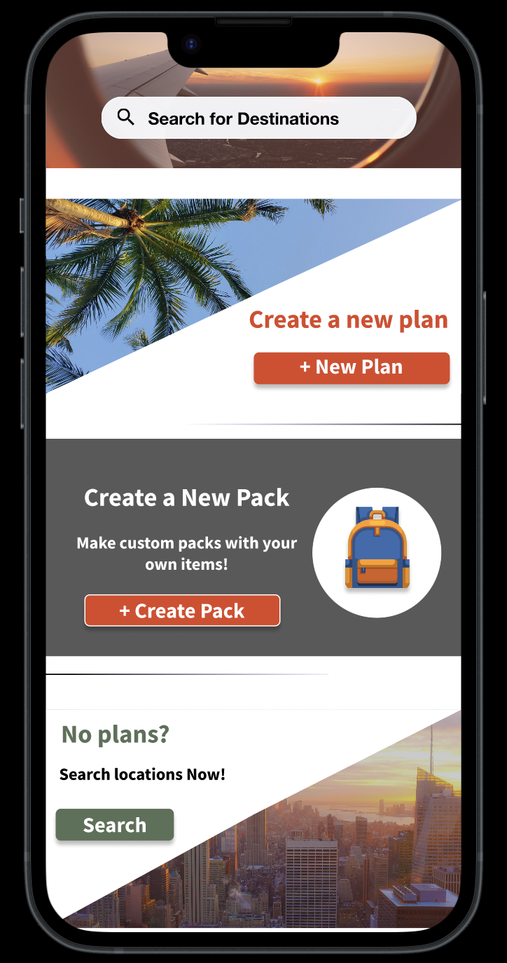
Early Design
Our primary focus for our early design research is to find insights into concerns with travelers while traveling, gauging user interests in finding guides, and finding traveling companions. Initial questions we had about the software product and the users who would be using it included:
- What are worries of people who travel?
- How interested are people in finding local guides in their travel location for touring / activities?
- How interested are travelers in connecting with other travelers?
- How difficult is it to stay organized for a trip and make sure you have everything?
- How much of a concern is renting / buying equipment for doing activities in the area of travel?
- How important is it to have the same preferences (budget, itinerary, activities) with traveling companions?
In order to gather early user feedback we relied on two different methods, interviews and questionnaires. We decided upon these two methods as interviews allowed us to get more insight and details into why users were unsatisfied with current systems / products, whilst giving us insights on things we could produce to enhance our product. Secondly, we used questionnaires as it was less time consuming and allowed us to reach a larger and broader audience for more feedback.
Key Insights
1. Appropriate Clothing When Traveling
2. Organization and reassurance of being completely packed
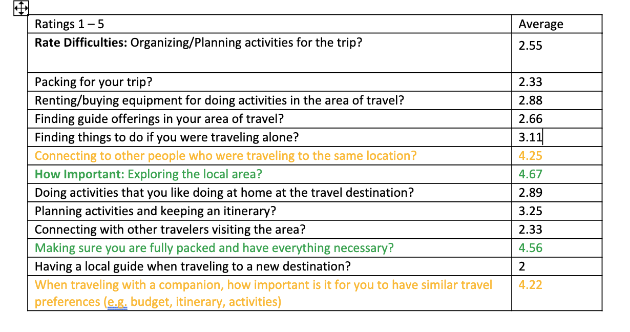
The top key insight we learned from our questionnaire was that a primary desire among respondents is to explore the area they are traveling to. Additionally, respondents indicated that ensuring they are fully packed for their trip and have all of their necessities was important.
3. Similar Travel Preferences
Storyboard
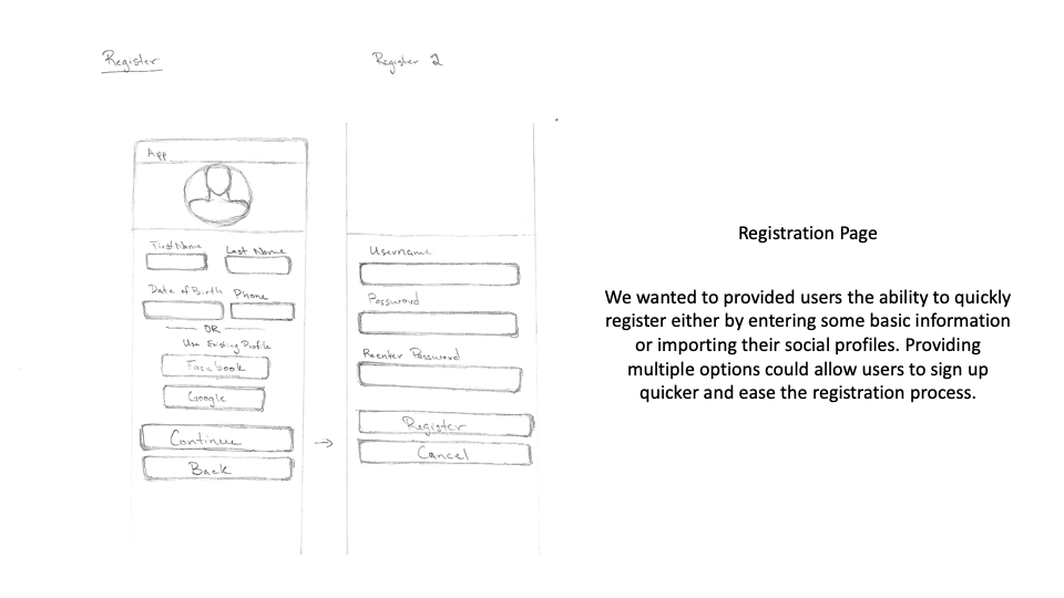
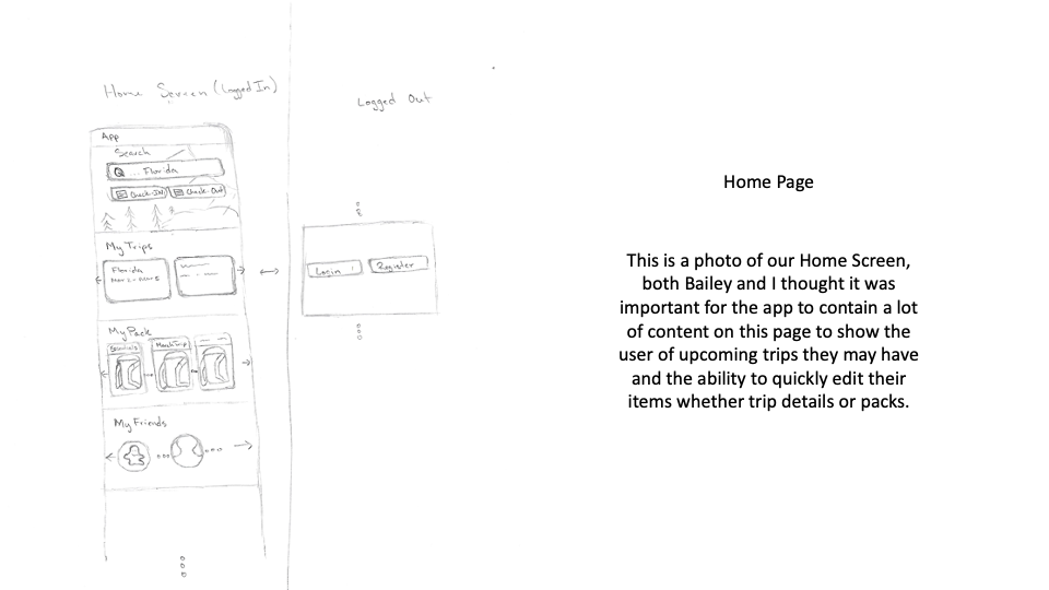
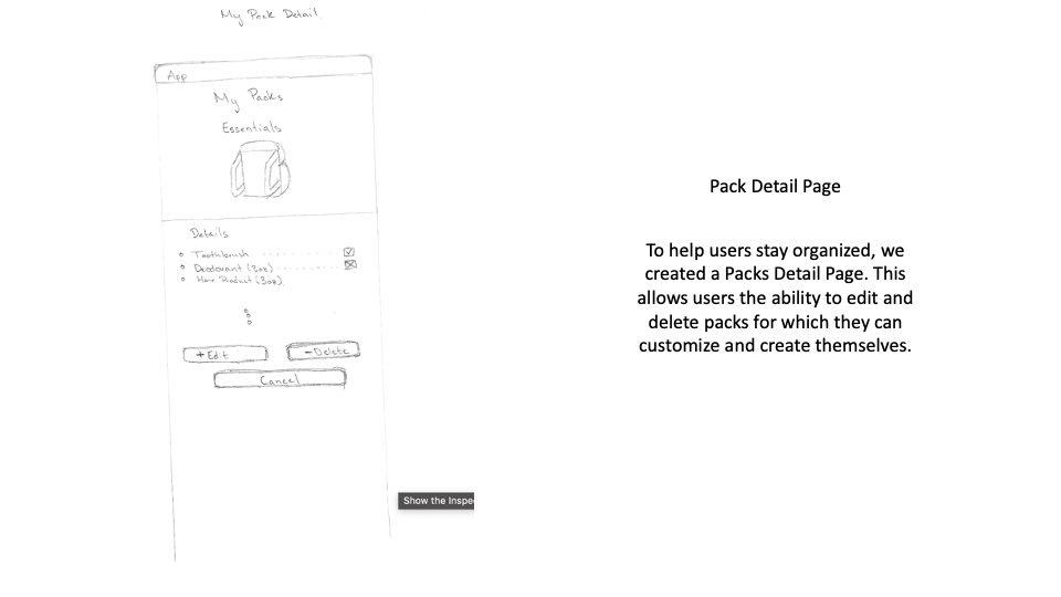
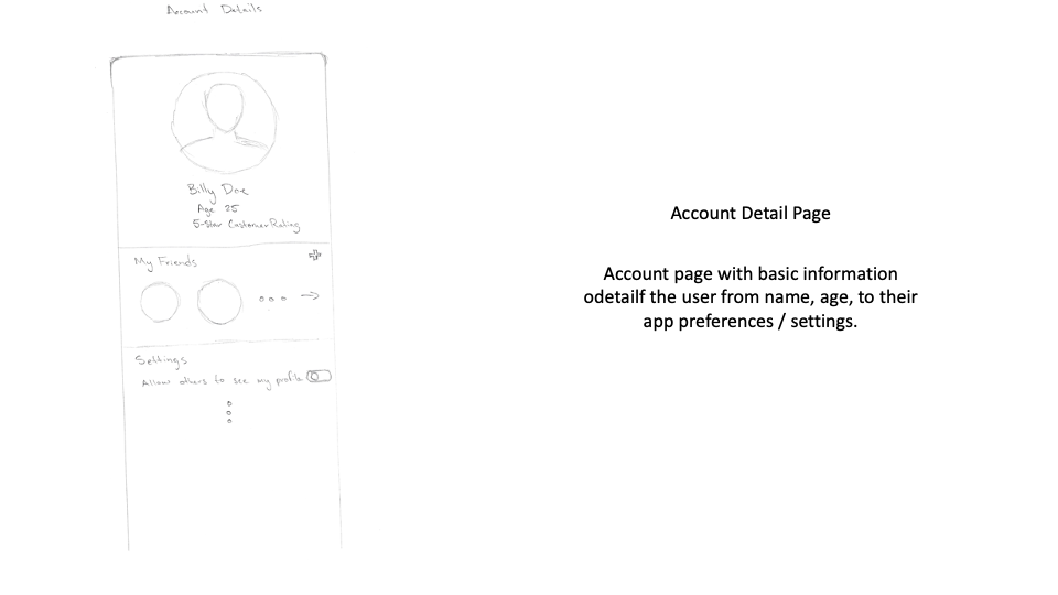
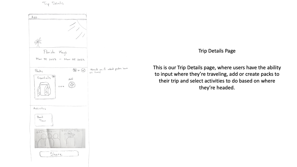
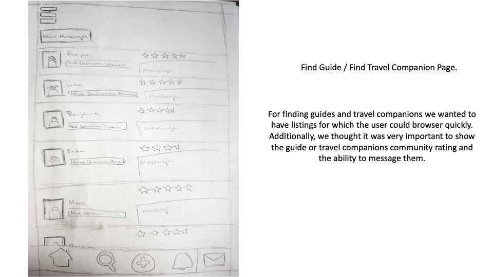
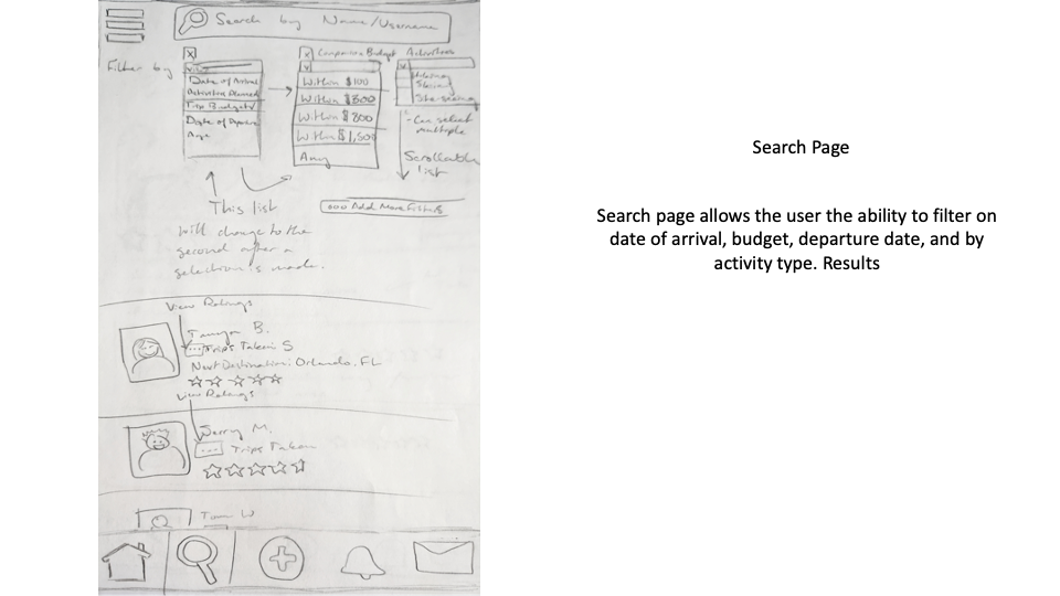
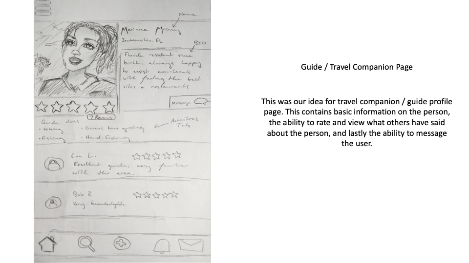
We started off with a rough paper prototype of our idea. Below is an illustration of some of the initial ideas we sketched out along with brief annotations of what is represented in each screen
Design Crits
Our iterative design process mandated that we gather user feedback early and often throughout the design cycle. Using our low-fidelity prototypes, we engaged in a number of design critiques (crits) with other students in our class as well as with the instructor. We also performed a heuristic evaluation by conducting a systemic analysis of the usability of our design based on established usability principles and best practices.
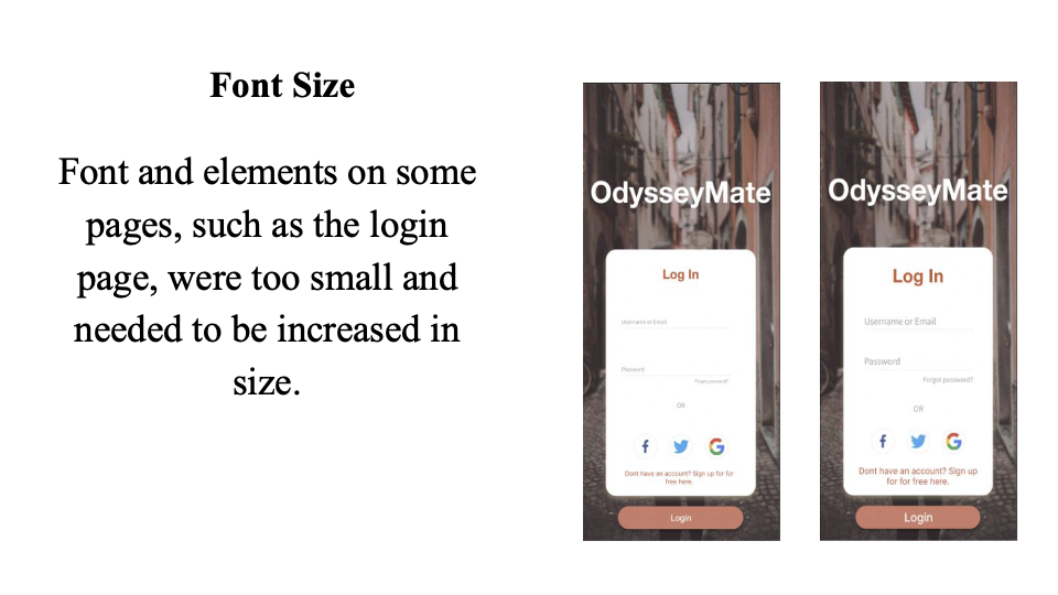
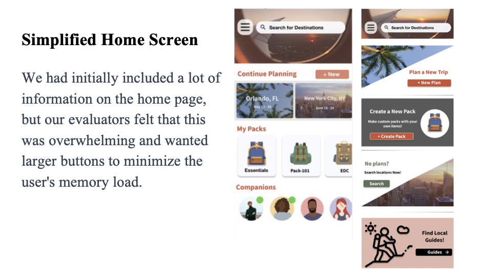
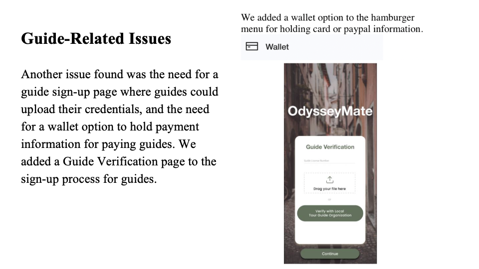
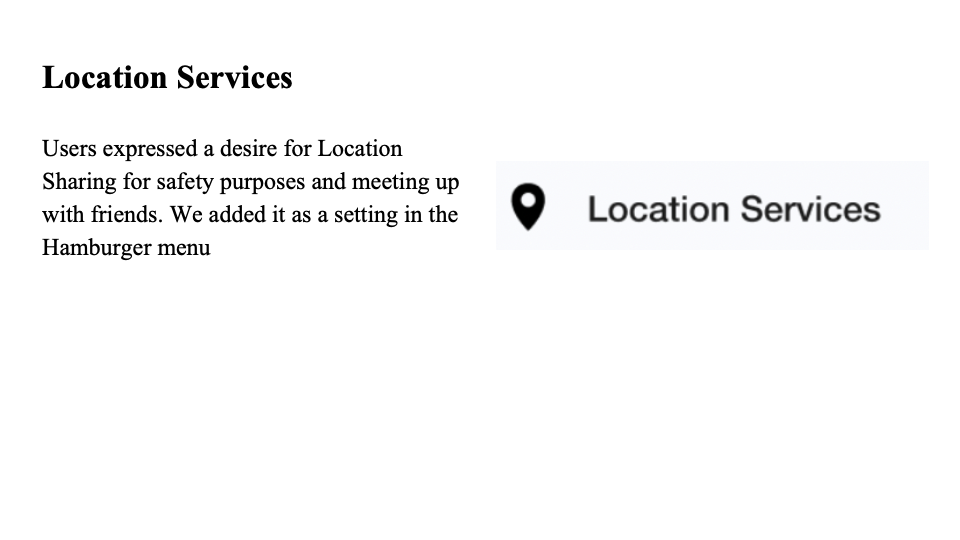
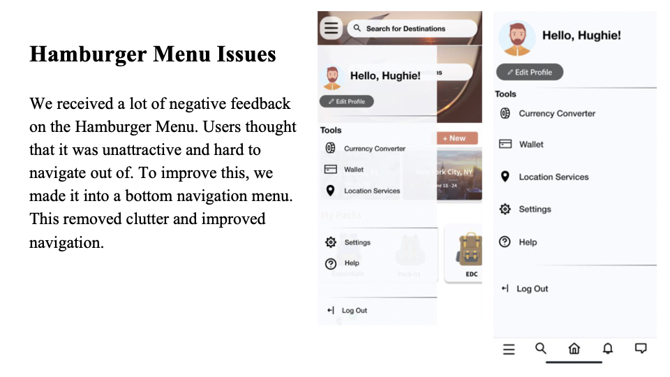
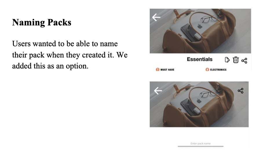
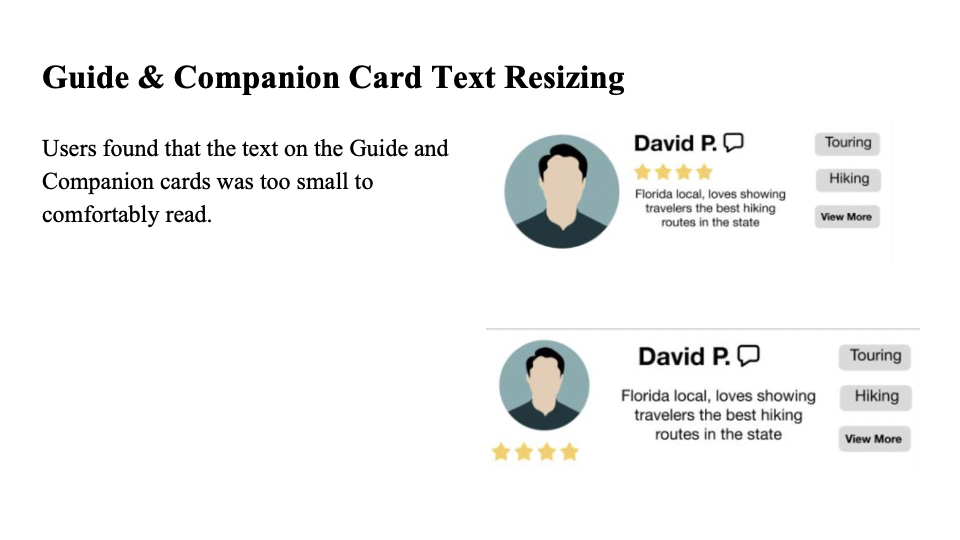
The main insights we gathered from our design crits and prototype evaluations included: users thought screens were too busy, and font was too small, users were concerned about guide verification and payment, and users wanted to be able to customize elements such as packs. These affected changes to our designs in the following (illustrated ways)...
High-fidelity Prototype
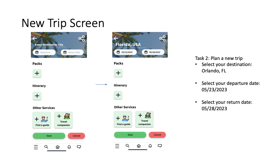
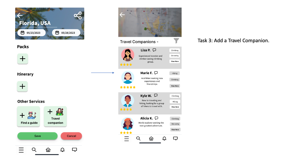
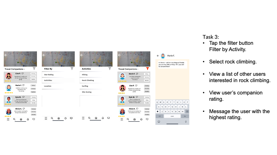
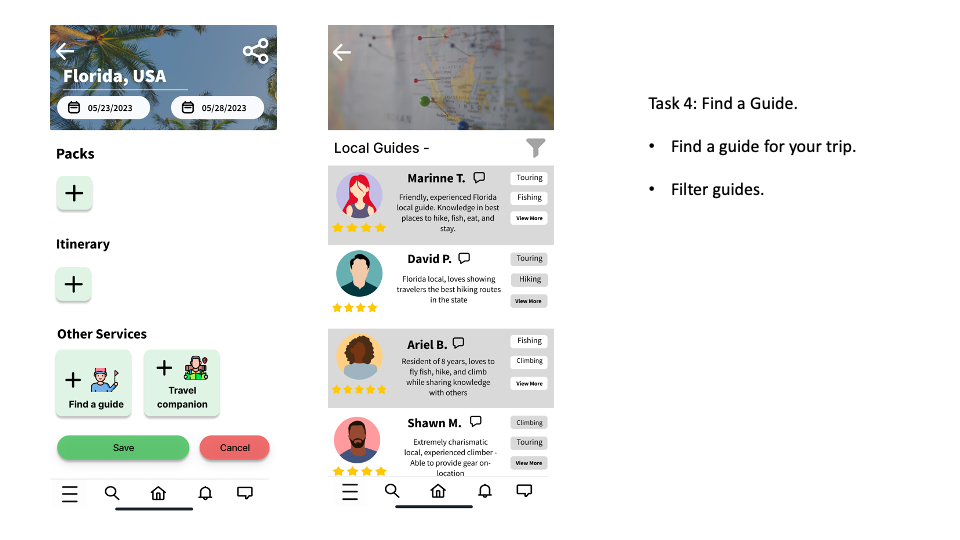
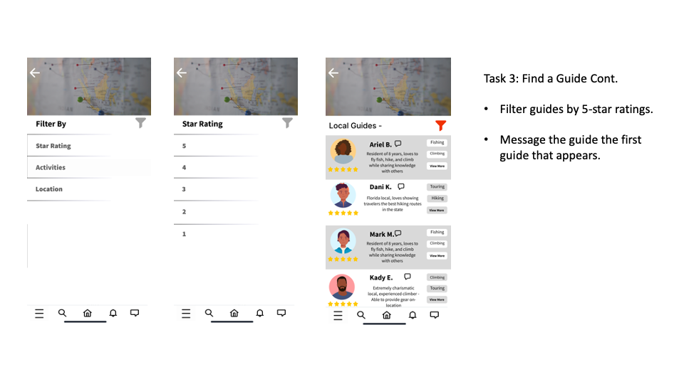

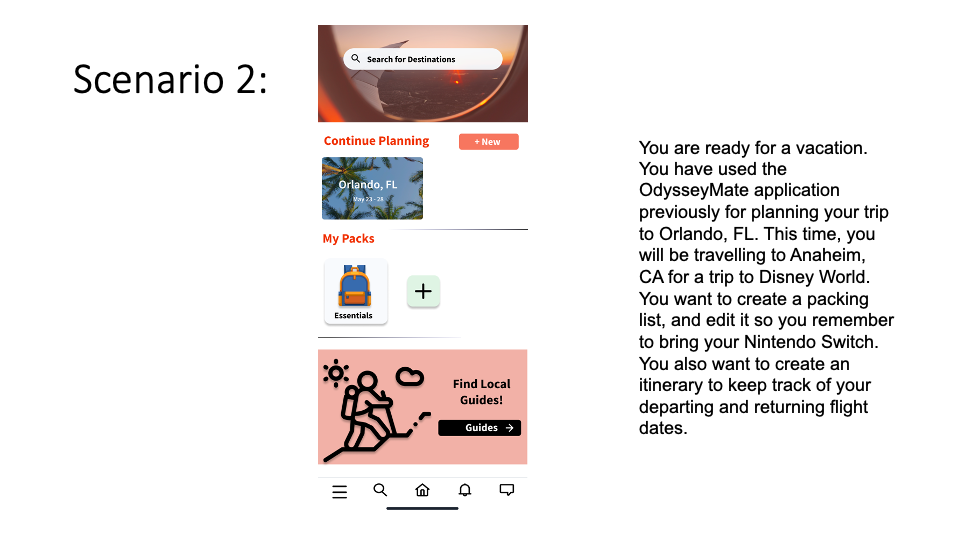
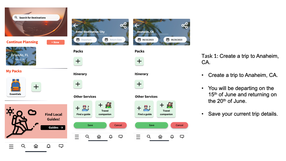
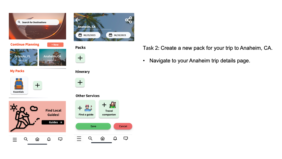
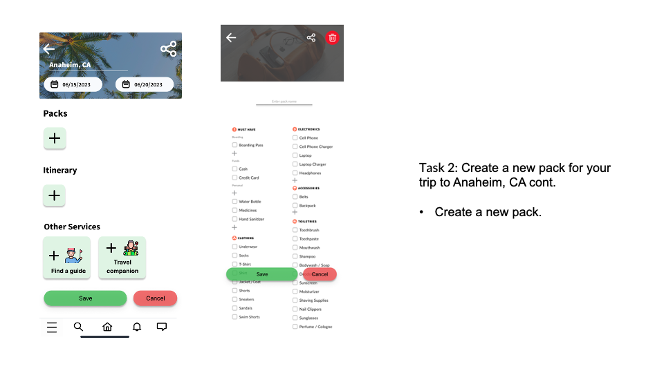
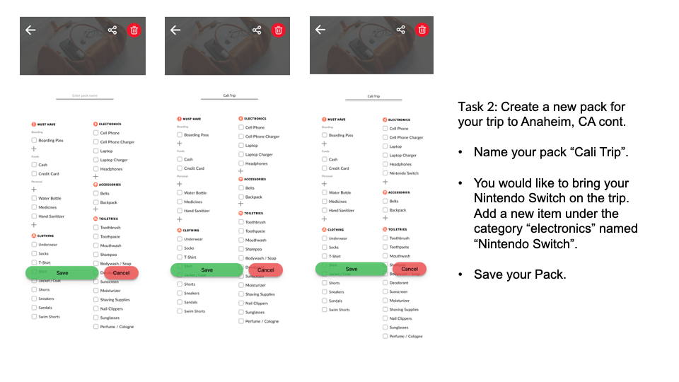
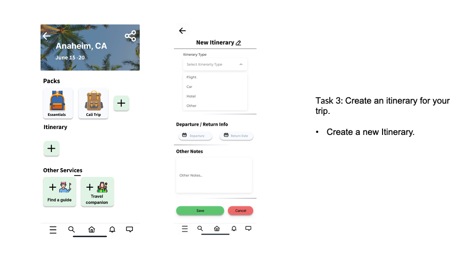
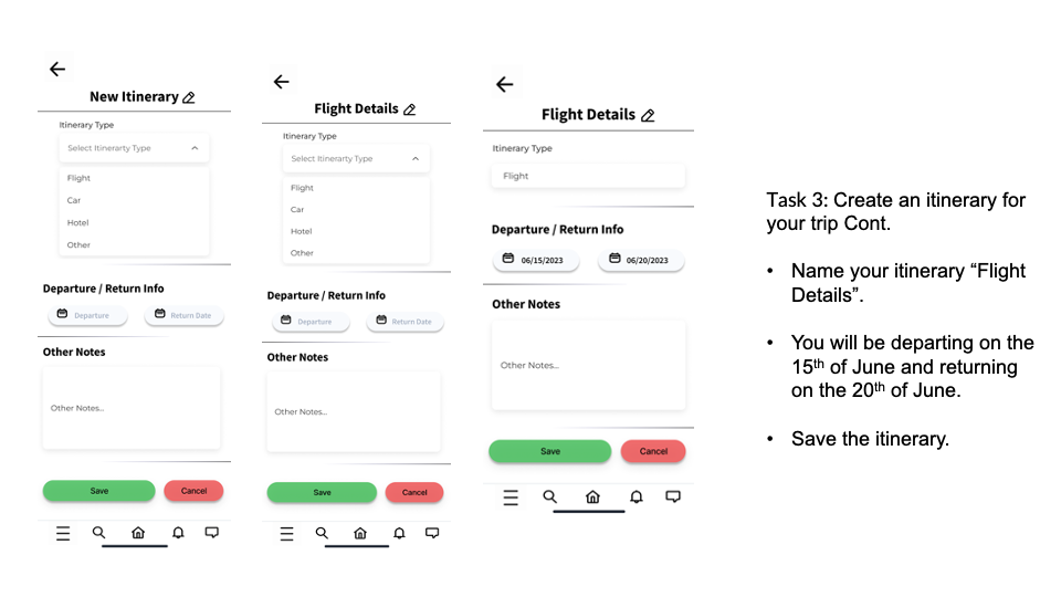
User Testing
We conducted all of our tests in the University Center between the dates of 4/23/2023 and 4/30/2023. All tests occurred in the afternoon between 3pm-6pm. 3 of our users were employees at The UPS Store, and the other 2 users were college students. All of our testers were between the age of 21-31. In total, we conducted 4 tests: 1 test with 2 users, and 3 tests with 1 user.
Key Insights
1. Messaging / Messaging Icon
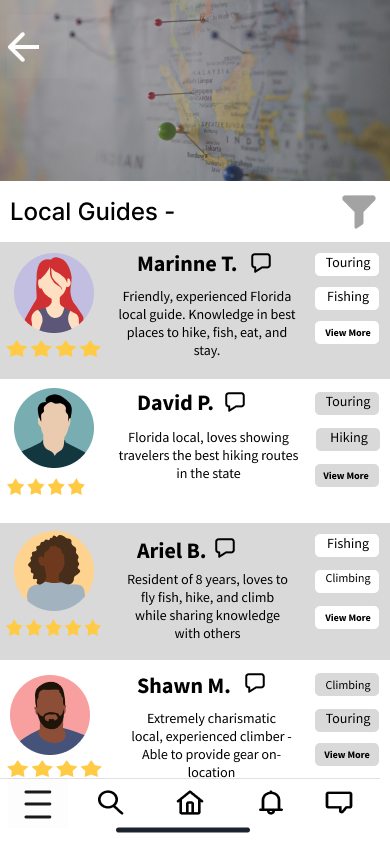
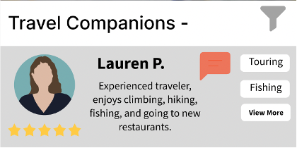
We found that more than half of our testers experienced difficulties locating the button to send messages to guides or travel companions, and it was specifically mentioned by our final tester in their interview that the message button was a problem. The button did not appear to afford clicking, and was too small to easily click.
Solution
We could change the color of the message button and enlarge it to make it more clickable, or we could just make it so you message a guide when you click on their profile card.
2. Figma Interactivity
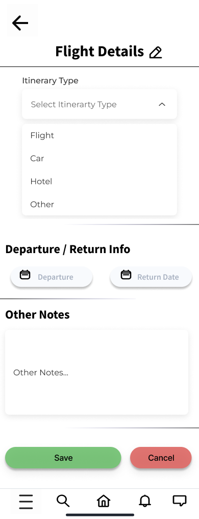
Another issue encountered by almost every user was an issue with the drop-down menu on our itinerary creation page from scenario 2. We were experimenting with an interactive dropdown menu found in Figma online resources to see if users were able to use it better than one we simulated, but the dropdown menu required an extra click after a selection was made to collapse it, which confused all of our users. Many of our users at this point in the test had discovered the blinking Figma icon showing them where they could press, so it was difficult to measure how long it would organically take them to figure it out without the icon.
Solution
Scrap the dropdown menu together and recreate it.
3. Text Sizing Issues
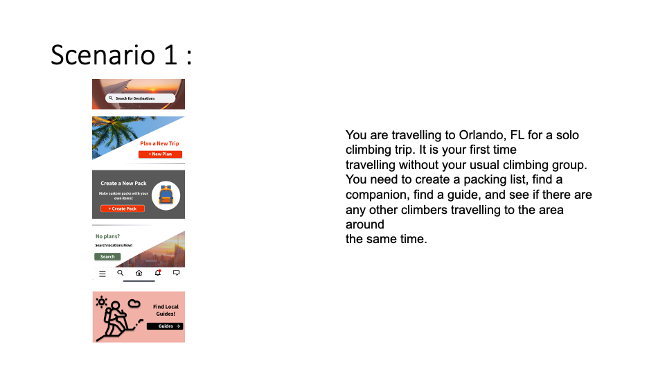
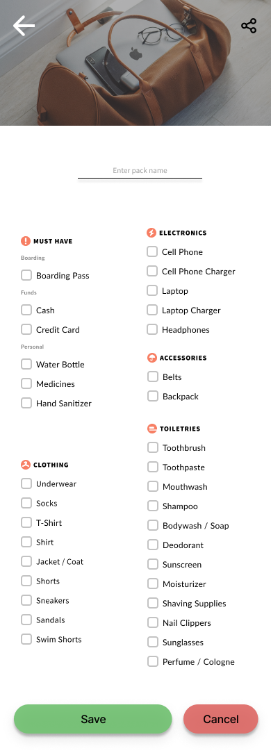
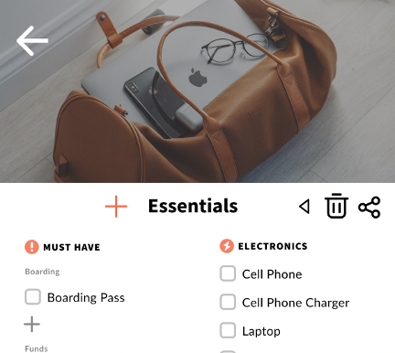
The majority of our users did not immediately recognize that they had edited their packing list after adding the Nintendo Switch in scenario 2, most likely because the text size was too small within the packing list, and the action of adding it didn’t feel interactive enough. Some users also had a hard time finding where they should add the item to the list in the first place.
Solution
Enlarge the font on the packing list, maybe create a central button at the top for adding items for greater convenience.
3. Post Test Questionnaire
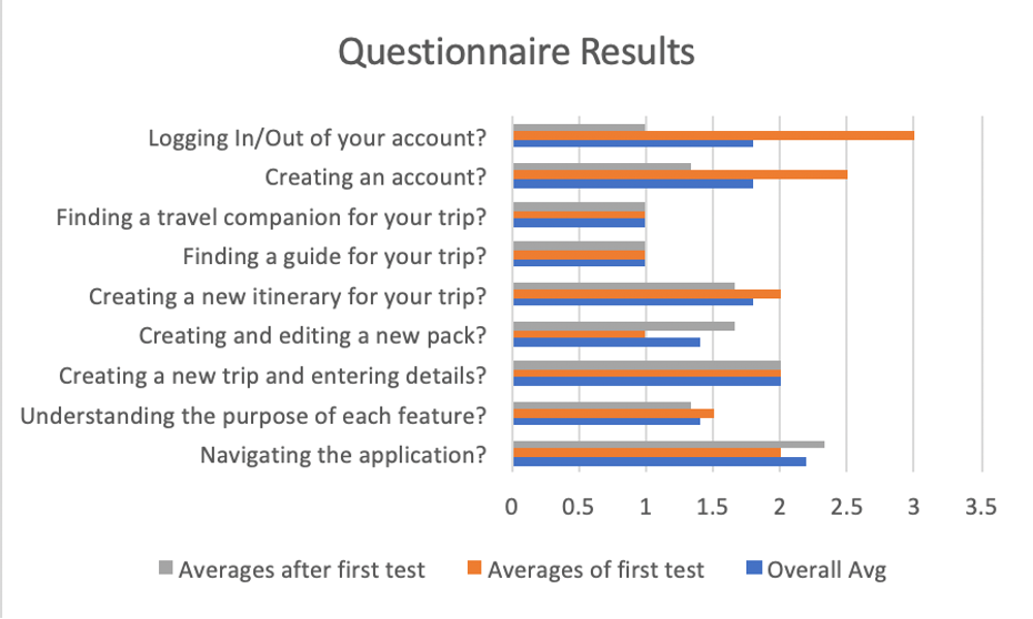
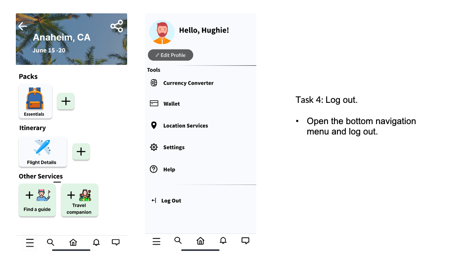
We felt that our first testing group encountered more difficulties than other groups during testing as they were our pilot test and we made changes to the application after they had already tested since some of the flaws they encountered during the test (for example, the not fully functional sign-up screen) would distract and confuse other users from the beginning of the test, becoming a detriment to our testing process. We also wanted to see if their difficulties with the features we changed matched that of users who tested after them. We found that after the changes to the application, users ranked their difficulties logging out at an average of 1 on our scale while the initial testers’ answers averaged at 3. As for creating an account, our second batch of users’ answers averaged at 1.3 while our initial user’s answers averaged at a 2.5
Final Reflections
Bailey Eggebrecht
During the process of testing OdysseyMate, I learned a lot about testing, and had a lot of thoughts on things I wish we could have done before testing, and things we still have left to fix after. The first thing that I learned was that instead of describing the gist of the task in the task list, we perhaps should have just numbered them. Some tasks required users to reach a certain screen before they could do the main point of the task, but when users read things like “Task 2: Create a new pack”, they are inclined to just start doing that before reading the steps in the bulleted list below. I also learned that prototyping app screens gets increasingly difficult with an increasing number of built-out features. While the screens were necessary, I wish I had stayed more organized when connecting them, because prototyping is a bit of a nightmare now as everything looks like a giant spider web. Additionally, while prototyping, I wish I had clicked around more randomly to simulate what a typical user would do. It was a bit painful to watch people click on the wrong item and get redirected back to their California trip page by hitting the home button mid-task, because we had to interrupt to return to the correct page. I also learned that if a question arises early, you can’t brush it under the rug, or it comes back. For example, we received a question about how guides would be rated early on and I ran out of time to implement all of the screens required to make it make sense, also I figured users wouldn’t end up interacting with a guide rating page in either of the task lists regardless. However, one of our testers asked a similar question again during their post-test interview, and was bothered by the idea of not being able to determine the validity of a 5-star review. Another group during our heuristic design pointed out that the packing list might be a bit small. We ended up enlarging it slightly, but it still proved to be difficult for testers to read and interact with, so we hadn’t completely fixed the issue in our first revision. I felt that having a 2 person group test was the best part of testing the application, as they spoke more freely than our other testers and had a lot of interesting feedback during their post-test interview. It was also helpful to have them test first, as they were able to assist each other in completing tasks when one of them got stuck on a page. This had the added benefit of knowing what was fully detrimental to testing if it was unfixed, because if 2 people couldn’t work out what button to press after an extended period of time and talking it over, we doubted individual testers would be able to figure it out alone. I also felt the post-test interviews went well, because some testers didn’t speak much about the application at all while clicking through it, so the interview was necessary to get meaningful feedback. I also learned that some testers catch on to how Figma works much faster than others, which can skew test results. In hindsight, we should have researched to try to figure out a way to remove the flashing buttons when users click on the wrong area, because some users seemed to understand from their first few mis-clicks that the app was telling them where they needed to click to continue on with the task. This made it a bit difficult to analyze the number of mis-clicks, since some users seemed that they were able to get through tasks just by following the flashing pointer. I was also glad we recorded because it made capturing the number of mis-clicks easier, and it was too difficult to keep track of everything in one watch. Overall, I enjoyed the testing and learned a lot for if I conduct a usability test again in the future.
Ma Vang
User testing in my opinion was pretty good for the most part and I felt like all of our users were able to get through the given scenarios and tasks. The biggest take away and learning experience from user testing that I learned was that users will find the loopholes in the prototype and often navigate to them. So having a robust and really well tested system/ prototype before even getting to the user test is crucial; not only for testing, but for the tester. Unexpected things that occurred during the test that I noticed that happened a lot was that users skimmed the scenarios and tasks that were written down and were more focused on interacting with the prototype. This caused confusion for a large portion of our test users when running through our second scenario when they were tasked with creating a new pack in the Anaheim, CA trip that they had just created in the prior task. Things that could’ve gone better for me is have a little bit more of a robust prototype or slightly more refined one. There were a couple times when testing that the user got to pages / screens where they should not have been, so we have to reset to the correct page or to the last page they were at and had them run through the task again. I think additionally if we also refined the scenarios and tasks, it would’ve maybe helped with causing less confusion. Additionally, limitations of Figma I felt detracted from the experience of some users. User testing taught me a lot about prototyping, design, and how outside users unfamiliar with your system interact with your system. As the designer of your own system, you think that your system is intuitive and easy. But when given to users to test, it is often not the case. User testing has really helped refined our system for which I don’t think we would’ve caught had we not done user testing.


