
MealTimeMe
Improve your process for cooking, prepping and grocery shopping by consolidating cookbooks, and having a food organizer all in one.
Team Members


Problem
Have you ever started preparing to cook, and realized your fridge is a little sparse and spent a portion of your evening frantically trying to figure out what to cook without having to go to the store? Or better yet, went on a shopping trip only to checkout and realize it was significantly more than you expected? With MealTimeMe both these problems are solved, combining a cookbook, grocery tracker and shopping portal all into one. MealTimeMe can help you not only keep better track of food in your kitchen but help you decide what to prepare. In addition it can be used as a regular old cookbook and shopping companion, telling you what all the items in your list will cost, Making your entire food buying and cooking experience more streamlined and less of a headache.
Early Design
The primary focus of our design research was to better understand what users wanted out of a meal preparation and planning mobile application. To gather early user feedback we did a combination of interviews and surveys. Some initial questions we had included questions about their current cooking and shopping habits, their knowledge about the food in their home, and their opinions regarding the recipes they cook at home. We asked users over a large age range and lifestyle to ensure that we had a wide variety of view points.
Key Insights
1. Current processes deeply flawed
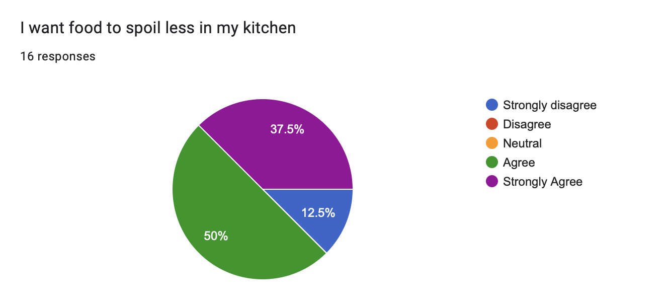
A large majority of our participants shared that they wanted food to spoil less in their home. This illustrates the need for a product like MealTimeMe® and also highlights the importance of a meal tracking app in general.
2. Balancing Personalization and Privacy
Multiple participants expressed a desire to know the cost of the shopping bill before they go to the store. Suggesting that a look into future pricing, cost of goods being sold, and availability of products would be a useful feature. It was important that we allowed for this sort of customization, while also ensuring the privacy of the user. We also were careful when selecting users for feedback, as we did not want to reveal or disclose any of their identities.
3. Adding new options
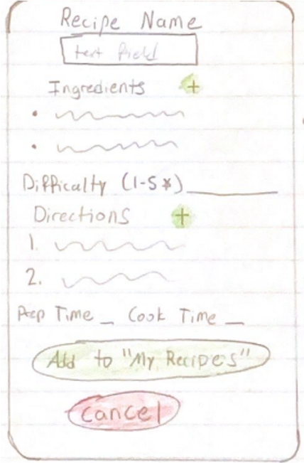
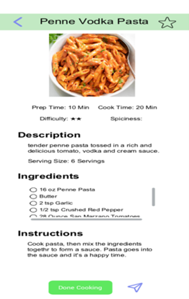
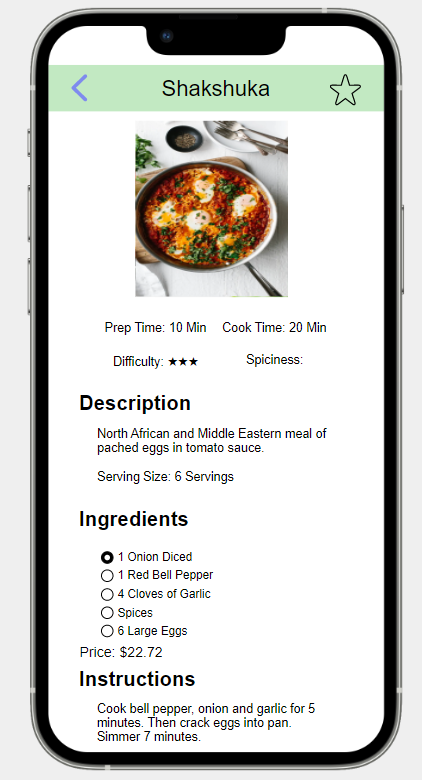
Multiple participants told us that they inquire about the skill level it takes to cook a recipe, before they attempt cooking the recipe. We decided that this would be a great feature to have, so we included a difficulty ranking for each recipe. Shown below in the screenshot, there is a section for difficulty rating. Each recipe has a difficulty rating out of 5 stars that the user can filter by. This allows them to filter out recipes that may be too difficult for their liking before they begin cooking the recipe.
Storyboard
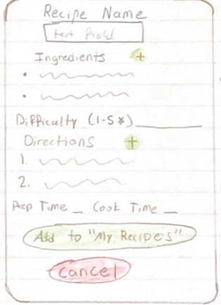
In the initial phase of our project, we utilized storyboarding to depict our design concept. This approach, commonly used by animators and individuals in the movie industry, involved creating a sequence of sketches or screenshots. We annotated these illustrations to facilitate effective communication among ourselves and our classmates. Storyboarding enabled us to comprehend the application's flow and merge our ideas into a cohesive design. Despite its advantages, storyboarding has limitations. It is a time-intensive process and may not depict precise design details. Also, storyboarding is not an ideal method to test the design's usability. Nevertheless, as an early step in the process, storyboarding provides a preliminary impression of the design's appearance and functionality.
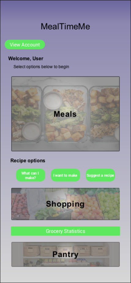
Meals and Pantry Pages
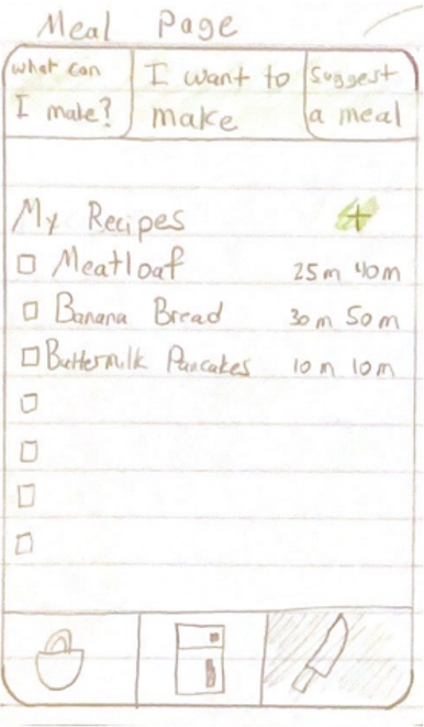
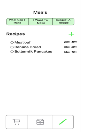
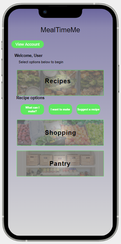
The Meals Page was initially designed to provide you with an array of options to choose from when it comes to meal preparation. With the help of the search feature, you could easily find a specific meal you want to cook. Additionally, you could receive meal suggestions based on the ingredients you currently have in your pantry or randomly suggested meals based on selected filters. Apart from exploring new meal options, the page also allows you to add your favorite recipes to the database and delete old ones that are no longer relevant. You can also view the preparation and total cook times for each recipe, enabling you to plan your meal preparation accordingly.
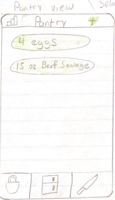
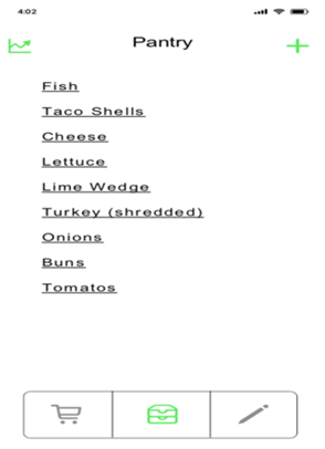
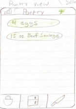
The Pantry View is a dedicated section within the platform that provides you with a comprehensive overview of the groceries you have at home. With this feature, you can effortlessly add or remove items from your pantry and keep track of your grocery budget. The pantry view also includes detailed grocery statistics, enabling you to monitor your spending for specific time periods such as 30, 60, or 90 days. The pantry items are represented as buttons, which are clickable for easy removal. To add new items, simply click on the plus icon, and to view grocery statistics, click on the histogram icon. This user-friendly design ensures that managing your pantry is seamless and efficient.
Recipe and Shopping Pages
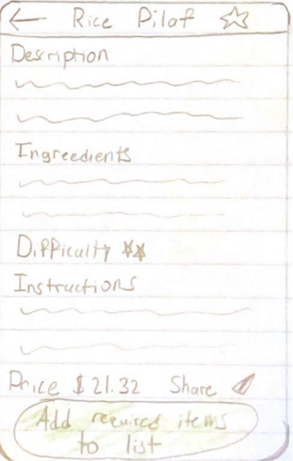
On the Recipe Page , you can access a wide range of recipes that cater to various tastes and preferences. We have included several important metrics to support the primary functions of the app and enhance the user experience. To facilitate easy access to favorite recipes, we have added a star icon in the top right corner of each recipe. The page also includes a share button, which allows users to share the recipe with friends and family. In addition to these features, users can view essential recipe details, such as the price, description, and ingredients. The displayed price is reflective of the food items available in the user's pantry, ensuring that the recipe remains affordable and accessible.
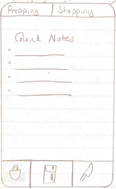
The purpose of the Shopping Page is to provide users with a convenient platform to plan their shopping trips by allowing them to view the items they require from the store, along with their corresponding prices and availability in different stores. Unlike a traditional shopping list, this page is divided into two sections, namely "Prepping" and "Shopping". The Prepping section allows users to list down the items they need to purchase, while the Shopping section compares the prices of these items across different stores. Additionally, the page features a Notes section that allows users to quickly jot down any relevant information related to their shopping list.
Design Crits
To adhere to our iterative design process, we made it a point to collect user feedback frequently and at various stages throughout the design cycle. To achieve this, we utilized low-fidelity prototypes and engaged in design critiques with our classmates and instructor. Additionally, we sought feedback from individuals outside of our class through a heuristic evaluation process. This involved having a user navigate a portion of the high-fidelity prototype while following a task list. Throughout the process, they provided feedback on usability issues and any aesthetic concerns they had with the design.
Based on our design critiques and prototype evaluations, we gained significant insights that led to several modifications, both major and minor. These changes had a notable impact on our designs and influenced them in various ways, which are outlined below:
- The icons for navigation were confusing to a lot of people, we changed the icons to better represent the pages they led to.
- We received feedback that the pages for individual recipes looked a little bit bare, we added pictures to fill the space and give a better idea of what the recipe was without having to read it.
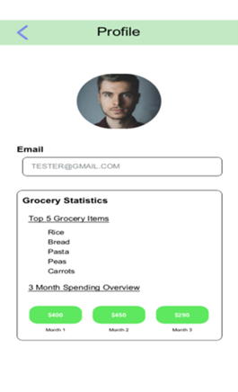

- Initially the statistics page was located on the pantry, we added an account view page where the statistics are shown.
- The current meals page was too much, we split it up into individual pages.
High-fidelity Prototype
After receiving feedback and conducting a heuristic evaluation on our early prototypes, we incorporated much of the feedback as we moved forward with the design process. To better understand how our ideas would function in the real world with real users, we created a high-fidelity prototype using the software Justinmind. This allowed us to take our storyboarding sections and turn them into an interactive interface, which we could then test and refine. Justinmind is a prototyping and wireframing tool that specializes in the creation of high-fidelity prototypes for web and mobile applications.
The main changes that we included were:
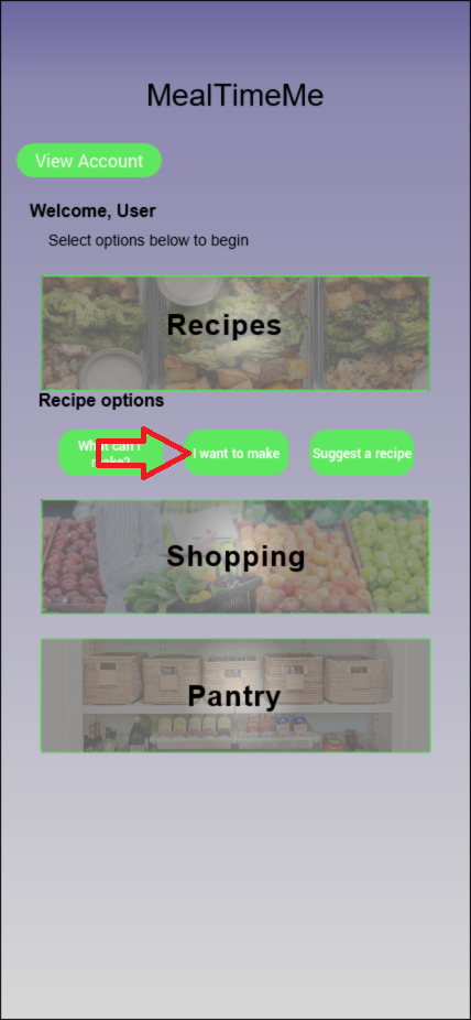
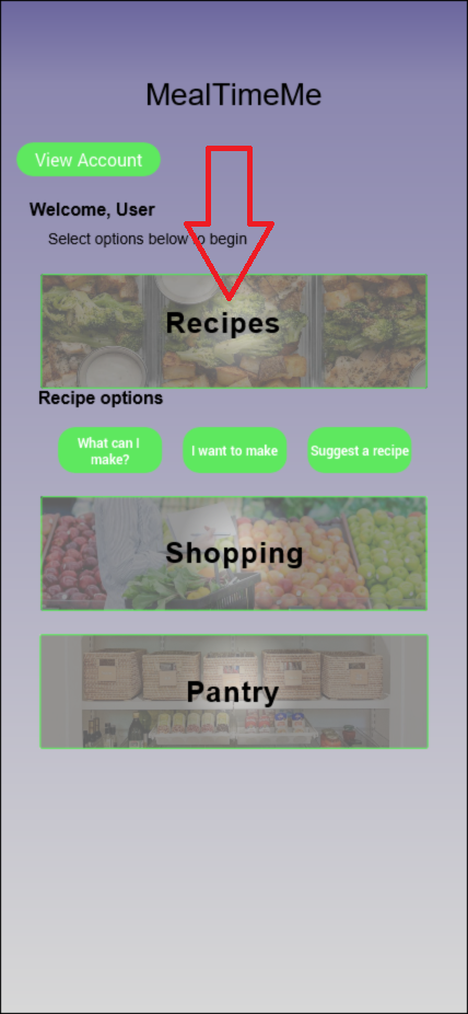
- Removing the navigation icons and creating a homepage.
- We extrapolated the meals page recipe option buttons to the homepage.
- removed the quick notes page from the shopping page.
Scenario:
You are a business executive that has to work late on valentine’s day. Your Fiancé is expecting you to cook dinner when you get home. Not knowing what you’re going to cook and remembering MealTimeMe®. You quickly find a recipe that you know she loves and that you’ve cooked for her before.
Task 1: You open the MealTimeMe® app.
This was simply asking the user to select the app from the phone provided.
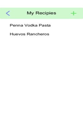
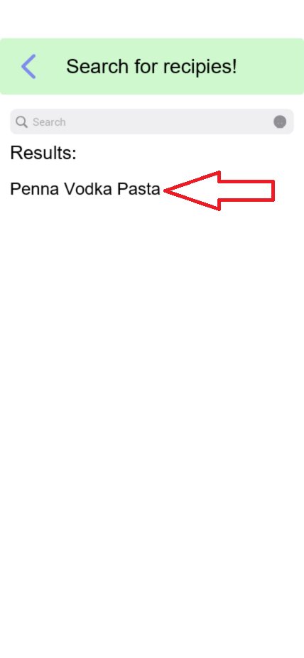
Task 2: Enter in the recipe that you want to make (Penne vodka pasta sauce).
- From the home page, select the "I Want to Make Option"
Task 3: Choose the recipe “Penne vodka pasta sauce”.- Ensure a prep time of 15 minutes.
- Ensure a cook time of 20 minutes.
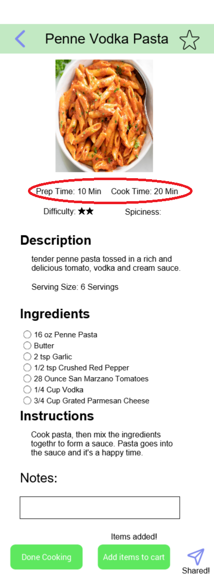
- Select the recipe from the list and look at the cook and prep time ensure that they are both below the required times.
Task 4: Check if you have all the ingredients at home to make this meal.
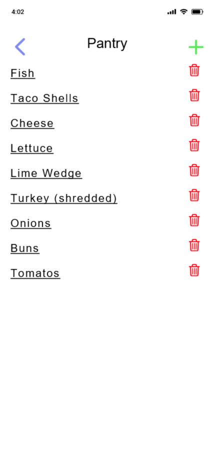
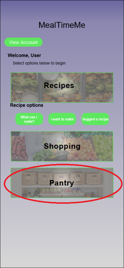
- Select the blue arrows from the top left until you are returned to the home page. Then select the pantry button from the home page, and see if you have the required ingredients for this meal.
Task 5: Check your account settings.
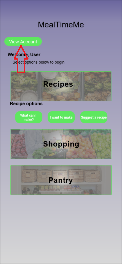
- From the homepage, select the view account button in the top left.
Task 6 & 7: Check your MealTimeMe statistics, then ensure that pasta is a top five food for you.
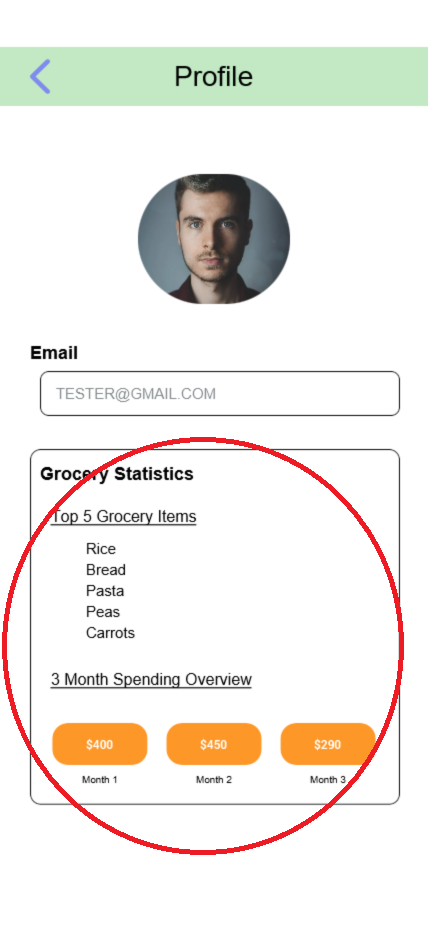
- Check you statistics in the account page. Ensure that pasta is a top five food for you by looking in the statistics section.
Task 8: Add a new recipe called spaghetti and meatballs.
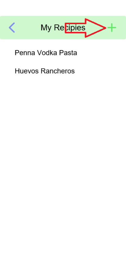
- Select the recipes button from the home page, and click the plus icon to add a new recipe.
Task 9: Enter in a prep time of 10 min and a cook time of 20 min.
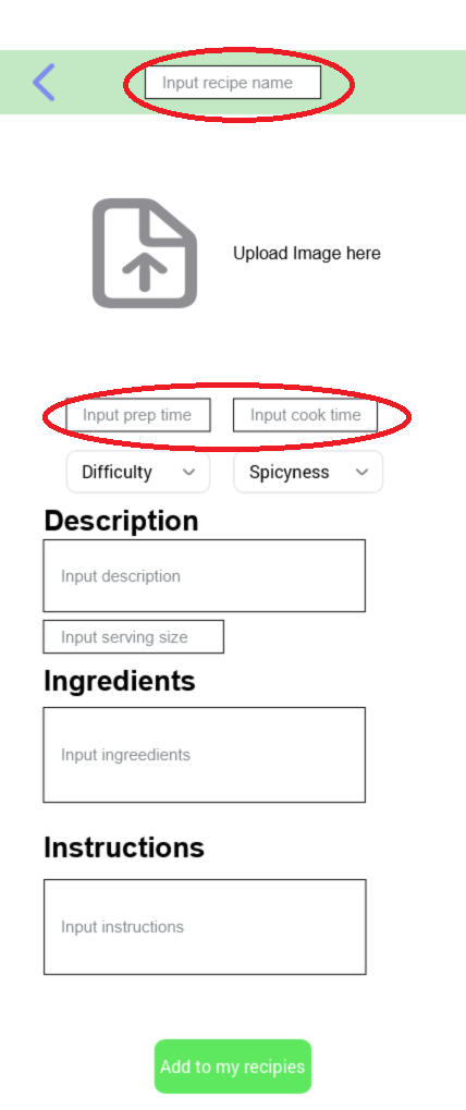
- Enter in the name, prep , and cook time on the recipe page.
Task 10: Exit the app.
This is simply asking the user to close out of the app on the phone provided.
User Testing
The main focus of our user testing was to root out potential usability issues with our prototype. We completed four testing sessions with a total of five participants. The first session was held on April 19th, 2023, at The University of Montana Library and involved two computer science students. The second session, which took place on April 20th, 2023, involved a computer science professor and their office. The third and fourth sessions were conducted on April 28th, 2023, in the journalism building at different times, with both participants being journalism majors.
Key Insights
1. Current processes deeply flawed
- Users had issues identifying what the "Meals" page on the home button was for, this has been changed to "Recipes".
- Users believed that the open bullets on the individual recipe pages indicated something about the status of the ingredient. This has been changed to reflect that
2. Balancing Personalization and Privacy
What Users Liked About the App
- Liked the idea of filters and budget.
- Liked finding price per store.
- Likes how it could help save money on not spoiling food.
- Liked how the ingredients and prep time were easily accessible.
- Liked ingredients space, and place to add to cart ingredients.
What Users Diliked About the App
- Some things didn’t show up.
- Didn’t like the naming of the meals page.
- Search recipe didn’t help much, and shopping part seemed clunky.
- Confused about different categories, should combine into one page.